Favorite Books 2022

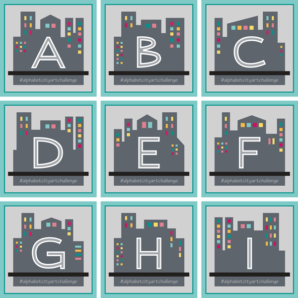
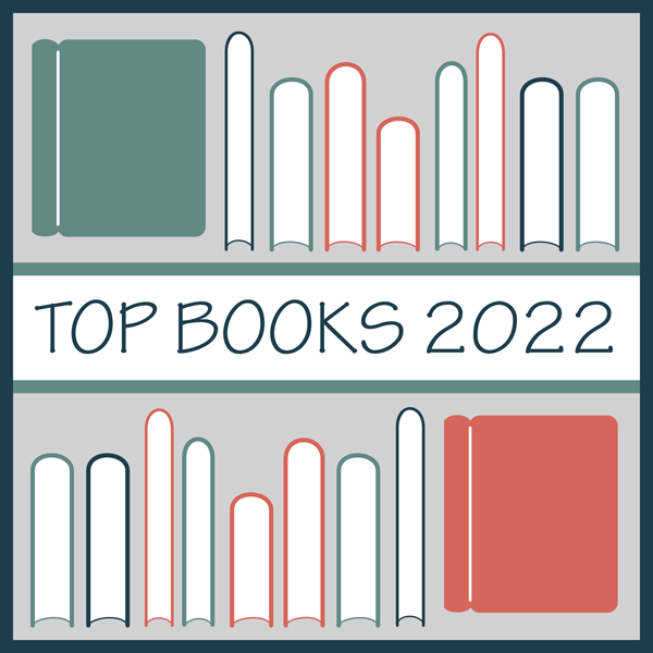
Mixing things up a little bit today with a (hopefully) fun post. A leisure activity that I really enjoy is reading. I have pretty eclectic tastes and I enjoy discovering new books to read. So I am sharing some favorites from the past year that might help someone else discover a new title! And because this is mainly a design and sewing blog, I decided to pair each book with a pattern design of mine that I think matches the book in some way. I am choosing to share my Top 3 favorite books I read this year (along with 2 honorable mentions) Why Top 3? I completed 27 books this year (number 28 will overlap into 2023) which is a decent number especially considering that a few were thick tomes (Including The Portrait of a Lady by Henry James which does NOT get a top spot). But as I reviewed the list a lot of them were just mediocre and I only wanted to share the best of the best. I hoping to have a better mix in 2023! I am also sharing 2 honorable mentions to help round out the list. So here they are in no particular order and spoiler FREE!

THE TOP 3

MIDDLEMARCH by George Elliot

I actually started this book in December 2021 but didn’t finish it until well into 2022 so I am counting it for this year’s list. This book is definitely a long and slow read, but it also took me a bit to finish because I chose to take breaks along the way and read a few other faster books. The novel is broken up into “books” which are not not stand alone stories but do provide good points to take a break if you need one. Obviously this book made my Top 3 so I think it is WORTH the time investment!

I had it in my mind to read something by George Elliot. After looking through the options, Middlemarch stood out as her “best”. I definitely think it deserves the “masterpiece” designation. This sweeping novel has a huge cast of characters and, if you can look beyond the sometimes heavy prose, the story is really good! This book is definitely hard to read. I read ebooks and sometimes I would have to look up several words PER PAGE! (Love that I can do that). And there is a lot of superfluous rambling that I think could have been streamlined. But I do think it is worth the effort!

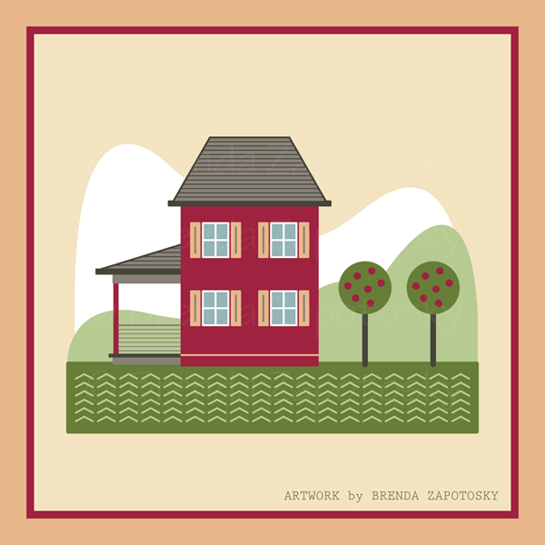
THE DESIGN: Little Cabins (Summer)

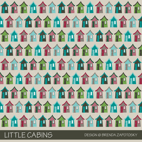
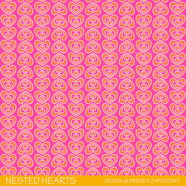
It is hard with a long book that covers so much to sum it up with a single design. I decided to go with my Little Cabins design in honor of my favorite character, Dorothea Brooke, who loved to draw “cottages” for the people who lived on the estate lands. These are pretty basic little dwellings in my design. Dorothea’s heart was so generous I am sure her designs were much more complex than these simple structures.

JAMAICA INN by Daphne Du Maurier

In total I have read 3 books by Du Maurier (not all this year), plus some but not all of the short story The Birds). 2 have been fantastic, 1 kind of disappointing. This year’s selection was Jamaica Inn and it definitely falls in the fantastic column! As I don’t want to give too much away I am not going to dive much into this one beyond saying that even I, who am very hard to surprise, did not expect all the twists! (Even though I did guess one of the big ones early on). I will say that if you want to go into this one completely blind DO NOT read the book blurb provided most places! It gives away a big plot point.

THE DESIGN: Landscape (Siesta)

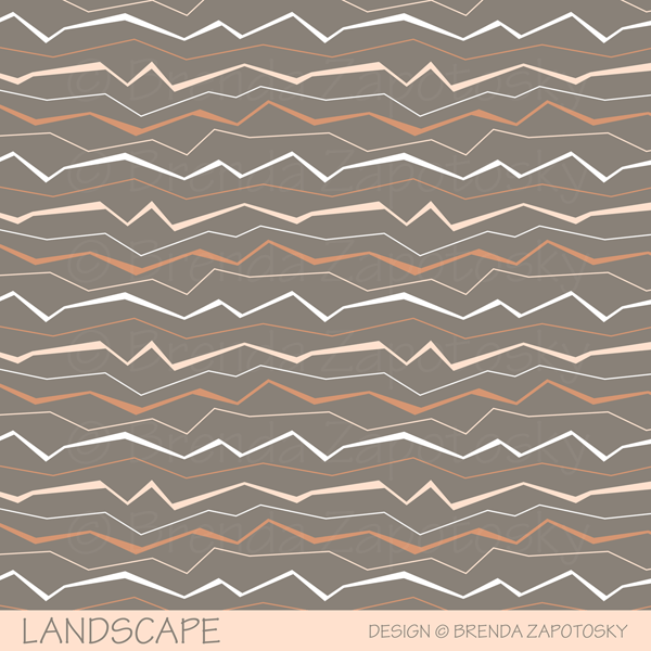
I chose my Landscape design in the Siesta colorway for this book since so much of the novel takes place on the moors of England it is almost a character of its own! This design was created for my Canyon Collection which is dessert themed, but I think the abstract jagged lines fit the feel of the moors as well! And this colorway with taupe as the predominant color feels a bit more muted and misty.

A GENTLEMAN IN MOSCOW by Amor Towles

If I had to pick just one favorite book this would be it based on its perfect combination of wonderful story and readability. I love that this book feels like classic fiction without all the weighty prose of something like Middlemarch. This book tells the story of a (former) Count Rostov who is sentenced to live the rest of his days as a “prisoner” at the Metropol Hotel. If you like books with lots of action this is not the book for you. I would estimate that probably the first 25% of the book is merely setting up the life and “landscape” of Count Rostov. A fast paced plot is not what this book needs. That is not the reality of the main character’s fate. What this book does, and does well, is give you a look into the life of a truly likable character and by proximity a very colorful supporting cast. The book jumps along in time so you get a lot of (light) history on the way. And there is some excitement too! I loved this book so much, after I finished it I could have flipped to page one and started rereading it immediately! I am not sure I have ever felt that way about a book before.

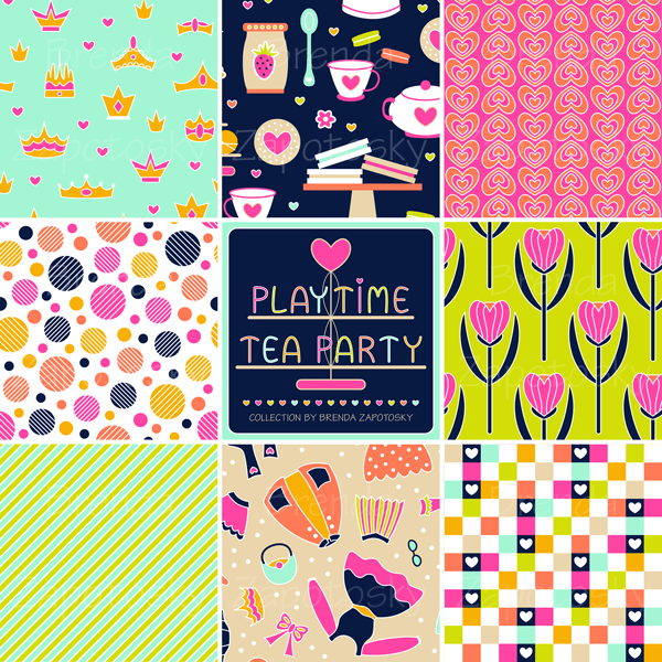
THE DESIGN: Playtime Tea Party (Dreamy)

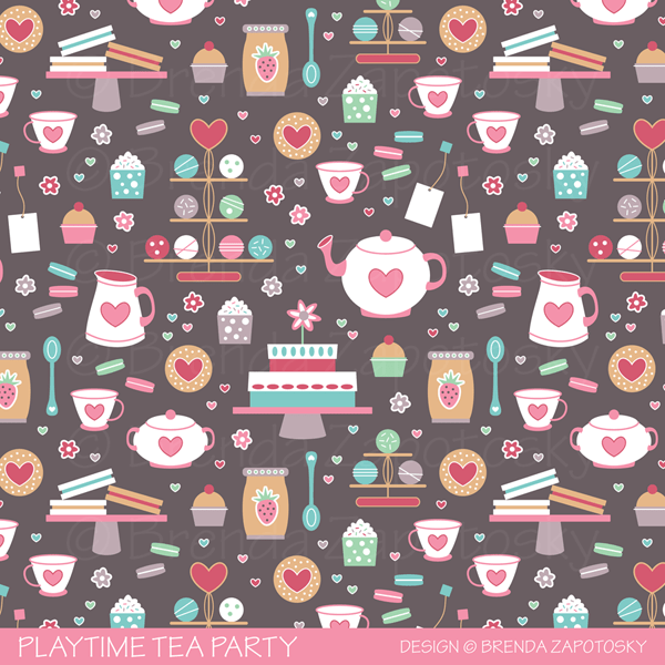
It was difficult to decide on a pattern for this book, especially when restricted to my current library of designs. Since food plays an important role throughout the book I chose a food themed design. And I picked Playtime Tea Party because it is “fancy food” in a sense and that DEFINITELY would appeal to the Count. Also, there is an almost tea party in the book. (No spoilers beyond that). Plus I like the playtime theme because the Count, while a charming, refined aristocrat, also reveals a playful side on more than one occasion!

HONORABLE MENTIONS

I decided to add a few other books to the list to round out the selections a bit. I enjoyed both of these. I wouldn’t rank them in the top favorites, but I would recommend them. And I chose them because they offer a different type of read for those who might not be interested in any of the books above!

THE MAGICIAN’S NEPHEW by C.S. Lewis

This was a reread for me as I have both read the book and listened to the audio book before (I am never sure if I should call that reading). The Magician’s Nephew is the (now) first book in The Chronicles of Narnia series. (I say now because I had a boxed set as a kid where this book was the last one. I think it was because that was the order in which they were written. But in terms of storytelling this tale is first chronologically.) I recommended the series to a family member and it motivated me to return to it myself. I only ended up reading this one book. It was fun to see what I remembered and what I didn’t. And of course it is great no matter how many times you read it! And for those of you unfamiliar with the series they are “kids” books. Younger than YA but I don’t know the technical term. I think at the library they are labelled J. So it is a fast and easy read!

THE DESIGN: Heart Trees (Sugar)

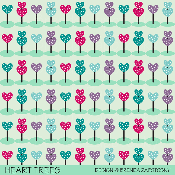
If I were to create a design from scratch inspired by this book I would come up with something very different. But when choosing from my existing library of designs I decided upon Heart Trees because a tree does play an important in the story and these heart shaped trees fit the fantasy theme of the novel!

HER ONE MISTAKE by Heidi Perks

This book was pretty good. Not a top favorite but I wanted to include it because it is from a popular genre: the modern thriller/celebrity book club pick/beach read type novel. I am not knocking this genre AT ALL! I love a good intense thriller that draws you in. A fast, fun read is a great type for the book rotation. And maybe I am just ultra picky. But so often I see a person share a book photo on social media and rave about it and I decide to pick it up and end up not liking it at all! One reason may be that I like PG-PG-13 books and too many of these would get a R rating if made into a movie. (Seriously why can’t book have ratings! I would love that!) But also maybe I just have weird tastes? So since I FINALLY read one of “these type” books that I enjoyed without any major objectionable content (that I can recall) so I thought it deserved a spot on the list!

THE DESIGN: Knock Down (Circus)

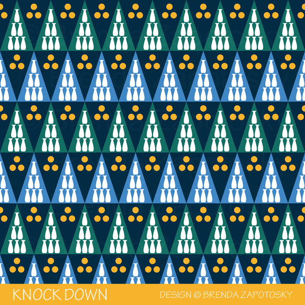
Not wanting even the design I pick to be any type of spoiler I chose my Knock Down design since the first main event of the book occurs at a school fair (which is mentioned right at the beginning of the book description).

THE END

I thought THE END was fitting way to wrap up this book themed post! I hope you enjoyed it and maybe found a new book to read. And if you DO read (or have already read) one of my suggestions I would love for you to leave a comment and let me know what you thought!

Until next time…

Thanks for reading,

Brenda

TUTORIAL: CUT AND SEW ORNAMENTS

Today I am sharing some basic steps to go along with the cut and sew ornament fat quarter design I have in my Spoonflower shop. While this post is intended to be a simple instruction set for anyone who purchases my design this process can really be applied to any sewn ornament you might want to make! (Simply cut some hexagons from some fabric in your stash and follow the steps!).

NOTE: The design you can purchase is only for FABRIC all additional materials you will need to obtain separately. This is not a kit.

THE FAT QUARTER

Here is a look at the design: ALPINE ORNAMENTS CUT AND SEW in the Classic colorway. The design is 21″ wide which will work on ALL fabric types, including Petal Cotton. If you purchase a wider fabric you may get a few extra ornaments from your cut! There are duplicates of every design giving you two options. You can buy just this fat quarter and make 10 two-sided ornaments OR you can pair this fat quarter with an additional fabric and get 20 ornaments. I have many coordinating patterns in my Alpine Classic Collection or you can use something from elsewhere. I used the STRIPE on the top left of the image below to back mine.

ADDITIONAL MATERIALS

OPTIONAL: 1/8″ Fusible Batting/Fleece: This will give your ornaments some structure and depth. You need enough to apply to ONE side of the ornaments. If you choose a heavier fabric you could skip it but with one of the quilting cottons you will want it.

Ribbon: I made my hanging loops with 1/8″ satin ribbon you can buy by the spool from a craft store. The instructions will be based on this ribbon. You could choose a different size ribbon or even something more decorative or even do a short loop of thick thread and use a hook to hang them instead.

PREPARATIONS

Pre-wash your fabric.

Cut out all the hexagons from the fat quarter. If you are backing with coordinating fabric use those hexagons as your pattern pieces for the backings.

Cut 1 fusible fleece hexagon for each ornament 3/8″+ smaller on every side.

Fuse the fleece to each front piece of your ornament.

LEFT to RIGHT: Right sides sewn together leaving the top open. Trimmed seam allowances. Ornament turned right side out and pressed.

SEWING THE ORNAMENTS TOGETHER

For each ornament take one front piece fused with fleece and one backing and sew right sides together with a 3/8″ SA around 5 sides leaving the TOP side of the hexagon unsewn.

Trim those same 5 seams down to 1/8″. DO NOT trim the top. Clip corner points a little extra.

Turn your ornament right side out pushing out corners and sides to get a crisp shape. Press well.

Turn in the top edges 3/8″ and press seam

BEFORE and AFTER adding the ribbon.
Right photo shows the coordinating fabric I used which is sold separately.

ADD RIBBON LOOP AND FINISH

Cut a 8″ length of ribbon for each ornament.

Turn the ribbon into a loop with the ends overlapping approximately 1/2″

Insert the overlapped portion into the top of the ornament opening until the overlap is concealed. Be sure that your loop is centered and secure in place. I work one ornament at a time and hold it in place with my fingers and move it over to the machine to sew immediately.

Top stitch around the entire outline of the ornament starting and stopping on the top center where the ribbon is. This step will close the top opening, secure the loop and create a nice finished edge for your ornament!

DONE

That’s it! Your ornaments are complete! You can hang them as decorations or use them in another fun way! Here is a look at few that I completed.

ADDITIONAL “HELPS” and “HINTS”

Having made these ornaments many times I like to sew each step for all the ornaments until I get to the loop insertion. At that point I like to do one ornament at a time so that I don’t have to have them all held in place.

If you choose an alternate fabric to back the ornaments and are using the minimum fat quarter size you need I highly recommend first cutting the three horizontal strips (The ornaments are in three rows, each row is a different height). Next lay out ALL the ornaments for each strip and mark your cutting lines to ensure you don’t accidentally cut a little too wide and run out of fabric.

Happy Sewing!

Brenda

New Collection, New Collaboration

Happy February! Spring is around the corner and spring is in the air with a new collection that I am excited to share with you today that is actually a collection WITHIN a collection! Intrigued? Read on to learn all about this new collaboration!

Many months ago a group of us Spoonflower designers joined together to create a color cohesive collection for a Spring release. This is not the first time this group of designers has a created a group collection in this way but it IS my first time joining in the fun! We began by choosing a colorway. Designers were allowed to submit color palettes that we as a group then voted on. The winning colorway is very bright and bold (and a little out of my usual comfort zone to be honest). I do think it is quite lovely for spring!

Once we finalized the colors we moved on to the design phase! While technically this is our Spring Release Collection we did not have to create solely spring themed designs. Since these colors were so bold and playful (and slightly girly) I drew inspiration from my 6 year old niece and designs I thought she would love.. Some brand new and some a new color version of older designs (from several different collections). My collection is called PLAYTIME TEA PARTY!

Playtime Tea Party features whimsical prints inspired by imaginary tea parties and dress up fun! All my designs can be found together in one COLLECTION in my shop. I already have a second colorway in the works and an additional design which will be added to it over time. The designs can also be found in various collections elsewhere on Spoonflower where they are grouped with all the other designer’s patterns.

To keep the group collection to a manageable size and aide shoppers in finding great prints and coordinates there are actually 6 separate collections featuring our spring colors. The main collection features a wide range of design styles, basically we could submit up to 5 designs of anything we liked as long as they met the color guidelines. Here are the 5 designs of mine that you can find it the MAIN COLLECTION:

In addition to the main collection there are 5 sub-collections featuring popular coordinate categories: Basics, Blenders, Florals, Plaid, Checks

I have 3 designs in two of those categories. Two in BASICS

And then one in CHECKS

While not all styles will compliment each other, by designing in a color cohesive collection like this the number of options buyers have to mix and match greatly increases! I did not add any designs to the other collections (some of my designs could fit but I chose to put them in the main collection) but they are definitely worth checking out as they are filled with lovely designs! Here are the links:

BLENDERS

PLAID

FLORALS

I am very excited to be a part of these collections! There are a lot of really great designs. One thing I find very interesting, similar to when I have participated in a Spoonflower limited palette challenge, is how very different the colors can look when applied in different combos and ratios from different designers. For a collection that was limited in color… the spectrum of design differences is big! And really quite fun! Between the 6 sub-collections there are more than 1000 designs from 59 different designers… there should be a little something for everyone!

We are using the hashtag: #designerspr22 on all our social posts and designerspr22 as a search tag on Spoonflower in case you would like to follow along with everyone’s posts or see all the designs not divided by collection.

I will end this post with one final look at all of my designs in a collage together.

And as always… Thanks for reading!

Brenda

Autumn Artwork Showcase

Hello All! It has been quite a long time since I have written a new blog post. I never intended to take such a big break. Oops! We are long past welcoming in Autumn, but since it is my FAVORITE season I thought that before it exits I could dedicate a post to some of my Autumn Art!

My Spoonflower Shop has so many designs tagged Autumn and/or Fall I decided to dedicate an entire COLLECTION to the theme. These designs are gathered from many other Collections and do not all necessarily color coordinate with one another, their common bond is that they evoke the colors or images of Autumn.

One of the designs in that Collection and actually one of the very first patterns I ever uploaded to Spoonflower is my Pumpkins and Squash Design. This one I adapted from a note card I designed.

I also have a design that features only Pumpkins. I created this from an Illustration I did for the Alphabet Fruit and Veggie Challenge from a few years back. As you can see Geometric Pumpkins is VERY different in style. This is interesting to me. I think my signature style is definitely more refined now and while I don’t feel the need to make everything geometric I do tend to gravitate to that stylistic choice a lot. If I was going to choose a pattern that felt more “me” I would choose the geometric pumpkins…

I didn’t do a regular Art Challenge in 2021 (which is of course just one of the many reasons for the lack of blog posts) but I have done a few different ones in the past. You might recall the monthly architecture/house illustrations I did where I followed along with the seasons. I ended up with two fun Autumn themed illustrations in that batch:

I also had a year long Alphabet Animal Art Challenge. I did NOT have a turkey included in that Collection. But I eventually created one in the same style. I am not sure if an animal can really qualify as a seasonal species but if there was an autumn specific animal I think it would definitely have to be a turkey! I did two versions of this cute guy. The second time giving him more detail and some Thanksgiving garb!

I’ll end this post with a look at a few more patterns from the autumn colorway of my Kiku Garden Collection:

I hope you have enjoyed this little Autumn design tour! Do you have a favorite from this mix? Are you an Autumn lover too? As always feel free to drop a comment! And enjoy the season!

Brenda

Alphabet City Art Challenge: Year End Recap

Alphabet City Art Challenge Final Review by Brenda Zapotosky

It is time for the Year End Recap for the Alphabet CITY Art Challenge!  I’ll share my overall thoughts at the end.  But first let’s start by looking at the illustrations!

26 Alphabet City Illustrations by Brenda Zapotosky

What a great mix!  I love the variety in the group as a whole.  It is a great collection overall!

It is interesting seeing the variating and color distribution of the title stripes since I just sort of picked colors randomly as I went (Trying to use the three color options evening but not really paying attention to how the final mix would look).  When I created the Clock Tower I loved how title stripe was layered behind the clock tower (out of neccessity).  I hoped to have more boards like this but if never really worked out again.

One thing I love about the this group that wasn’t true with the previous two challenges is the consistancy of color!  I began with a set color palette already in place from my CITY Collection.  It was this Collection that also inspired the overall look and scale of the illustrations and I love that I now have many more buildings to add to all the existing ones I originally created for my Around the Town design:

Around the Town Promo by Brenda Zapotosky

There a large number of illustrations that do not incorporate with these because of scale, or view, or “levels” (like the subway).  But there are many that do.  When it worked, I was consistant with door height etc so that all the “regular” scale ones CAN work together.  In the course of the Challenge I did create a few street view illustrations here is a reminder of what they look like:

2 CITY Street Views by Brenda Zapotosky

It is impossible for me to pick a favorite out of the group or even a top 3.  Instead you can read about more about my thoughts on the groupings of illustrations in the 3 previous Recaps (linked at the end of this post).

Also part of the Challenge were the CITY Blocks I created for each letter.  Here is a look at them all together:

26 CITY Letter Blocks by Brenda Zapotosky

The look of these were inspried by the original CITY Collection Logo.  All letters are my own original font:

CITY Original Lettering by Brenda Zapotosky Online

I love this font overall and definitely plan on using it in the future.  I will probably need to do a few tweaks.  I did not like the “B” when I created it… and I still don’t!  But I never got around to editing it.

Unlike the previous challenges I have not created any new patterns or cards featuring these illustrations.  I do have a project planned for them AND the font!  A very exciting one in fact.  But it is something I am keeping secret for the moment.

FINAL THOUGHTS:

Overall I think this challenge was easier to execute than the others since architecture is already a strength of mine.  And I really enjoy drawing buildings and built spaces so it was mostly fun.  But having to stick to the alphabet was not always enjoyable. And of course there is the deadline of the 2 week time frame…

So for 2020 I have decided that there will not be an alphabet challenge.  While it is a great way to motivate me to create new art pieces on a regular basis, the alphabet component is too constraining.  Also… this has been an Instagram centered challenge and with all the algorythym changes the posts just aren’t getting much engagement.  This wouldn’t be such an issue if these posts were spread across multiple platforms.  But if the main place I am sharing the art isn’t showing the art to many people, then I am mostly just creating for myself.  With that in mind… I think my design time will be better spent elsewhere.

To those have been following along and liking etc for the past year (or longer) BIG THANKS!  To those just reading about this challenge here are the previous posts so you can catch up!

And that’s a wrap!  After 3 straight years of Alphabet Challenges I look forward to a change!  I hope you will follow along with me on Instagram as I share more new work this year (including a NEW, non-alphabet challenge I will be doing monthly).

THANKS for Reading!  And feel free to comment below.  I love hearing your thoughts!

Brenda

Alphabet City Art Challenge: S-Z

Alphabet City Art Challenge Blog Post S thru Z_CITY S thru Z

It is time for the 3rd (but not final) recap of the Alphabet City Art Challenge!  I have decided to dedicate a post to the last group of letters and then do a full year recap.  If this is your first time hearing about this Challenge you can read the Introduction Post and the First Recap and Second Recap to catch up!

As usual I will start with a look at all 8 illustrations that make up this group:

City Illustration Boxes S thru Z by Brenda Zapotosky
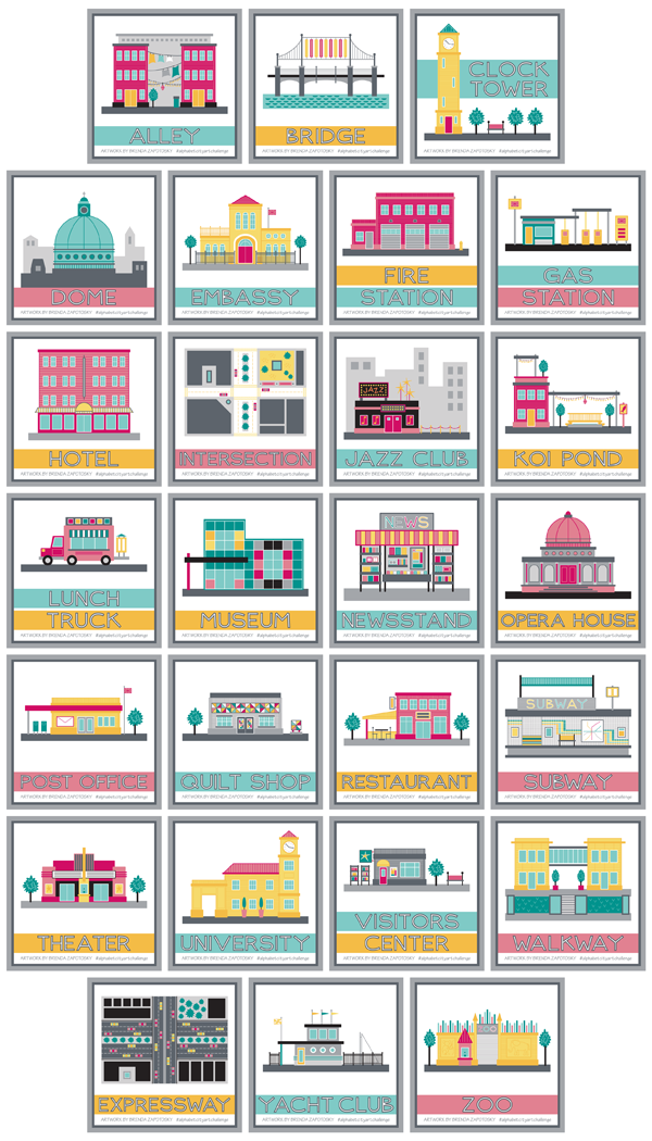
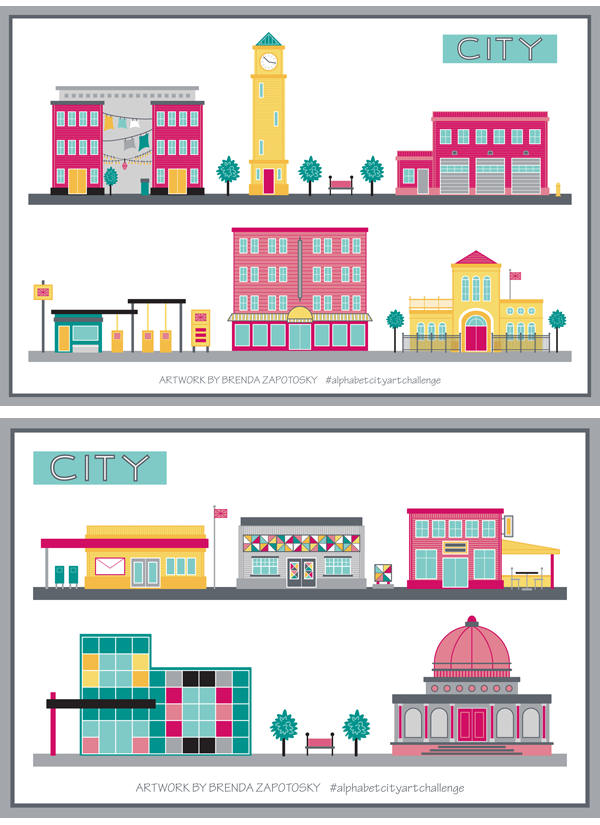
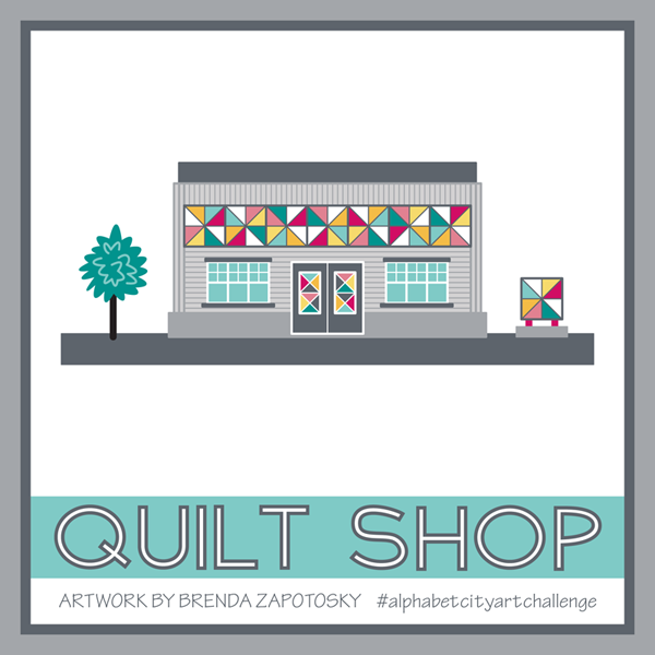
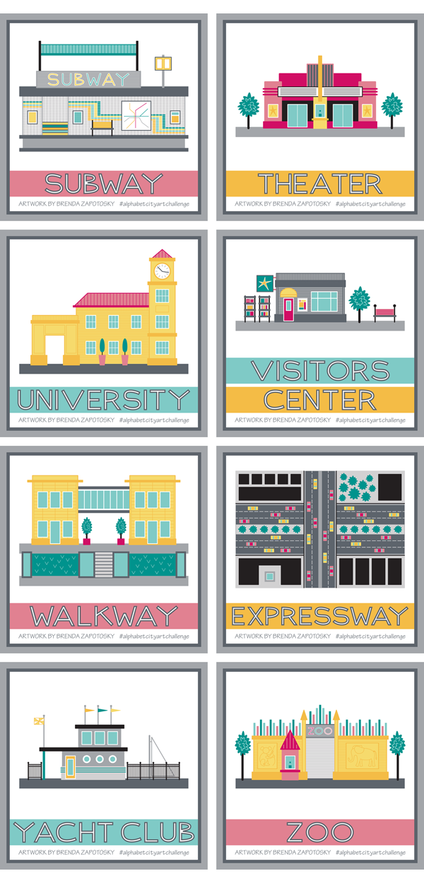
I want to note that I did change one illustration since posting it on IG.  I revised the Visitors Center which used to have a “TI” on its sign.  I thought “TI” was a universal term for tourist information, but it turns out it is not… So I switched it to a generic star.  Ha ha!  If you want to see the original you can find it HERE.

I am really happy with this group of illustrations.  Some of the more difficult letters are part of this batch and not only did I find something to draw for each letter, they aren’t just filling a slot, they are nice choices!

I did have to be creative with the letter “X”.  For that one I decided just to go with something that had a “X” in it.  And expressway sounds like it starts with “X”!  Good enough!  Actually it is one of my favorites of the group!

X is for Expressway by Brenda Zapotosky

It was nice to create an illustration in plan view and I just love the energy and activity of the cars.  Plus I love how bold the colors look, especially since it fills up so much of the presentation square!

Another favorite of mine is the Yacht club:

Y is for Yacht Club by Brenda Zapotosky

As a person who loves to sail and has a partiality for the nautical it makes sense that I like this one.  But also the colors and unique building design are things I like too.  Interestingly, the idea I had in my head for this one was very different.  Originally I was going to pick WHARF for the letter W.  I actually picked it way before I even reached W.  But as I got near the end I realized there were more options for W than Y and that a Yacht Club could be very similar to a Wharf.  I envisioned LOTS of boats docked (which for wharf would have worked well) but when it actually came to draw this one I was more drawn to the idea of a nautical themed building.  I did slip in one boat!  And as a disclaimer:  I know that the sail most likely would NOT be up when docked… I did it for the visual effect.  We can pretend they got caught in the rain and wanted to dry out the sail!

The subway is another favorite.  Again, it was nice drawing a different view, this time a cross section… one of my favorite construction views from back in my architecture days.

S is for Subway by Brenda Zapotosky

A lot of time was invested for all that detail too!

Finally I want to give a mention to a special detail for the Zoo.  When thinking of how I could illustrate a sprawling place like a Zoo I decided to focus on just the front entry.  To give it a unique Zoo look I decide to add some animal silhouettes!  To create these I started with a few animals from a previous challenge:  The 2017 Alphabet Animal Art Challenge.   Unfortunately, while I love the idea of a simple monochrome outline, especially when envisioning a real wall, they do not stand out as much as I would like.

Z is for Zoo by Brenda Zapotosky

I also wish I could have come up with a better way to depict the “zoo in the background” that you glimpse through the gate.  But I do like the color embellishments along the top of the wall and the ticket booth.

Overall I think this group was a strong finish to the challenge!

Finally, as with the rest of the Challenge I also created a letter block for each of the 8 letters in this batch.  Here is a look at them all together:

City Letter Boxes S thru Z by Brenda Zapotosky

Stay tuned for final recap that will discuss the entire years worth of illustrations!  Coming Soon!

Thanks for reading!

Brenda

Sewing: Handmade Ornaments

Checkered Christmas by Brenda Zapotosky Tree Ornaments

Today I am sharing with you an easy handmade Christmas gift idea that you can make with SCRAPS!  Yay!  Scrap busting ideas are always welcome to me!  Hopefully they are for you too!  And since you can use scraps, you could sew up a few of these in time for Christmas. (You could change up the batting if you don’t have it on hand).

This is sort of a simplified tutorial (my first ever!)  I’ll describe how I made these in a few short steps but no photos of the process.

But first:  The fabric!  The main fabric I used for these ornaments was one of my own designs:  Checkered Christmas, in both the Merry (top) and Festive (bottom) colorways.

Checkered Christmas Promo By Brenda Zapotosky
Checkered Christmas is part of my Classic Christmas Collection

I originally purchased this fabric for another Christmas gift project which you can read about in this POST.  The fabric type was Spoonflower’s Lightweight Cotton Twill (but you could used any woven type of fabric you’d like).  I paired it with some Forest Green Canvas in my stash.  I cut the main fabric at an angle to add a little visual interest and fused it with a layer of batting to give it some extra thickness.  The ribbon for the loops was also in my stash.  You could also use embroidery thread, yarn, or even a tiny loop of thread for an ornament hook to attach.

Checkered Christmas by Brenda Zapotosky Tree Ornaments 3

HOW TO:

Before diving in I want to say that these instructions are for a medium weight fabric like the Canvas Twill.  If you choose something lighter, like quilting cotton, you may want to interface pieces, add fusible batting to the trunk, or even have the batting on both pieces of the triangle.  You want to make sure there is a enough stability that they can hang nicely.

Step 1:  For each ornament CUT:  (2) Tree Top Triangles, (2) Tree Trunk Rectangles, and  (1) Fusible batting triangle approx 3/8″ smaller all around than the tree triangle. (See Diagram at the end of post for dimensions).

Step 2:  Fuse 1 side only of the tree top triangle with the batting. (You could skip this step or interface with non-batting instead.)

Step 3:  Sew tree trunk rectangles right sides together on 3 sides with a 1/4″ SA, leaving the top unsewn.  Clip corners, turn right side out and press well.

Step 4:  Sew tree top triangles right sides together with a 1/4″ SA, leaving an opening in the bottom center slightly wider than the finished outside dimensions of the tree trunk rectangle.  Clip corners, turn right side out and press well.

Step 5:  Insert the trunk into the bottom of the tree, unsewn side up approx. 1/4″  Secure with a pin, washable tape etc.

Step 6:  Add top attachment piece of your choosing.  For my trees I secured the ribbon loops to the top of the trees with a few hand sewn loops of thread.  I THINK I did this before sewing the tree opening closed so I could hide the knotted ends INSIDE the tree.

Step 7:  Top-stitch around entire tree outline with a 1/8″ SA (which will attach the trunk to the tree top).

And Voila!  Your simple ornament is finished!  Repeat steps 1-7 for as many as you’d like.  As you can see below I made A LOT of these!

Checkered Christmas by Brenda Zapotosky Tree Ornaments 2

I hope this tutorial was helpful.  If a step is unclear please let me know so I can clarify!

CUTTING DIAGRAM:

Tree Ornaments Cutting Information by Brenda Zapotosky

These are the approximate dimensions for my trees.  I made these for Christmas 2018 and the trunk might have been sized slightly differently.  I had hoped to have a pdf download of the “pattern” as part of this post.  (and may add it in the future).  For now, if you would like a printable copy of the pieces let me know and I can send them too you.

Thanks for much for reading!  If you make this and share online please be sure to tag me so I can see your creation!  On Instagram: @brendazapotosky

Merry Christmas!

Brenda


Alphabet City Art Challenge: J – R

Alphabet City Art Challenge Blog Post J thru R

It is time for the second recap for the Alphabet City Art Challenge.  This time I am sharing the illustrations I created for letters J thru R.  If you are new to learning about this art challenge you can read the original blog post HERE.  And you can find the first recap HERE.

Ok! Let’s start with a look at the 9 illustrations in this group:

City Illustration Boxes J thru R by Brenda Zapotosky


This is an interesting group.  There were some challenging letters in the mix, not only in terms of finding an appropriate city sight to illustrate (i.e. koi pond, quilt shop) but also in creating a building that could distinctly convey a certain sight without using specific branding (i.e. jazz club, post office, restaurant).  It would be an interesting to see if I had posted all of these illustrations without the titles if people would be able to name what they depicted.  Obviously the Jazz Club has the word JAZZ on it and the post office has an envelope so that would help. These features were added specifically to help convey their function.  I think the newsstand is probably the only one that is obviously apparent. (Even the lunch truck could be mistaken for an ice cream truck etc.)

N is for Newsstand by Brenda Zapotosky


The newsstand is one of my favorites of this batch too.  It was fun to create something other than a building and to create something at a scale big enough to show some detail.  I really enjoyed “filling the shelves” of this kiosk.

I also really like the Quilt Shop:

Q is for Quilt Shop by Brenda Zapotosky

I LOVE the quilted components I was able to incorporate and how their colors really pop in contrast to the gray building.

As I did with my first recap I put together a couple of “street views” so you could see the buildings interacting with one another.

CITY Street View 2 by Brenda Zapotosky

I really like seeing them in relationship to one another.  The modern Art Museum and classical Opera House don’t initially seem like an obvious pairing, but I think within the contest of an “Arts District” they could work!

I have also continued to post a letter block on the Monday of each new week period.  Here is the collection of letters J-R:

City Letter Boxes J thru R by Brenda Zapotosky

I really like seeing them all together in a grid like this.  Since it is difficult to continue to come up with new silhouettes, after the letter “M” I started over and reused the same blocks, but I mirrored them to give them a little variety and then made tweaks as needed to work well for the new letter.  So the letter “N” started with a mirrored version of the “A” block and so on.

And that wraps about another batch of alphabet city sights!  I anticipate a few challenges with the last batch of letters, but I already have at least one idea that I am super excited about!  Be sure to follow me on Instagram to see each illustration when they get posted.

And feel free to comment on this post!  I love hearing from my readers.

Thanks!

Brenda

Alphabet City Art Challenge: A-I

Alphabet City Art Challenge Blog Post A thru I

Time for the First Recap in the 2019 Alphabet City Art Challenge!  This year, I have decided to three recaps instead of four, so this first post will look at the illustrations I created for letters A thru I.  If you missed what the challenge is all about you can read the announcement blog post HERE.

Let’s start with a look at the 9 Illustrations I did for the first round, as they were presented as square, framed art.

City Illustration Boxes A thru I by Brenda Zapotosky

Overall I think this is a fun mix.  I have been intentionally switching up the colors so that there is a variety and looking at them all grouped together like this, I am very happy with the overall feel of the collection so far.  Whenever possible I have been keeping the scale of the buildings similar as well.  So, for example, for all the buildings with doors, all the doors are the same height. This was done so that I could easily combine them together in future compositions.  Just for fun, I arranged the buildings in two “street” views so you can see how they look.  (I had to change up the Gas Station colors a tad to make it work).

CITY Street View 1 by Brenda Zapotosky


As with past challenges, I did not “research” ahead of time if there would be a good pick for every letter.  I am mostly choosing each subject as I reach that letter (I did/do have some pre-picked ideas for a few of the letters).  Embassy was the biggest “surprise” so far, as it took me a while to come up with that idea (and I almost chose something else before it came to me).  It was one of the trickiest to create too, especially the curved entryway.

E is for Embassy by Brenda Zapotosky

My overall favorite is the Clock Tower.  It isn’t the most elaborate or even creative of the illustrations but I really love the overall feel of the composition.  The title for this one had to moved up to fit everything and I love how the building interacts with it.  Hopefully a few more illustrations down the line can also be arranged in a creative way.  Also… it makes me think of Italy.

C is for Clock Tower by Brenda Zapotosky

Somewhat surprisingly, the most “hearted” illustration so far has been the Gas Station.  Now I know that there are a lot of factors that can influence hearts, including when the artwork is posted and what hashtags it has…. So it could be that I just picked a “hot list” of hashtags.  Still, it is a pretty fun one.  Lots of little details.

G is for Gas Station by Brenda Zapotosky

So far I have not created any other art or patterns that incorporate any of these illustrations.  I already have the CITY COLLECTION in my Spoonflower Shop that features many city inspired designs, so I don’t have any specific plans to create more surface patterns.  As part of that collection, I have my Around the Town design that already includes many City buildings, which has added an extra challenge as I am trying to not repeat any of those and it includes many ubiquitous buildings.

That wraps it up for the illustrations, but I did want to talk about the letters/titles too.

I mixed things up this year and instead of using “A is for xxx” etc. to title my illustrations (like in past years) I chose to just put the word I was illustrating.  And the lettering for those words, is all original by me.  I like this clean look, but I do wonder if people who stumble upon the illustrations without knowing about the challenge miss out on the alphabet connection. Also new this year:  I have not been posting idea prompt lists.  Instead I have been simply posting the letter for the 2 weeks on their designated Mondays.  Here are the 9 posts so far:

City Letter Boxes A thru I by Brenda Zapotosky

I had already established the style of the letters with the CITY Collection title art, and I have been creating new letters as I have needed them (for either the letter prompts or in the illustration titles). The cityscape used also began with the CITY Collection title art, I have simply been mixing up the details for each letter.

Ok.  I think that covers everything. I hope you enjoyed this first recap.  If you aren’t already, be sure to Follow Me on Instagram to see each new Letter Prompt and Illustration as I post them.  And feel free to comment below!

Thanks for reading!

Brenda