New Collection, New Collaboration

Happy February! Spring is around the corner and spring is in the air with a new collection that I am excited to share with you today that is actually a collection WITHIN a collection! Intrigued? Read on to learn all about this new collaboration!

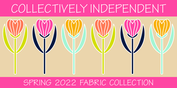
Many months ago a group of us Spoonflower designers joined together to create a color cohesive collection for a Spring release. This is not the first time this group of designers has a created a group collection in this way but it IS my first time joining in the fun! We began by choosing a colorway. Designers were allowed to submit color palettes that we as a group then voted on. The winning colorway is very bright and bold (and a little out of my usual comfort zone to be honest). I do think it is quite lovely for spring!

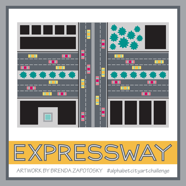
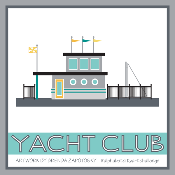
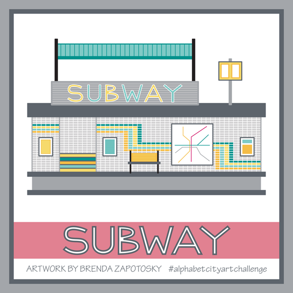
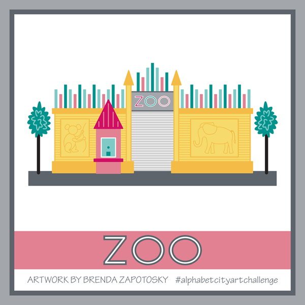
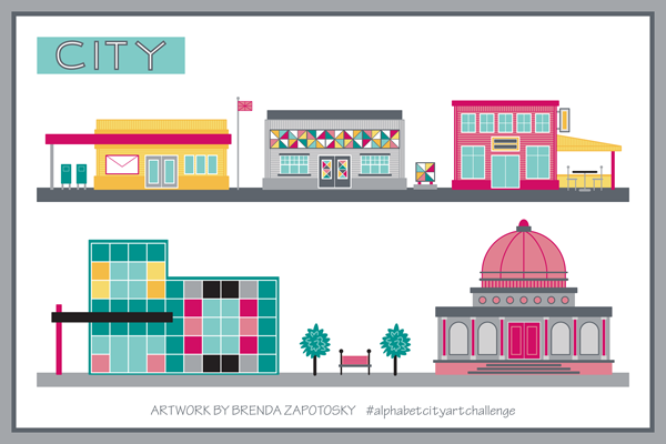
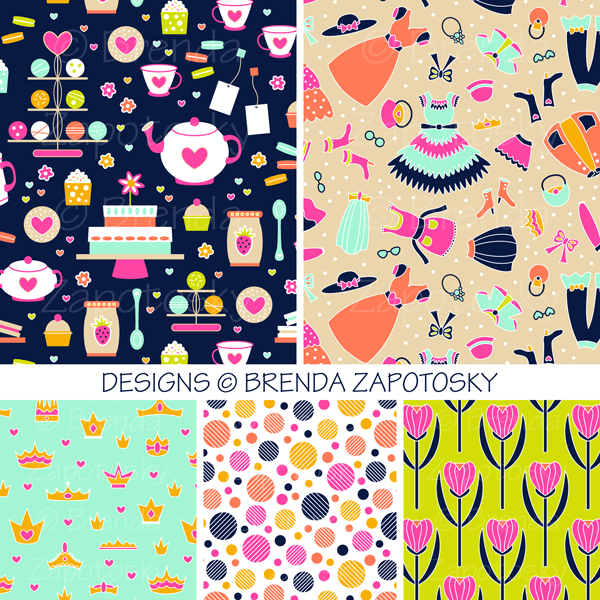
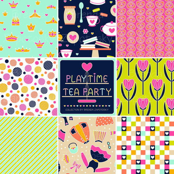
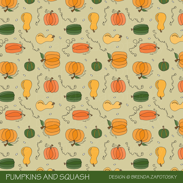
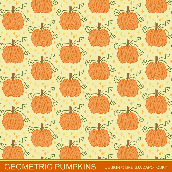
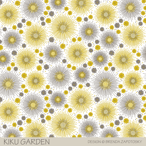
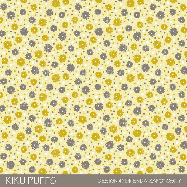
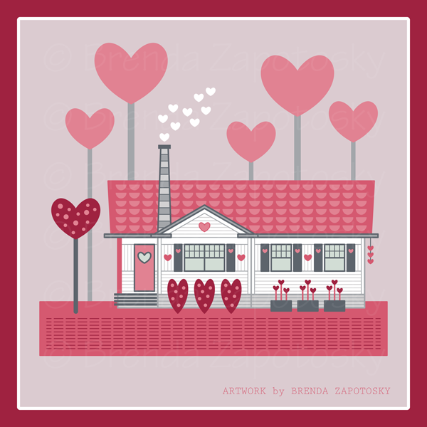
Once we finalized the colors we moved on to the design phase! While technically this is our Spring Release Collection we did not have to create solely spring themed designs. Since these colors were so bold and playful (and slightly girly) I drew inspiration from my 6 year old niece and designs I thought she would love.. Some brand new and some a new color version of older designs (from several different collections). My collection is called PLAYTIME TEA PARTY!

Playtime Tea Party features whimsical prints inspired by imaginary tea parties and dress up fun! All my designs can be found together in one COLLECTION in my shop. I already have a second colorway in the works and an additional design which will be added to it over time. The designs can also be found in various collections elsewhere on Spoonflower where they are grouped with all the other designer’s patterns.

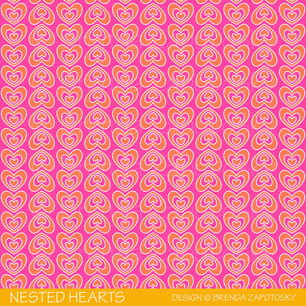
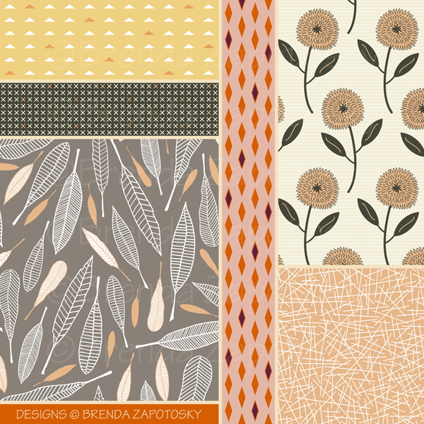
To keep the group collection to a manageable size and aide shoppers in finding great prints and coordinates there are actually 6 separate collections featuring our spring colors. The main collection features a wide range of design styles, basically we could submit up to 5 designs of anything we liked as long as they met the color guidelines. Here are the 5 designs of mine that you can find it the MAIN COLLECTION:

In addition to the main collection there are 5 sub-collections featuring popular coordinate categories: Basics, Blenders, Florals, Plaid, Checks

I have 3 designs in two of those categories. Two in BASICS

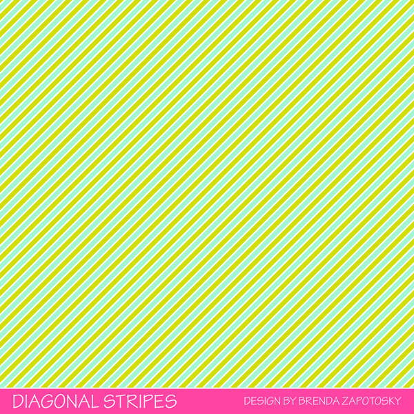
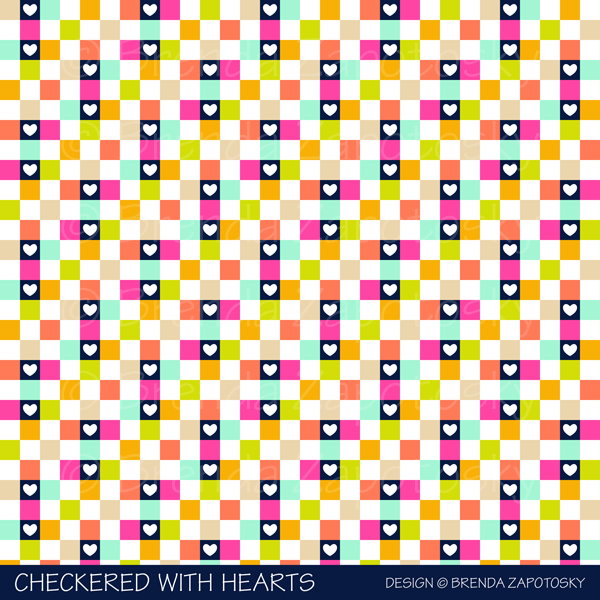
And then one in CHECKS

While not all styles will compliment each other, by designing in a color cohesive collection like this the number of options buyers have to mix and match greatly increases! I did not add any designs to the other collections (some of my designs could fit but I chose to put them in the main collection) but they are definitely worth checking out as they are filled with lovely designs! Here are the links:

BLENDERS

PLAID

FLORALS

I am very excited to be a part of these collections! There are a lot of really great designs. One thing I find very interesting, similar to when I have participated in a Spoonflower limited palette challenge, is how very different the colors can look when applied in different combos and ratios from different designers. For a collection that was limited in color… the spectrum of design differences is big! And really quite fun! Between the 6 sub-collections there are more than 1000 designs from 59 different designers… there should be a little something for everyone!

We are using the hashtag: #designerspr22 on all our social posts and designerspr22 as a search tag on Spoonflower in case you would like to follow along with everyone’s posts or see all the designs not divided by collection.

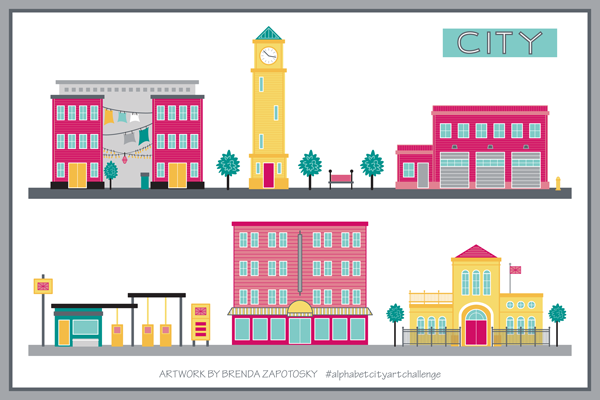
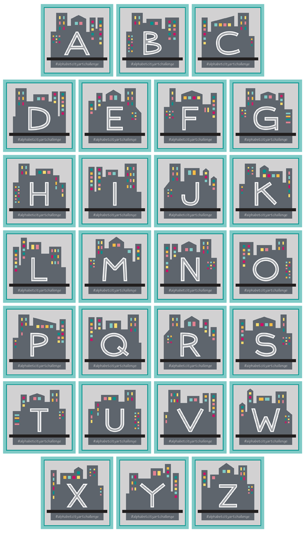
I will end this post with one final look at all of my designs in a collage together.

And as always… Thanks for reading!

Brenda

Autumn Artwork Showcase

Hello All! It has been quite a long time since I have written a new blog post. I never intended to take such a big break. Oops! We are long past welcoming in Autumn, but since it is my FAVORITE season I thought that before it exits I could dedicate a post to some of my Autumn Art!

My Spoonflower Shop has so many designs tagged Autumn and/or Fall I decided to dedicate an entire COLLECTION to the theme. These designs are gathered from many other Collections and do not all necessarily color coordinate with one another, their common bond is that they evoke the colors or images of Autumn.

One of the designs in that Collection and actually one of the very first patterns I ever uploaded to Spoonflower is my Pumpkins and Squash Design. This one I adapted from a note card I designed.

I also have a design that features only Pumpkins. I created this from an Illustration I did for the Alphabet Fruit and Veggie Challenge from a few years back. As you can see Geometric Pumpkins is VERY different in style. This is interesting to me. I think my signature style is definitely more refined now and while I don’t feel the need to make everything geometric I do tend to gravitate to that stylistic choice a lot. If I was going to choose a pattern that felt more “me” I would choose the geometric pumpkins…

I didn’t do a regular Art Challenge in 2021 (which is of course just one of the many reasons for the lack of blog posts) but I have done a few different ones in the past. You might recall the monthly architecture/house illustrations I did where I followed along with the seasons. I ended up with two fun Autumn themed illustrations in that batch:

I also had a year long Alphabet Animal Art Challenge. I did NOT have a turkey included in that Collection. But I eventually created one in the same style. I am not sure if an animal can really qualify as a seasonal species but if there was an autumn specific animal I think it would definitely have to be a turkey! I did two versions of this cute guy. The second time giving him more detail and some Thanksgiving garb!

I’ll end this post with a look at a few more patterns from the autumn colorway of my Kiku Garden Collection:

I hope you have enjoyed this little Autumn design tour! Do you have a favorite from this mix? Are you an Autumn lover too? As always feel free to drop a comment! And enjoy the season!

Brenda

A Home Filled with Crafting Memories

Happy Monday!

I am bringing you a new kind of post today… a bit more reflective than my usual posts.  But before I dive into sentimentality let me begin with a bit of background about this art piece I am sharing today.

Last November I joined  Bonnie Christine’s Flourish Design Tribe.  As part of the group we have the option of participating in a monthly challenge each with a new theme.  For my illustrations I have decided to focus on a house or other building as the main feature.  And I am trying to keep them seasonal as well (with the thought of maybe making a calendar with them when I am done).

I actually drew my first house for December 2019. And for January, I used row houses to illustrate my word for the year:  Knock.  Here is a little look at those illustrations:

December and January Houses Brenda Zapotosky

You can read more about each of them on their Instagram posts:  December and January

For February our theme was:  A Favorite Memory.  I found it hard to narrow down to a specific favorite memory (and still fit my architecture criteria), so instead I decided to focus on SOME great memories.  The theme of house/building was not too constraining this time since I can think of many fond memories from many, many buildings past and present.  I settled on my Grandparent’s house from my childhood because it held many great memories AND was great style inspiration for the Valentine’s themed house I knew I wanted to create.   I shared a brief description of the illustration on Instagram (and elsewhere).  But I wanted to expand on that here.  So first, here is my official description:

In keeping with my running theme of buildings/houses that are seasonal for each month, I chose to do a Valentine themed rendition of a home inspired by my paternal grandparent’s house which held a lot of fond memories for me. While there are several houses I could have chosen, I thought the base look of this one fit a “heart” cottage theme well. This is a great blend of my architecture and illustration selves with the high detailing of the house mixed with the playful whimsy of the Valentine elements.

This is a great succinct explanation but it fails to capture the nostalgia connected to this image for me. The memories themselves.  I could share the usual stories of holidays and sleepovers etc.  But I think what is uniquely fun about this house is the CRAFTING memories it holds.  My grandparents, for lack of better description, were crafters!  Multi-talented.  And going to their house often meant that we would get to create something!  Either with one of my grandparents or on our own just using their VAST “stash” of supplies…. usually scraps left over from one of their projects.

My grandfather was a carpenter. Half the basement was dedicated to his wood working shop and his amazing tools!  I learned to use a band saw in that basement.  I crafted (with assistance) a working marionette for a school project.  There were always little wood scraps galore that could be re-purposed.  And my grandfather’s ingenuity was as skilled as his hands!

My grandmother (granny) was the one I spent more time crafting with however.  She was crafty on so many levels!  Painting…  Gardening (and flower arranging)… etc etc Most especially, she was a master seamstress!  And so much of my early sewing memories involve her.  She had not one but TWO sewing spaces in the house!  An upstairs sewing room and extra room in the basement (which could be closed off from the sawdust of grandpa’s wood working).  That room has PILES and PILES of fabric!  Not so lovely as the Instagram worthy “stashes” of today… but then again, Instagram was not around back then.

She could sew it all:  Clothing, costumes, home decor of all kinds, toys, you name it!  I had quite a few doll clothes I requested that she make.  She could also knit, crochet, hand embroider… I think you get the picture.  I mostly watched.  As she sewed up the creations I requested and “designed”.  But she taught me to sew too.  And crochet.  And then after college I taught myself to knit, finally, which was news I was happy to share with her.

Both my grandparents have passed now.  But I have crafting mementos from both of them!  From grandpa a wooden pencil holder (the kind that has individual holes for each pencil/pen etc.) that he made me as a gift when I was a kid.  From granny, a whole bunch of knitting needles, some handmade items (including a SUPER awesome poodle skirt she made me, complete with a POODLE ON IT), random notions, some fabric… probably more.

As I have become an avid seamstress myself.  These sewing memories hold extra value to me now.  One of the items I made with fabric I got from granny are sewing pattern weights.  I love that a memento from her sits on my sewing table and are used all the time!  I also made my sister a set of the weights and a little bag to keep them in.  Here are hers:

Pattern Weights and Bag Sewing Project by Brenda Zapotosky

So back to the house illustration.  I said at the beginning that one of the reasons I chose this house is that the style fit my vision for the Valentine’s themed house.  But given how crafty my grandparents were, I think a re-imagined whimsical design of their house is very fitting!  A crafted version of a craft filled house!

February 2020 House Artwork by Brenda Zapotosky IG Grid

As I have mentioned many times in this space, my degrees are actually in Architecture and this illustration is a perfect amalgam of my architecture and illustrator sides!  I spent a great deal of time detailing out the architectural features.  And had so much fun infusing the house and landscaping with Valentine flair! The end result is an illustration that I love that just so happens to invoke memories when I look at it!  Double fun!

I was going to end with a photo of my grandparents but I can’t immediately find a digital one where my grandma has a nice smile.  And I can hear her voice in my head… she wouldn’t want the photo I did find attached to this post.  🙂  Ah memories….

Thanks, as always, for reading!

Brenda


Alphabet City Art Challenge: Year End Recap

Alphabet City Art Challenge Final Review by Brenda Zapotosky

It is time for the Year End Recap for the Alphabet CITY Art Challenge!  I’ll share my overall thoughts at the end.  But first let’s start by looking at the illustrations!

26 Alphabet City Illustrations by Brenda Zapotosky

What a great mix!  I love the variety in the group as a whole.  It is a great collection overall!

It is interesting seeing the variating and color distribution of the title stripes since I just sort of picked colors randomly as I went (Trying to use the three color options evening but not really paying attention to how the final mix would look).  When I created the Clock Tower I loved how title stripe was layered behind the clock tower (out of neccessity).  I hoped to have more boards like this but if never really worked out again.

One thing I love about the this group that wasn’t true with the previous two challenges is the consistancy of color!  I began with a set color palette already in place from my CITY Collection.  It was this Collection that also inspired the overall look and scale of the illustrations and I love that I now have many more buildings to add to all the existing ones I originally created for my Around the Town design:

Around the Town Promo by Brenda Zapotosky

There a large number of illustrations that do not incorporate with these because of scale, or view, or “levels” (like the subway).  But there are many that do.  When it worked, I was consistant with door height etc so that all the “regular” scale ones CAN work together.  In the course of the Challenge I did create a few street view illustrations here is a reminder of what they look like:

2 CITY Street Views by Brenda Zapotosky

It is impossible for me to pick a favorite out of the group or even a top 3.  Instead you can read about more about my thoughts on the groupings of illustrations in the 3 previous Recaps (linked at the end of this post).

Also part of the Challenge were the CITY Blocks I created for each letter.  Here is a look at them all together:

26 CITY Letter Blocks by Brenda Zapotosky

The look of these were inspried by the original CITY Collection Logo.  All letters are my own original font:

CITY Original Lettering by Brenda Zapotosky Online

I love this font overall and definitely plan on using it in the future.  I will probably need to do a few tweaks.  I did not like the “B” when I created it… and I still don’t!  But I never got around to editing it.

Unlike the previous challenges I have not created any new patterns or cards featuring these illustrations.  I do have a project planned for them AND the font!  A very exciting one in fact.  But it is something I am keeping secret for the moment.

FINAL THOUGHTS:

Overall I think this challenge was easier to execute than the others since architecture is already a strength of mine.  And I really enjoy drawing buildings and built spaces so it was mostly fun.  But having to stick to the alphabet was not always enjoyable. And of course there is the deadline of the 2 week time frame…

So for 2020 I have decided that there will not be an alphabet challenge.  While it is a great way to motivate me to create new art pieces on a regular basis, the alphabet component is too constraining.  Also… this has been an Instagram centered challenge and with all the algorythym changes the posts just aren’t getting much engagement.  This wouldn’t be such an issue if these posts were spread across multiple platforms.  But if the main place I am sharing the art isn’t showing the art to many people, then I am mostly just creating for myself.  With that in mind… I think my design time will be better spent elsewhere.

To those have been following along and liking etc for the past year (or longer) BIG THANKS!  To those just reading about this challenge here are the previous posts so you can catch up!

And that’s a wrap!  After 3 straight years of Alphabet Challenges I look forward to a change!  I hope you will follow along with me on Instagram as I share more new work this year (including a NEW, non-alphabet challenge I will be doing monthly).

THANKS for Reading!  And feel free to comment below.  I love hearing your thoughts!

Brenda

Alphabet City Art Challenge: S-Z

Alphabet City Art Challenge Blog Post S thru Z_CITY S thru Z

It is time for the 3rd (but not final) recap of the Alphabet City Art Challenge!  I have decided to dedicate a post to the last group of letters and then do a full year recap.  If this is your first time hearing about this Challenge you can read the Introduction Post and the First Recap and Second Recap to catch up!

As usual I will start with a look at all 8 illustrations that make up this group:

City Illustration Boxes S thru Z by Brenda Zapotosky
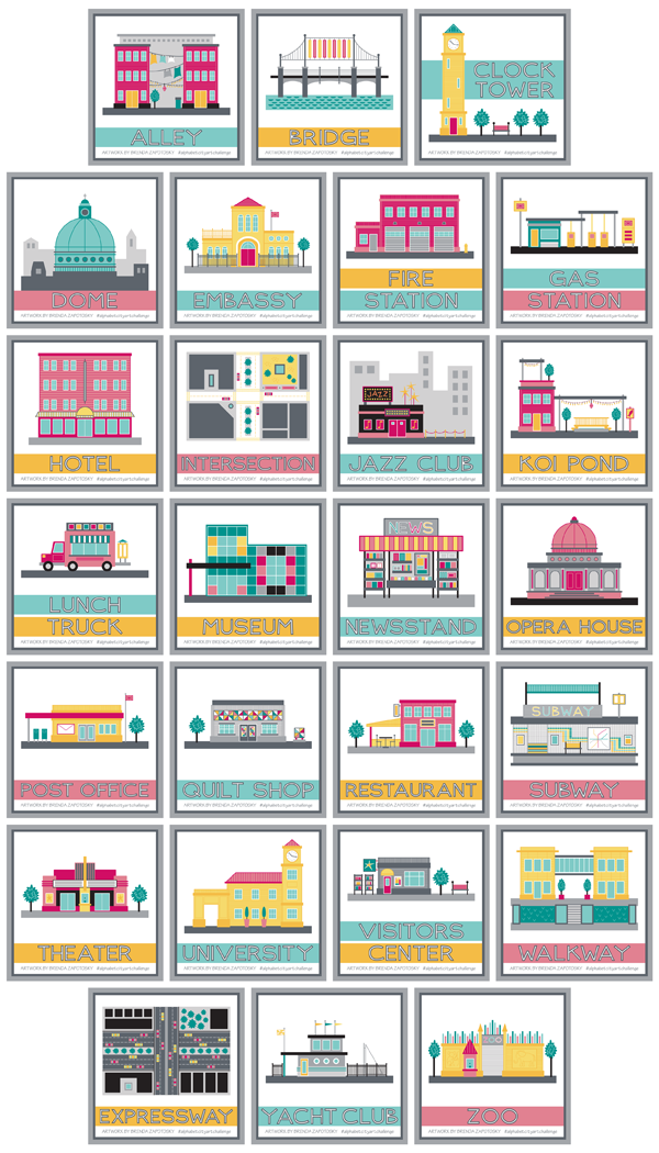
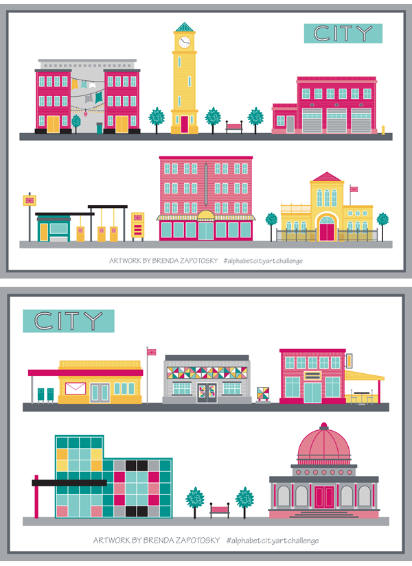
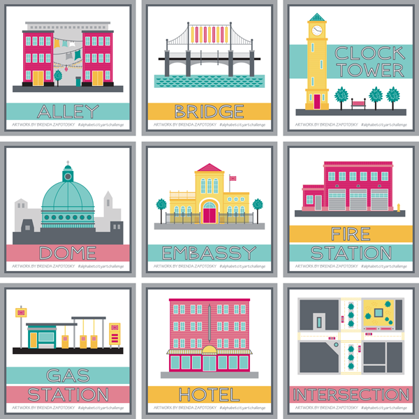
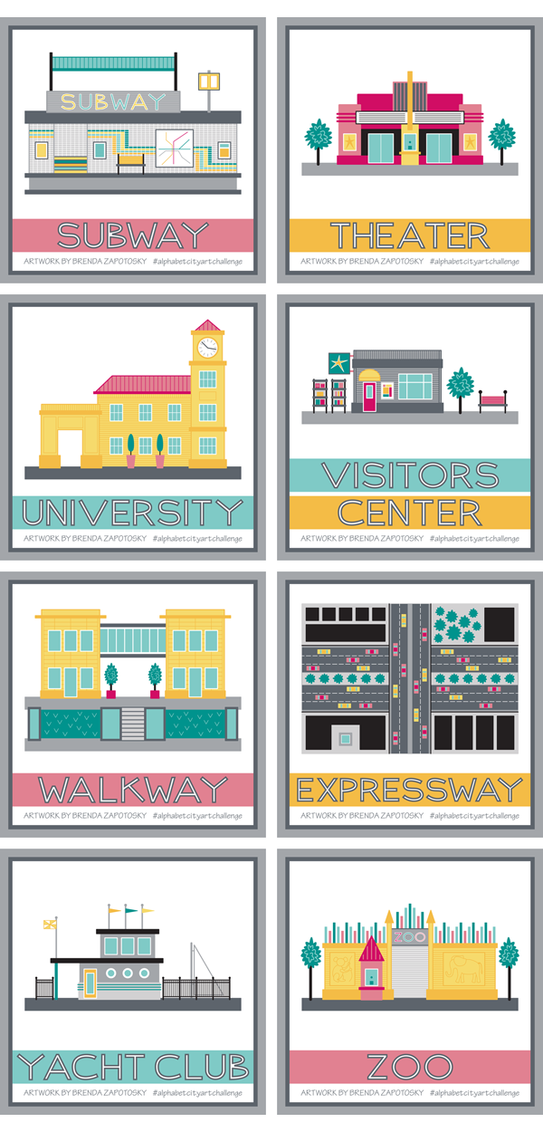
I want to note that I did change one illustration since posting it on IG.  I revised the Visitors Center which used to have a “TI” on its sign.  I thought “TI” was a universal term for tourist information, but it turns out it is not… So I switched it to a generic star.  Ha ha!  If you want to see the original you can find it HERE.

I am really happy with this group of illustrations.  Some of the more difficult letters are part of this batch and not only did I find something to draw for each letter, they aren’t just filling a slot, they are nice choices!

I did have to be creative with the letter “X”.  For that one I decided just to go with something that had a “X” in it.  And expressway sounds like it starts with “X”!  Good enough!  Actually it is one of my favorites of the group!

X is for Expressway by Brenda Zapotosky

It was nice to create an illustration in plan view and I just love the energy and activity of the cars.  Plus I love how bold the colors look, especially since it fills up so much of the presentation square!

Another favorite of mine is the Yacht club:

Y is for Yacht Club by Brenda Zapotosky

As a person who loves to sail and has a partiality for the nautical it makes sense that I like this one.  But also the colors and unique building design are things I like too.  Interestingly, the idea I had in my head for this one was very different.  Originally I was going to pick WHARF for the letter W.  I actually picked it way before I even reached W.  But as I got near the end I realized there were more options for W than Y and that a Yacht Club could be very similar to a Wharf.  I envisioned LOTS of boats docked (which for wharf would have worked well) but when it actually came to draw this one I was more drawn to the idea of a nautical themed building.  I did slip in one boat!  And as a disclaimer:  I know that the sail most likely would NOT be up when docked… I did it for the visual effect.  We can pretend they got caught in the rain and wanted to dry out the sail!

The subway is another favorite.  Again, it was nice drawing a different view, this time a cross section… one of my favorite construction views from back in my architecture days.

S is for Subway by Brenda Zapotosky

A lot of time was invested for all that detail too!

Finally I want to give a mention to a special detail for the Zoo.  When thinking of how I could illustrate a sprawling place like a Zoo I decided to focus on just the front entry.  To give it a unique Zoo look I decide to add some animal silhouettes!  To create these I started with a few animals from a previous challenge:  The 2017 Alphabet Animal Art Challenge.   Unfortunately, while I love the idea of a simple monochrome outline, especially when envisioning a real wall, they do not stand out as much as I would like.

Z is for Zoo by Brenda Zapotosky

I also wish I could have come up with a better way to depict the “zoo in the background” that you glimpse through the gate.  But I do like the color embellishments along the top of the wall and the ticket booth.

Overall I think this group was a strong finish to the challenge!

Finally, as with the rest of the Challenge I also created a letter block for each of the 8 letters in this batch.  Here is a look at them all together:

City Letter Boxes S thru Z by Brenda Zapotosky

Stay tuned for final recap that will discuss the entire years worth of illustrations!  Coming Soon!

Thanks for reading!

Brenda

Alphabet City Art Challenge: J – R

Alphabet City Art Challenge Blog Post J thru R

It is time for the second recap for the Alphabet City Art Challenge.  This time I am sharing the illustrations I created for letters J thru R.  If you are new to learning about this art challenge you can read the original blog post HERE.  And you can find the first recap HERE.

Ok! Let’s start with a look at the 9 illustrations in this group:

City Illustration Boxes J thru R by Brenda Zapotosky


This is an interesting group.  There were some challenging letters in the mix, not only in terms of finding an appropriate city sight to illustrate (i.e. koi pond, quilt shop) but also in creating a building that could distinctly convey a certain sight without using specific branding (i.e. jazz club, post office, restaurant).  It would be an interesting to see if I had posted all of these illustrations without the titles if people would be able to name what they depicted.  Obviously the Jazz Club has the word JAZZ on it and the post office has an envelope so that would help. These features were added specifically to help convey their function.  I think the newsstand is probably the only one that is obviously apparent. (Even the lunch truck could be mistaken for an ice cream truck etc.)

N is for Newsstand by Brenda Zapotosky


The newsstand is one of my favorites of this batch too.  It was fun to create something other than a building and to create something at a scale big enough to show some detail.  I really enjoyed “filling the shelves” of this kiosk.

I also really like the Quilt Shop:

Q is for Quilt Shop by Brenda Zapotosky

I LOVE the quilted components I was able to incorporate and how their colors really pop in contrast to the gray building.

As I did with my first recap I put together a couple of “street views” so you could see the buildings interacting with one another.

CITY Street View 2 by Brenda Zapotosky

I really like seeing them in relationship to one another.  The modern Art Museum and classical Opera House don’t initially seem like an obvious pairing, but I think within the contest of an “Arts District” they could work!

I have also continued to post a letter block on the Monday of each new week period.  Here is the collection of letters J-R:

City Letter Boxes J thru R by Brenda Zapotosky

I really like seeing them all together in a grid like this.  Since it is difficult to continue to come up with new silhouettes, after the letter “M” I started over and reused the same blocks, but I mirrored them to give them a little variety and then made tweaks as needed to work well for the new letter.  So the letter “N” started with a mirrored version of the “A” block and so on.

And that wraps about another batch of alphabet city sights!  I anticipate a few challenges with the last batch of letters, but I already have at least one idea that I am super excited about!  Be sure to follow me on Instagram to see each illustration when they get posted.

And feel free to comment on this post!  I love hearing from my readers.

Thanks!

Brenda

Alphabet City Art Challenge: A-I

Alphabet City Art Challenge Blog Post A thru I

Time for the First Recap in the 2019 Alphabet City Art Challenge!  This year, I have decided to three recaps instead of four, so this first post will look at the illustrations I created for letters A thru I.  If you missed what the challenge is all about you can read the announcement blog post HERE.

Let’s start with a look at the 9 Illustrations I did for the first round, as they were presented as square, framed art.

City Illustration Boxes A thru I by Brenda Zapotosky

Overall I think this is a fun mix.  I have been intentionally switching up the colors so that there is a variety and looking at them all grouped together like this, I am very happy with the overall feel of the collection so far.  Whenever possible I have been keeping the scale of the buildings similar as well.  So, for example, for all the buildings with doors, all the doors are the same height. This was done so that I could easily combine them together in future compositions.  Just for fun, I arranged the buildings in two “street” views so you can see how they look.  (I had to change up the Gas Station colors a tad to make it work).

CITY Street View 1 by Brenda Zapotosky


As with past challenges, I did not “research” ahead of time if there would be a good pick for every letter.  I am mostly choosing each subject as I reach that letter (I did/do have some pre-picked ideas for a few of the letters).  Embassy was the biggest “surprise” so far, as it took me a while to come up with that idea (and I almost chose something else before it came to me).  It was one of the trickiest to create too, especially the curved entryway.

E is for Embassy by Brenda Zapotosky

My overall favorite is the Clock Tower.  It isn’t the most elaborate or even creative of the illustrations but I really love the overall feel of the composition.  The title for this one had to moved up to fit everything and I love how the building interacts with it.  Hopefully a few more illustrations down the line can also be arranged in a creative way.  Also… it makes me think of Italy.

C is for Clock Tower by Brenda Zapotosky

Somewhat surprisingly, the most “hearted” illustration so far has been the Gas Station.  Now I know that there are a lot of factors that can influence hearts, including when the artwork is posted and what hashtags it has…. So it could be that I just picked a “hot list” of hashtags.  Still, it is a pretty fun one.  Lots of little details.

G is for Gas Station by Brenda Zapotosky

So far I have not created any other art or patterns that incorporate any of these illustrations.  I already have the CITY COLLECTION in my Spoonflower Shop that features many city inspired designs, so I don’t have any specific plans to create more surface patterns.  As part of that collection, I have my Around the Town design that already includes many City buildings, which has added an extra challenge as I am trying to not repeat any of those and it includes many ubiquitous buildings.

That wraps it up for the illustrations, but I did want to talk about the letters/titles too.

I mixed things up this year and instead of using “A is for xxx” etc. to title my illustrations (like in past years) I chose to just put the word I was illustrating.  And the lettering for those words, is all original by me.  I like this clean look, but I do wonder if people who stumble upon the illustrations without knowing about the challenge miss out on the alphabet connection. Also new this year:  I have not been posting idea prompt lists.  Instead I have been simply posting the letter for the 2 weeks on their designated Mondays.  Here are the 9 posts so far:

City Letter Boxes A thru I by Brenda Zapotosky

I had already established the style of the letters with the CITY Collection title art, and I have been creating new letters as I have needed them (for either the letter prompts or in the illustration titles). The cityscape used also began with the CITY Collection title art, I have simply been mixing up the details for each letter.

Ok.  I think that covers everything. I hope you enjoyed this first recap.  If you aren’t already, be sure to Follow Me on Instagram to see each new Letter Prompt and Illustration as I post them.  And feel free to comment below!

Thanks for reading!

Brenda


Artist Feature: 2018 Fruit and Veggie Art Challenge

Today we are back with the final installment in the 2018 Fruit and Veggie Art Challenge Series:  A special “Artist Feature” spotlighting the other two artists who participated in the challenge.  I am so thrilled to have had two others complete this challenge with me.  It was so interesting to see their picks for each letter (sometimes we were the same, others we were different). Their interpretations of the subjects themselves as well as the presentations were outstanding.  Two very talented gals here!

First up is Jill.  You can follow her at jillbyersdesign

Jill is a fellow designer on Spoonflower which was how we “met”.  Last year she started the Animal Art Challenge, but did not make it through to the end.  I am so delighted that this year she did!  Jill painted of all her subjects with oil on square canvases with a unique cropped view.  They make quite a stunning collection:

A-P

She painted these all from real life, which meant she was sometimes out of order due to availability.  This is the reason U hasn’t made it to the grid yet.  She posted a photo of ugli fruit which she now has. So it is coming soon!  Be sure to follow her to see it when it is finished.

I asked Jill to share a few thoughts about the challenge. Here is what she said:

I set a few rules for myself when I started this project. I wanted to have the actual fruit or vegetable in hand, I wanted all of the compositions to be square and cropped and I wanted them to be 8″x8″ oil on canvas. My self imposed rules were pretty easy to stick to. I really enjoyed creating the compositions and working with oils. Having the actual fruit/vegetable in hand proved to be a challenge though. Dragon Fruit, Kohlrabi, Quince and Ugli Fruit where not in season when it was time to paint those letters so I had to occasionally skip a letter and then go back to it.

I love so many of them but some of my favorites are the Avocados, Beets, Eggplant, Leeks, Mushrooms, Onion, Papaya, Quince, Radish, Xigua (Watermelon). I had so much fun painting the carrots that I painted two versions. I thought that I would maybe do that again with another letter but time never allowed for that.

There are only two that I would have done differently. I would like to redo the Nectarine composition and I wish that I had sliced the Watermelon Radish thinner so that the slices would have been more transparent.

It was a great year long project. When I look at them collectively, I can see how my painting style changed throughout the year. I feel like every time I pick up a paintbrush I learn something new and this project taught me a lot.

Here is a closer look at some of the favorites Jill mentioned above:

A

Jill has decided to take a break from the Alphabet Challenge this year.  While I understand (completing all 26 letters was definitely a great endeavor) she will be missed!

Next up is Anastasia.  You can follow her at:  al_donzza

Anastasia was new to the alphabet art challenge this year and I so delighted that she joined in!  She also used paints: watercolors.  Her loose, sketchy style is so stunning.  Sometimes they included text sometimes not.  Here is a look of a few of her favorite paintings.  It is a nice example of the variety of her presentations:

al 2 images

al 1 image

Anastasia was also kind enough to send me some thoughts.  English is not her first language so the following is not a direct quote (I did some editing per her request).  As a side note… I absolutely LOVE that she is from a totally different part of the world!!!  Super awesome how the online world can bring together artists from all over!  Language barriers don’t matter much in the visual world anyways!  Here is the essence of her thoughts:

It was a great pleasure to participate in this challenge.

Honestly, I’m not a REAL artist, as other participants, and it was a great lesson to me as I discovered that I have my own style. (However my works were very different: different materials and techniques).

I saw that other participants did have a distinct style, something that I did not think I had.   However, by the end I realized that I do have my own style!  That was exciting to realize.

And I saw a huge progress between my “A” and “Z”. A one year long exercise like this, is a time frame to see things like progress and style.

Such great observations, although I would have to disagree with her sentiment that she is not a REAL artist!  Perhaps she is not pursuing art professionally, but she is ABSOLUTELY a real artist, and a very good one too!

She sent me this look at a few of the paintings she framed:

al framed art

Anastasia IS participating in this year’s challenge:  The Alphabet City Art Challenge.  She has already posted for the first two letters and they are amazing!  You can follow the challenge hashtag to see everything that we (and hopefully others!) will be posting. It is not too late to join in!  You can even skip letter A if you don’t want to play catch up.

Well folks.  THAT is a wrap.  If you missed any of the Recaps for the 2018 Fruit and Veggie Art Challenge links to them all can be found at the end of this POST.

I hope you have enjoyed seeing the artwork in this series both of myself and others and that you continue to follow along in 2019 as we explore the CITY theme!

And one last THANK YOU to Jill and Anastasia for joining in last year and for sharing their incredible work!

Brenda

Fruit and Veggie Art Challenge: T-Z

Happy New Year friends!  January is going to be a busy time on my blog so get set for a flurry (relatively speaking) of posts! We begin with the “fourth quarter” recap of the 2018 Fruit and Veggie Art Challenge, letters T thru Z.  There will also be a final year end recap but I wanted to give some thoughts on the last batch of letters and illustrations before contemplating the year as a whole.

First a look at the 7 fruit/veg I created for the final quarter of the alphabet:

T thru Z Fruit and Veggies by Brenda Zapotosky

Overall I quite like this group.  Despite the fact that there were less options for many of these letters I was able to find something interesting to illustrate for each.  It is actually quite difficult to pick a favorite.  I will call it a tie between the Turnip and the Ulluco.

T is for Turnip by Brenda Zapotosky

Interestingly, I was hesitant to choose turnip since I drew radishes for R and I thought they might be too similar.  But it was an enjoyable challenge to determine the differences and make the turnip its own unique thing.  Here is a side by side view.  (PS: The identical frame colors was not planned!)

Radish and Turnip by Brenda Zapotosky

The letter U was one of the more challenging one in terms of choices, making my love for the finished illustration all the more sweeter!

U is for Ulluco by Brenda Zapotosky

I love the look of the vegetables; the colors used for them, the background and frame; and just the overall composition.  It is too bad this would probably not be very marketable as a pattern, etc.

Choosing a favorite is difficult but choosing a LEAST favorite is not!  Yam is the “winner” of that unfortunate prize.  To be honest, I think my geometric rendition is fairly good in terms of representation… I just don’t like it!  It sort of looks like a hairy rectangle to me!!!!  In real life they are sort of “hairy” so again… rather accurate. You will NOT be seeing a Yam pattern in my Spoonflower Shop!  Ha ha ha

Y is for Yam by Brenda Zapotosky

However, you probably WILL be seeing a Watermelon one!  I see the most potential with this one either alone or incorporated in a more elaborate print.  Perhaps something picnic themed.  I have nothing in the works yet… maybe closer to summertime.

W is for Watermelon by Brenda Zapotosky

That about wraps it up!  Overall I would say it was a strong finish to the year long challenge!  Up next will be the entire year recap.  In the meantime, in case you missed it, the 2019 Alphabet Art Challenge has officially begun.  The theme is CITY and you can read all about it HERE.

I hope you enjoyed this in-depth look at the final set.  Do you have a favorite?  I would LOVE to know which!

Thanks for reading!

Brenda