Artist Feature: 2018 Fruit and Veggie Art Challenge

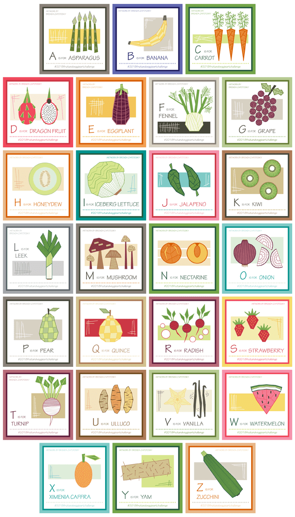
Today we are back with the final installment in the 2018 Fruit and Veggie Art Challenge Series:  A special “Artist Feature” spotlighting the other two artists who participated in the challenge.  I am so thrilled to have had two others complete this challenge with me.  It was so interesting to see their picks for each letter (sometimes we were the same, others we were different). Their interpretations of the subjects themselves as well as the presentations were outstanding.  Two very talented gals here!

First up is Jill.  You can follow her at jillbyersdesign

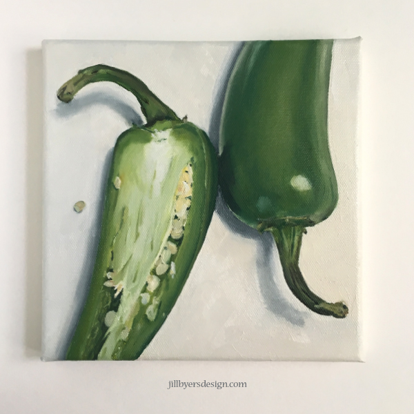
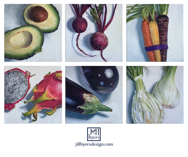
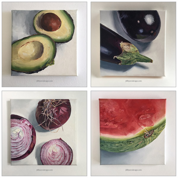
Jill is a fellow designer on Spoonflower which was how we “met”.  Last year she started the Animal Art Challenge, but did not make it through to the end.  I am so delighted that this year she did!  Jill painted of all her subjects with oil on square canvases with a unique cropped view.  They make quite a stunning collection:

A-P

She painted these all from real life, which meant she was sometimes out of order due to availability.  This is the reason U hasn’t made it to the grid yet.  She posted a photo of ugli fruit which she now has. So it is coming soon!  Be sure to follow her to see it when it is finished.

I asked Jill to share a few thoughts about the challenge. Here is what she said:

I set a few rules for myself when I started this project. I wanted to have the actual fruit or vegetable in hand, I wanted all of the compositions to be square and cropped and I wanted them to be 8″x8″ oil on canvas. My self imposed rules were pretty easy to stick to. I really enjoyed creating the compositions and working with oils. Having the actual fruit/vegetable in hand proved to be a challenge though. Dragon Fruit, Kohlrabi, Quince and Ugli Fruit where not in season when it was time to paint those letters so I had to occasionally skip a letter and then go back to it.

I love so many of them but some of my favorites are the Avocados, Beets, Eggplant, Leeks, Mushrooms, Onion, Papaya, Quince, Radish, Xigua (Watermelon). I had so much fun painting the carrots that I painted two versions. I thought that I would maybe do that again with another letter but time never allowed for that.

There are only two that I would have done differently. I would like to redo the Nectarine composition and I wish that I had sliced the Watermelon Radish thinner so that the slices would have been more transparent.

It was a great year long project. When I look at them collectively, I can see how my painting style changed throughout the year. I feel like every time I pick up a paintbrush I learn something new and this project taught me a lot.

Here is a closer look at some of the favorites Jill mentioned above:

A

Jill has decided to take a break from the Alphabet Challenge this year.  While I understand (completing all 26 letters was definitely a great endeavor) she will be missed!

Next up is Anastasia.  You can follow her at:  al_donzza

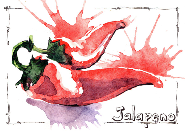
Anastasia was new to the alphabet art challenge this year and I so delighted that she joined in!  She also used paints: watercolors.  Her loose, sketchy style is so stunning.  Sometimes they included text sometimes not.  Here is a look of a few of her favorite paintings.  It is a nice example of the variety of her presentations:

al 2 images

al 1 image

Anastasia was also kind enough to send me some thoughts.  English is not her first language so the following is not a direct quote (I did some editing per her request).  As a side note… I absolutely LOVE that she is from a totally different part of the world!!!  Super awesome how the online world can bring together artists from all over!  Language barriers don’t matter much in the visual world anyways!  Here is the essence of her thoughts:

It was a great pleasure to participate in this challenge.

Honestly, I’m not a REAL artist, as other participants, and it was a great lesson to me as I discovered that I have my own style. (However my works were very different: different materials and techniques).

I saw that other participants did have a distinct style, something that I did not think I had.   However, by the end I realized that I do have my own style!  That was exciting to realize.

And I saw a huge progress between my “A” and “Z”. A one year long exercise like this, is a time frame to see things like progress and style.

Such great observations, although I would have to disagree with her sentiment that she is not a REAL artist!  Perhaps she is not pursuing art professionally, but she is ABSOLUTELY a real artist, and a very good one too!

She sent me this look at a few of the paintings she framed:

al framed art

Anastasia IS participating in this year’s challenge:  The Alphabet City Art Challenge.  She has already posted for the first two letters and they are amazing!  You can follow the challenge hashtag to see everything that we (and hopefully others!) will be posting. It is not too late to join in!  You can even skip letter A if you don’t want to play catch up.

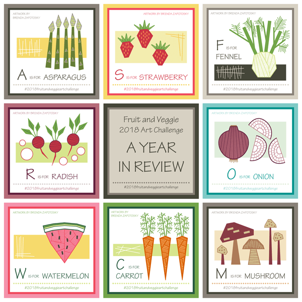
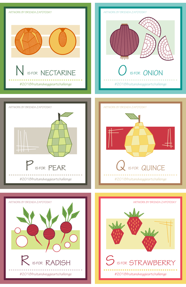
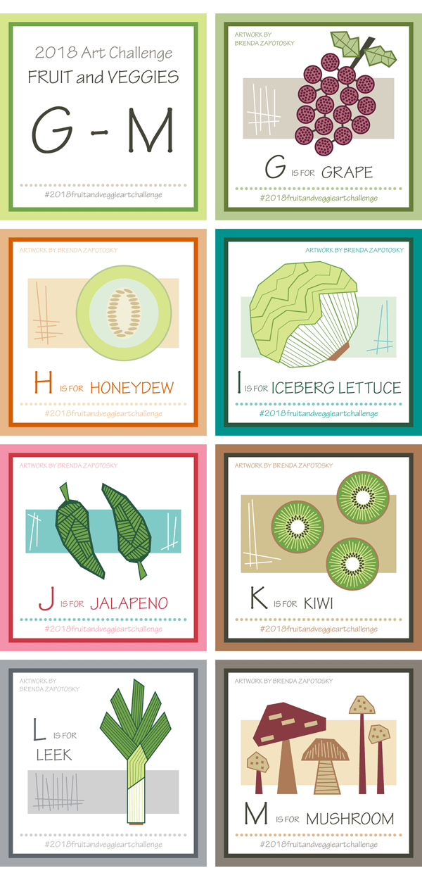
Well folks.  THAT is a wrap.  If you missed any of the Recaps for the 2018 Fruit and Veggie Art Challenge links to them all can be found at the end of this POST.

I hope you have enjoyed seeing the artwork in this series both of myself and others and that you continue to follow along in 2019 as we explore the CITY theme!

And one last THANK YOU to Jill and Anastasia for joining in last year and for sharing their incredible work!

Brenda

Fruit and Veggie Art Challenge: Year End Recap

alphabet art challenge 2018 final review by brenda zapotosky

Today I am bringing you the Year End Recap for the Fruit and Veggie Art Challenge and I am very excited to be wrapping things up!  Actually… this is sort of a Part 1 as I have a follow up post planned… but more on that at the end.  And if this the first time you are hearing about this challenge, you may want to read the orginal challenge announcement HERE.

Let’s begin with a look at all the fruit and veggies I illustrated this past year:

26 fruit and vegetable illustrations by brenda zapotosky

I think it is such a fun and colorful collection!  I love seeing them all together like this.  My design parameters for this challenge were to do a geometric interpretation of the fruit/veg which included simplifying shape lines, segmentation, and using hatch, dots etc. to create texture.  You may notice that all the boards also include a background rectangle(s).  This was not originally planned, but I added it for the asparagus to fill in the white space and liked it so much I decided to make it a standard feature for all the boards!  Overall, I am extremely happy with this collection as a whole.  I already shared favorites and other thoughts in my quarterly recaps so I won’t do that again.  If you missed any of those, they are all linked at the end of this post.

As with last year, one of the goals of this challenge, besides committing myself to creating new art on a regular basis, was to create a library of illustrations that could be used in other ways.  I would definitely consider this aspect a success.  I created three new patterns which incorporated one of more of the fruit/veg and have ideas for a few more in the future.  I have also had a request for a poster version that would include most of the illustrations. This will be similar to the animal art poster I did last year but smaller and probably without the words. You can see that poster in THIS post.

Two patterns I created featured just one illustration:  Geometric Carrots and Geometric Strawberries (which has two different colorways).

carrots and strawberries patterns by brenda zapotosky

I also created a pattern that uses many of the above fruit/veg along with some other ones not part of the alphabet collection.  Geometric Taco Bar was created for a Spoonflower contest.

Geometric Taco Bar Pattern by Brenda Zapotosky

All of these designs can be found as fabric, wallpaper and gift wrap for sale in my Spoonflower shop.  Along with several other geometric food designs from the past.  Here is a link to the entire Geometric Food Collection.

The other major component of this year long challenge was the Letter Prompt lists that I posted at the beginning of each fortnight.  These prompts included an original block letter and a list of fruit/veggie ideas that began with that letter.  Here are all 26 together:

26 fruit and vegetable letter lists by brenda zapotosky

I tried to include 7 options for each letter but as you can see that wasn’t always possible.  I enjoyed learning about different fruit/veg I had not heard of before. The font is an expansion of a slightly more simplified block font I had started a few years ago. (You can see an example of the letters on my Colorful Merry Christmas Text pattern.) I had been adding to it as needed so not all the letters were there. AND I modified the look of most of them and added all the hatching.  It was nice to create a font in increments like this. It made it much less tedious.  I am super happy with the alphabet as a whole:

stripey block font by brenda zapotosky

I definitely plan on making a repeating pattern with these letters.  And I am excited to play with lots of color variations!  Plus, now I have it to use for future projects!  WIN!

Overall I think I can call this year long challenge a success!  Admittedly, I wasn’t always enthusiastic to work on some of them.  And I was definitely happy to reach the end.  But looking back on the library of illustrations and letters I now have I am happy I did it!

And… so did two others!  Yup!  Two fellow artists followed along and completed *most* of the challenge!  Since their work is so different from my own and I knew this blog post would be long to begin with I have decided to give them their own Featured Artist Post. COMING SOON!  (I will link it once it is live).  You are definitely going to want to come back and see their beautiful creations!

And as mentioned above, in case you missed any of the previous posts about this challenge here are all the links:

EDITED:  The bonus Artist Feature post is now up!

Finally there IS a new challenge for this year!  We are still in the middle of letter A so if you feel inspired to join in you still can from the very beginning!  The theme is CITY and you can read all about it HERE. Or you just follow along with me!

Do you have a favorite?  Any fruit or veggie you would like to see as a pattern?  I would LOVE to hear from you in the comments!

Thanks for reading!

Brenda

Fruit and Veggie Art Challenge: T-Z

Happy New Year friends!  January is going to be a busy time on my blog so get set for a flurry (relatively speaking) of posts! We begin with the “fourth quarter” recap of the 2018 Fruit and Veggie Art Challenge, letters T thru Z.  There will also be a final year end recap but I wanted to give some thoughts on the last batch of letters and illustrations before contemplating the year as a whole.

First a look at the 7 fruit/veg I created for the final quarter of the alphabet:

T thru Z Fruit and Veggies by Brenda Zapotosky

Overall I quite like this group.  Despite the fact that there were less options for many of these letters I was able to find something interesting to illustrate for each.  It is actually quite difficult to pick a favorite.  I will call it a tie between the Turnip and the Ulluco.

T is for Turnip by Brenda Zapotosky

Interestingly, I was hesitant to choose turnip since I drew radishes for R and I thought they might be too similar.  But it was an enjoyable challenge to determine the differences and make the turnip its own unique thing.  Here is a side by side view.  (PS: The identical frame colors was not planned!)

Radish and Turnip by Brenda Zapotosky

The letter U was one of the more challenging one in terms of choices, making my love for the finished illustration all the more sweeter!

U is for Ulluco by Brenda Zapotosky

I love the look of the vegetables; the colors used for them, the background and frame; and just the overall composition.  It is too bad this would probably not be very marketable as a pattern, etc.

Choosing a favorite is difficult but choosing a LEAST favorite is not!  Yam is the “winner” of that unfortunate prize.  To be honest, I think my geometric rendition is fairly good in terms of representation… I just don’t like it!  It sort of looks like a hairy rectangle to me!!!!  In real life they are sort of “hairy” so again… rather accurate. You will NOT be seeing a Yam pattern in my Spoonflower Shop!  Ha ha ha

Y is for Yam by Brenda Zapotosky

However, you probably WILL be seeing a Watermelon one!  I see the most potential with this one either alone or incorporated in a more elaborate print.  Perhaps something picnic themed.  I have nothing in the works yet… maybe closer to summertime.

W is for Watermelon by Brenda Zapotosky

That about wraps it up!  Overall I would say it was a strong finish to the year long challenge!  Up next will be the entire year recap.  In the meantime, in case you missed it, the 2019 Alphabet Art Challenge has officially begun.  The theme is CITY and you can read all about it HERE.

I hope you enjoyed this in-depth look at the final set.  Do you have a favorite?  I would LOVE to know which!

Thanks for reading!

Brenda

Fruit and Veggie Art Challenge: N-S

It is time for the 3rd “Quarter” Recap for the 2018 Fruit and Veggie Art Challenge!  Letters N thru S were an interesting group and I am beginning to see some of the limitations of my “geometric” design criteria. Before I jump into my thoughts on this group let me share my 6 fruit and veggie creations for this portion of the challenge:

N thru S Fruit and Veggies by Brenda Zapotosky

Overall I really like this group.

You may notice that the pear and quince are quite similar.  This was completely intentional.  I thought since their shapes are so similar AND they are in season around the same time that it would be nice to have them “go” together.  While I already have a Geometric Apple pattern in my shop, I think I would like to do a new apple that matches the style of the pear and quince and create a pattern using all of them.

Also, I had an interesting creative process with a few of these.  I recently created a new pattern, Geometric Taco Bar, that includes a variety of fruit/veg, including both the onion and the radish.  The letter “O” fell during the time that I was making the pattern so it was created for both at the same time.  As for the radish, that was created for the pattern first, but I did not feel compelled to do another “R” fruit/veg when it arrived, so I simply composed a board featuring the Radish.

Geometric Taco Bar was created for a Spoonflower Design Challenge and is available in my shop!

Geometric Taco Bar Pattern by Brenda Zapotosky
Geometric Taco Bar is available as gift wrap, wallpaper, and fabric.

I also included both the Jalapeno and Iceberg Lettuce which were created earlier in the Challenge (adding in slices of each).  I love this pattern.

It is hard to pick a favorite in this group.  I am actually more prone to pick a least favorite:  The nectarine!  It is difficult to differentiate between the specific varieties of round fruits especially in the geometric style I have chosen.  I like the cut view of the nectarine better and do think it captures the essence pretty well.  This difficulty is one of the limitations I was referring to at the start of this post.  I am also finding that even in the “non-circle” fruit/veg that there are a lot of similar looking shapes.  For example, radishes, beets and turnips, when drawn in the geometric style are also hard to differentiate.  The same would hold true with leafy greens.  Hopefully enough unique shapes will present themselves as I complete the challenge.

One fun aspect of this group is that half of them have been included in surface patterns! The onion and radish are both part of the Geometric Taco bar design.  Additionally, I love the strawberry so much I already created a pattern for it!  This pattern will be added to my shop very soon. So that is 3/6.  And, as I have already mentioned, I hope to create a pattern using both the pear and quince together. One of my favorite aspect of this challenge is a library of illustrations to use in other applications.

Speaking of the strawberries, I wanted to share a look at the pattern!  I have ordered the swatches, so it will be in my shop soon.  But I do want to say it COULD CHANGE.  I often tweak designs after seeing them printed, so this is how it will tentatively look.

Geometric Strawberries Classic Pattern by Brenda Zapotosky

This is the Classic colorway.  I also created a Pinky colorway too! I’ll update this post when they are available in my shop.

And that’s a wrap!  Looking forward, I expect this final batch of letters to be challenging.  For the most part I do not look at the options for a letter until I make the prompt list, so there is a chance that I will be surprised, but I think the options for everything but “T” to be very limited.  Follow me on Instagram if you want to see each letter (and the prompts as I create them).

As always, thanks for reading!

Brenda


Fruit and Veggie Art Challenge: G-M

We have officially reached the 1/2 way point in this year’s Fruit and Vegetable themed Art Challenge!  It has been a fruitful (ha ha) challenge thus far, and even though the selection is a bit leaner than with the Animal themed challenge from last year, I have managed to find a good subject for every letter! But before we dive in to the works… If this is the first time learning about this challenge you can read more about it here.

OK!  Onto the good stuff! Let’s start with a look at the 7 fruit/veg I drew for this portion of the challenge:

G thru M Fruit and Veggies by Brenda Zapotosky

Overall I like this batch a lot.  I was able to find a good mix of round and non-round fruit/veg to draw and all of them are commonly known.  I think those are the two biggest challenges.  I love discovering new-to-me varieties of fruit and veggies when I put together the letter prompts, but since I am drawing these in the hopes of future uses, choosing more commonly known fruit/veg is the better choice.  Plus, since I am choosing to do geometric versions, having the fruit/veg already be known helps them remain recognizable.  The other challenge is that so many fruit/veg are ROUND… often they are more distinguishable cut than whole (like the honeydew) especially if I am doing stylized versions.  A geometric, minimal detail round fruit or veggie could end up looking like a solid oval or circle!

Interestingly my favorite of this batch is an “oval” fruit… the kiwi!  Here is a closer look:

K is for Kiwi by Brenda Zapotosky

Obviously I used a “cut” view to make it more interesting.  I love how with the geometric stylization a common fruit takes on a beautiful “abstract” look.  I am considering making a pattern with this one. I might not even make it a kiwi pattern!  I think with some re-coloring it could simply be a geometric design element!

Speaking of patterns.  I have not created any new repeating patterns (or any other art pieces) with any of these fruit/veg or ones from the first batch (my only “extra” so far is my Geometric Carrots design which I shared in the last recap).  This is partially because an opportunity has not yet occurred to give me a chance to do so (like a Spoonflower contest or a new card need).  But also, I think that patterns that incorporate multiple fruit/veg or have the fruit/veg combined with non-food elements, etc. will probably be the way that I will most likely use them.  I expect at the END of the challenge that I will take the new produce library as a whole and work them into a pattern(s).

COMMUNITY PARTICIPATION:

Another aspect of this challenge that I have been encouraging is participation from other artists.  You may recall that in my first recap I shared the work of Jill Byers.  I am happy to report that Jill has been continuing with the challenge and that there has been another artist, Al Donzza, who has joined and also been posting for every letter.  Since we all chose the Jalapeno for our “J” letter, I thought it would be fun to see all three together.  I absolutely love how different are our interpretations can be of the of the same subject.

First up is my jalapeno, which is obviously in keeping with my geometric theme.  I chose to hatch this one and I am quite happy with how it looks.  I did struggle with the composition of this art board though.  I think the jalapeno will work better in a repeating pattern, maybe with a few other variations thrown in.

J is for Jalapeno by Brenda Zapotosky

Next up is the gorgeous oil paint version by Jill Byers which is so drastically different from mine.  I love how Jill has chosen to compose all her canvases so that the subjects disappear off the sides of the canvas.  It adds a unique perspective which complements her realistic style and makes it more interesting!  You can see all of Jill’s paintings grouped together here.  It is an amazing collection!

Avocados
Jalapeno painting by Jill Byers

Next up is the work of Al Donzza who has also been doing paintings but in a totally different style and medium: Watercolors!  I love the vibrancy of Al’s work and the “action” worked into a usually static subject!  These red jalapenos really pop!

Al Donzza Jalapeno
Jalapeno painting by Al Donzza

I find it interesting that we all included two jalapenos in our compositions.  But that of course, is where the similarities end!

I hope you have enjoyed this review of the second quarter of Alphabet Illustrations.  If you have been thinking about joining in it is not too late!  I would love to have you take part!  I post a letter prompt every two weeks as a reminder of the start of the next letter and help get the creative juices flowing! And don’t forget to include the hashtag for the challenge with your posts:  #2018fruitandveggieartchallenge

Thanks for reading!

Brenda

Fruit and Veggie Art Challenge: A-F

It is here!  The first blog recap of the 2018 Fruit and Veggie Art Challenge!  6 letters and 12 weeks completed!  Wow.  This new theme has been quite fun and overall, for me at least, easier than the Alphabet Animal Art Challenge from last year. If this is the first time you are learning about the 2018 Alphabet Art Challenge I recommend reading this blog post first.

Also, a side note:  I have been struggling with what simple word to use when writing about my illustrations.  I have settled on the generic combo fruit/veg to try to make things as simple as possible 🙂

Let’s start with a look at the first 6 illustrations I created:

A thru F Fruit and Veggies by Brenda Zapotosky

4 Veggies and 2 Fruits so far.  As I shared in the original blog post for this year’s theme, in addition to the Alphabet Fruits and Veggies I am also giving them all a “geometric” flare.  I am absolutely loving this twist on the theme as it frees me from trying to exactly recreate the fruit/veg I have chosen and gives me a bit of creative flexibility.  It is quite fun to choose my fruit/veg then think through the best way to geometrically create it.  In addition to the fruit/veg itself each illustration has a rectangle and hatching as part of the composition.  I added this for the first item, asparagus, to fill in the blank space and liked it so much I decided to make it a standard element for all the illustrations.  I think my favorite illustration this round is the Fennel, it was such a perfect fit for my geometric style.  Here is a closer look:

F is for Fennel by Brenda Zapotosky

I also really like the carrot.  In fact, I have already made it into a repeating pattern and added it to my Spoonflower Shop!  I think this Geometric Carrots print would be especially fun for the kitchen!

Geometric Carrots Pattern by Brenda Zapotosky Outlined


I anticipate more patterns in the future and probably a few that incorporate more than one fruit/veg. Those will probably come closer to the end or after the challenge once I have an entire collection.

Probably the biggest challenge I have encountered so far is fitting the fruit/veg well on my template.  I really liked the framed square I used for the Alphabet Animal Art Challenge and definitely wanted to keep the square format for this year too, however, so far the fruit/vegs have been much more vertical than the animals. Had I thought of this before starting I might have tweaked the format of the squares.  This is another good reason to incorporate the background rectangles and sticks as they help to fill the space.

Like last year, I extended an invitation for other artists to join me in the challenge. Not sure if fruit/veg are less appealing than animals, or that others found it too difficulat to stick to a year long challenge, but participation is down from last year.  (Actually last year started strong and then eventually everyone except myself dropped out).  3 other artists started the year with me.  I wanted to give them a shout out because I loved that they joined in.  And since there are less options with fruit/veg there were often repeat picks which I think is quite fun.  You can see all our creations on Instagram via the hashtag for the challenge:  #2018fruitandveggieartchallenge.  You can also check out all of the artist’s individual feeds:  onecreativechameleon, deevlasak, and jillbyersdesign

Jill from jillbyersdesign is the only artist that has also completed every letter and I wanted to give her a special mention!  She is also using a consistent design style and I absolutely LOVE how her collection is coming together!!!  Her style is so different from mine which is super fun.  Painting is NOT my strength, but I have done it enough to really appreciate the gift in others.  Jill definitely has the gift.  Here are her first 6 fruit/veg paintings!

Jill Byers A-F

So gorgeous, right?  I highly recommend giving her a follow on Instagram.  You can also find more of her work on her website and in her own Spoonflower shop (which is how we “met” in the first place!)

Speaking of other participants… you could still join in if you wanted!  I think that the fruit/veg are so much faster to create you could easily catch up at this point.  Or simply start at the latest letter:  G!  I even create a prompt list for each letter to give you ideas.  Find the latest one here.

I think that about covers it all.  I would love to hear which fruit/veg is your favorite!  Or any other comments you may have 🙂

Thanks for reading!

Brenda

Announcing the 2018 Alphabet Art Challenge!!!

I super excited about this post and to share the theme for the 2018 Alphabet Art Challenge!  If you are new to this Challenge you can read all about the first one, The Alphabet ANIMAL Art Challenge, here. You can also read each of the quarterly updates here, here and here.

And so without further ado, and perhaps a little drumroll…. The 2018 theme is:

FRUITS AND VEGETABLES

Yay!!!!!!!!!!!!  (At least, I am hoping that is what you are thinking.)  I am very excited about this theme.  While the Animal theme was a great challenge to me personally, and I will be sharing a lot of thoughts about it all when I do the final recap of the year, I am looking forward to having a little bit simpler subject matter this time around.

The OFFICIAL name for this challenge will be the Fruit and Veggie Challenge, because that is more fun in my opinion, and makes for a shorter hashtag:  #2018fruitandveggieartchallenge

2018 Alphabet Art Challenge Announcement by Brenda Zapotosky

For this theme I have a very distinct vision for the style of the art I will be creating.  Since my days of doodle books, starting way back in college, I have LOVED hatching.  And one of the style methods I employ a lot in my artwork is creating “geometric” versions of common objects.  So for my fruits and vegetables this year, they will be geometric in style and employ hatching as part of the rendering.  I already created some patterns that use geometric fruits and vegetables, so I will be building upon that small library.  Here are a few examples (Which are available as fabric, wallpaper and gift wrap in my Spoonflower shop) :

Geometric Pumpkins by Brenda Zapotosky

Tropical Pineapples Pattern by Brenda Zapotosky

As an added “bonus” this year, I have also decided to create a new geometric font to go with my fruit and veggie illustrations, which will add an element of Art to the “Prompt” posts that I do at the beginning of each letter. (You can see examples of the prompts on my Instagram feed.)

Ok, so onto the official “rules” for this Challenge.  There are 52 weeks and 26 letters, so that means 1 letter for every 2 weeks.  Since 2018 starts on a Monday, that will be our starting day for each new letter.  So Monday, Jan. 1 will kick off the letter “A”.  On each Monday where a new letter begins I will post a reminder on Instagram with the letter for that 2-week period and some ideas of fruits and veggies to get you started.

Like last year, this is JUST FOR FUN!  There are not any prizes for participating.  Use any type of medium you like to create your art.  And if you are late to join in or miss a letter or 2, that is totally fine!  I would like to do an artist round up like I did for the first quarterly recap of 2017.  Sadly participation last year drastically tapered off after that first quarter, so the other recaps did not include other artist’s work.  I hoping that there will be more participation this year and I will able to share a bit more of other’s work.

So get your artistic thinking caps on and start mentally prepping for a year of Alphabet Art Fun!  I really hope you will consider joining me!

Brenda

ps.  If you are not already following me on Instagram, I highly recommend it.  It is where I will be posting all the prompts and fruit and veggie creations.