
It is time for the 3rd (but not final) recap of the Alphabet City Art Challenge! I have decided to dedicate a post to the last group of letters and then do a full year recap. If this is your first time hearing about this Challenge you can read the Introduction Post and the First Recap and Second Recap to catch up!
As usual I will start with a look at all 8 illustrations that make up this group:
 I want to note that I did change one illustration since posting it on IG. I revised the Visitors Center which used to have a “TI” on its sign. I thought “TI” was a universal term for tourist information, but it turns out it is not… So I switched it to a generic star. Ha ha! If you want to see the original you can find it HERE.
I am really happy with this group of illustrations. Some of the more difficult letters are part of this batch and not only did I find something to draw for each letter, they aren’t just filling a slot, they are nice choices!
I did have to be creative with the letter “X”. For that one I decided just to go with something that had a “X” in it. And expressway sounds like it starts with “X”! Good enough! Actually it is one of my favorites of the group!
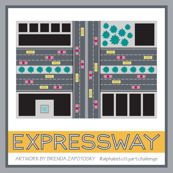
It was nice to create an illustration in plan view and I just love the energy and activity of the cars. Plus I love how bold the colors look, especially since it fills up so much of the presentation square!
Another favorite of mine is the Yacht club:
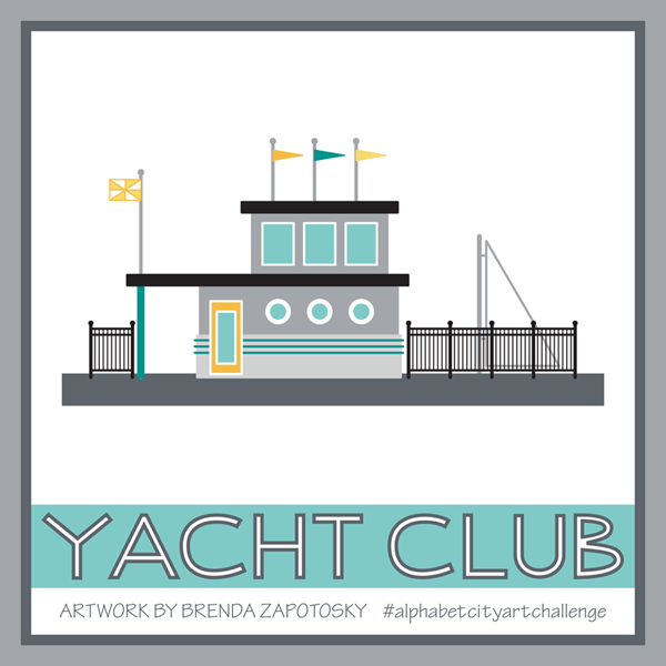
As a person who loves to sail and has a partiality for the nautical it makes sense that I like this one. But also the colors and unique building design are things I like too. Interestingly, the idea I had in my head for this one was very different. Originally I was going to pick WHARF for the letter W. I actually picked it way before I even reached W. But as I got near the end I realized there were more options for W than Y and that a Yacht Club could be very similar to a Wharf. I envisioned LOTS of boats docked (which for wharf would have worked well) but when it actually came to draw this one I was more drawn to the idea of a nautical themed building. I did slip in one boat! And as a disclaimer: I know that the sail most likely would NOT be up when docked… I did it for the visual effect. We can pretend they got caught in the rain and wanted to dry out the sail!
The subway is another favorite. Again, it was nice drawing a different view, this time a cross section… one of my favorite construction views from back in my architecture days.

A lot of time was invested for all that detail too!
Finally I want to give a mention to a special detail for the Zoo. When thinking of how I could illustrate a sprawling place like a Zoo I decided to focus on just the front entry. To give it a unique Zoo look I decide to add some animal silhouettes! To create these I started with a few animals from a previous challenge: The 2017 Alphabet Animal Art Challenge. Unfortunately, while I love the idea of a simple monochrome outline, especially when envisioning a real wall, they do not stand out as much as I would like.
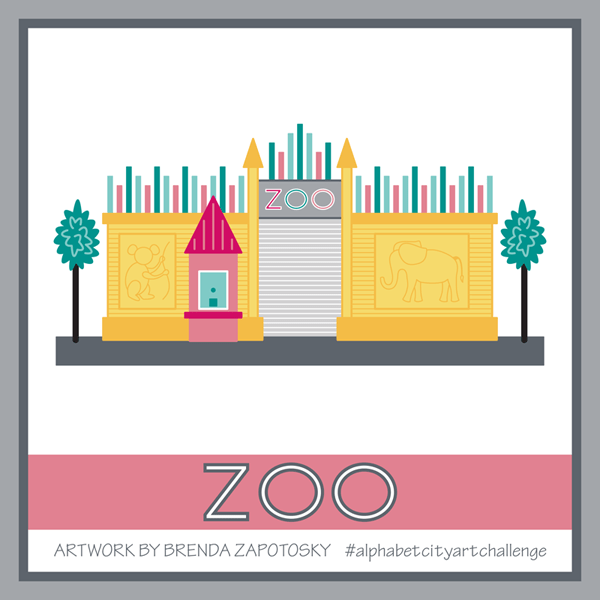
I also wish I could have come up with a better way to depict the “zoo in the background” that you glimpse through the gate. But I do like the color embellishments along the top of the wall and the ticket booth.
Overall I think this group was a strong finish to the challenge!
Finally, as with the rest of the Challenge I also created a letter block for each of the 8 letters in this batch. Here is a look at them all together:

Stay tuned for final recap that will discuss the entire years worth of illustrations! Coming Soon!
Thanks for reading!
Brenda

One thought on “Alphabet City Art Challenge: S-Z”