It is time for the second recap for the Alphabet City Art Challenge. This time I am sharing the illustrations I created for letters J thru R. If you are new to learning about this art challenge you can read the original blog post HERE. And you can find the first recap HERE.
Ok! Let’s start with a look at the 9 illustrations in this group:
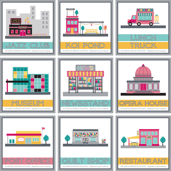
This is an interesting group. There were some challenging letters in the mix, not only in terms of finding an appropriate city sight to illustrate (i.e. koi pond, quilt shop) but also in creating a building that could distinctly convey a certain sight without using specific branding (i.e. jazz club, post office, restaurant). It would be an interesting to see if I had posted all of these illustrations without the titles if people would be able to name what they depicted. Obviously the Jazz Club has the word JAZZ on it and the post office has an envelope so that would help. These features were added specifically to help convey their function. I think the newsstand is probably the only one that is obviously apparent. (Even the lunch truck could be mistaken for an ice cream truck etc.)
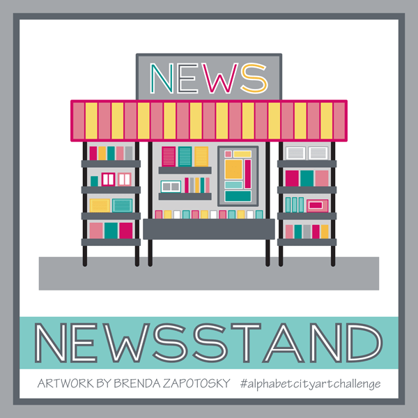
The newsstand is one of my favorites of this batch too. It was fun to create something other than a building and to create something at a scale big enough to show some detail. I really enjoyed “filling the shelves” of this kiosk.
I also really like the Quilt Shop:
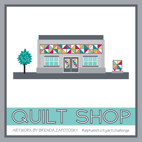
I LOVE the quilted components I was able to incorporate and how their colors really pop in contrast to the gray building.
As I did with my first recap I put together a couple of “street views” so you could see the buildings interacting with one another.
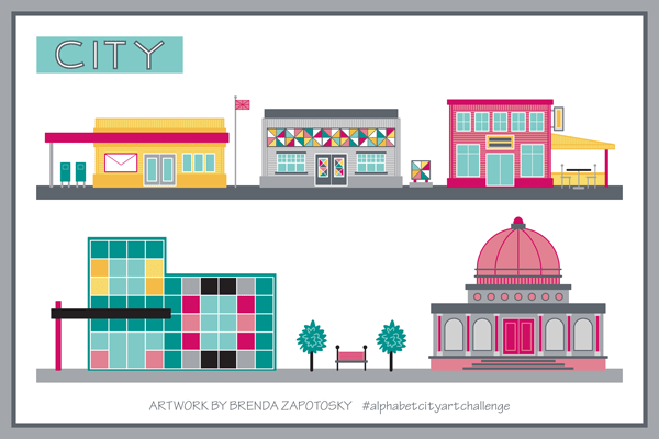
I really like seeing them in relationship to one another. The modern Art Museum and classical Opera House don’t initially seem like an obvious pairing, but I think within the contest of an “Arts District” they could work!
I have also continued to post a letter block on the Monday of each new week period. Here is the collection of letters J-R:
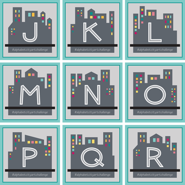
I really like seeing them all together in a grid like this. Since it is difficult to continue to come up with new silhouettes, after the letter “M” I started over and reused the same blocks, but I mirrored them to give them a little variety and then made tweaks as needed to work well for the new letter. So the letter “N” started with a mirrored version of the “A” block and so on.
And that wraps about another batch of alphabet city sights! I anticipate a few challenges with the last batch of letters, but I already have at least one idea that I am super excited about! Be sure to follow me on Instagram to see each illustration when they get posted.
And feel free to comment on this post! I love hearing from my readers.
Thanks!
Brenda
