
Time for the First Recap in the 2019 Alphabet City Art Challenge! This year, I have decided to three recaps instead of four, so this first post will look at the illustrations I created for letters A thru I. If you missed what the challenge is all about you can read the announcement blog post HERE.
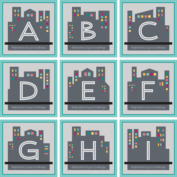
Let’s start with a look at the 9 Illustrations I did for the first round, as they were presented as square, framed art.
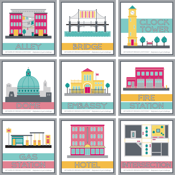
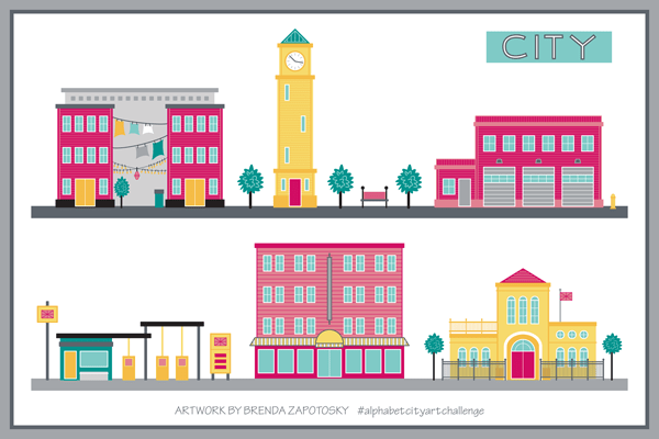
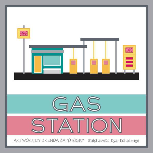
Overall I think this is a fun mix. I have been intentionally switching up the colors so that there is a variety and looking at them all grouped together like this, I am very happy with the overall feel of the collection so far. Whenever possible I have been keeping the scale of the buildings similar as well. So, for example, for all the buildings with doors, all the doors are the same height. This was done so that I could easily combine them together in future compositions. Just for fun, I arranged the buildings in two “street” views so you can see how they look. (I had to change up the Gas Station colors a tad to make it work).
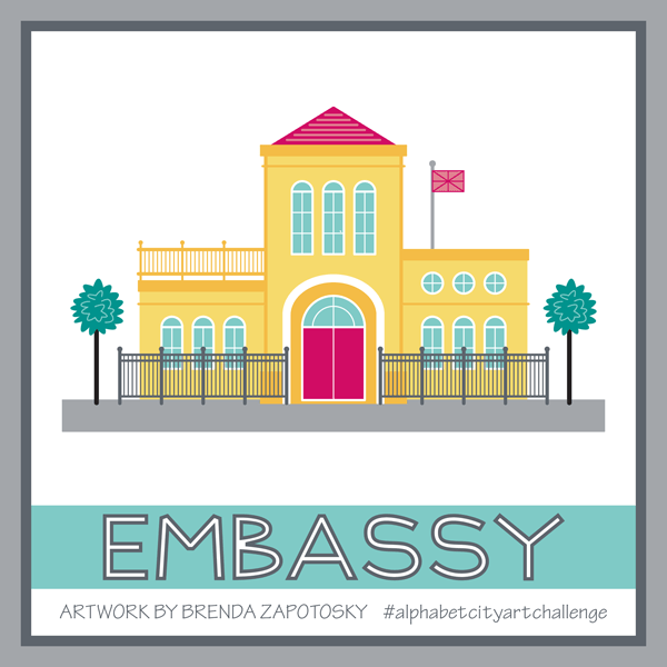
As with past challenges, I did not “research” ahead of time if there would be a good pick for every letter. I am mostly choosing each subject as I reach that letter (I did/do have some pre-picked ideas for a few of the letters). Embassy was the biggest “surprise” so far, as it took me a while to come up with that idea (and I almost chose something else before it came to me). It was one of the trickiest to create too, especially the curved entryway.
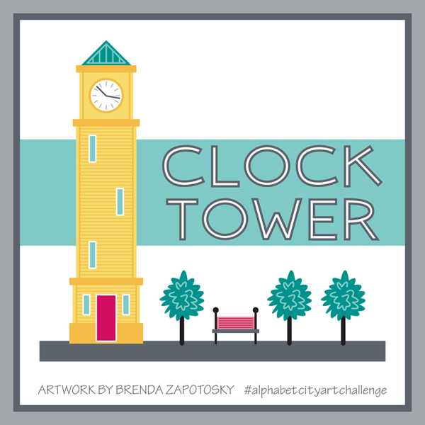
My overall favorite is the Clock Tower. It isn’t the most elaborate or even creative of the illustrations but I really love the overall feel of the composition. The title for this one had to moved up to fit everything and I love how the building interacts with it. Hopefully a few more illustrations down the line can also be arranged in a creative way. Also… it makes me think of Italy.
Somewhat surprisingly, the most “hearted” illustration so far has been the Gas Station. Now I know that there are a lot of factors that can influence hearts, including when the artwork is posted and what hashtags it has…. So it could be that I just picked a “hot list” of hashtags. Still, it is a pretty fun one. Lots of little details.
So far I have not created any other art or patterns that incorporate any of these illustrations. I already have the CITY COLLECTION in my Spoonflower Shop that features many city inspired designs, so I don’t have any specific plans to create more surface patterns. As part of that collection, I have my Around the Town design that already includes many City buildings, which has added an extra challenge as I am trying to not repeat any of those and it includes many ubiquitous buildings.
That wraps it up for the illustrations, but I did want to talk about the letters/titles too.
I mixed things up this year and instead of using “A is for xxx” etc. to title my illustrations (like in past years) I chose to just put the word I was illustrating. And the lettering for those words, is all original by me. I like this clean look, but I do wonder if people who stumble upon the illustrations without knowing about the challenge miss out on the alphabet connection. Also new this year: I have not been posting idea prompt lists. Instead I have been simply posting the letter for the 2 weeks on their designated Mondays. Here are the 9 posts so far:
I had already established the style of the letters with the CITY Collection title art, and I have been creating new letters as I have needed them (for either the letter prompts or in the illustration titles). The cityscape used also began with the CITY Collection title art, I have simply been mixing up the details for each letter.
Ok. I think that covers everything. I hope you enjoyed this first recap. If you aren’t already, be sure to Follow Me on Instagram to see each new Letter Prompt and Illustration as I post them. And feel free to comment below!
Thanks for reading!
Brenda

3 thoughts on “Alphabet City Art Challenge: A-I”