Alphabet City Art Challenge: Year End Recap

Alphabet City Art Challenge Final Review by Brenda Zapotosky

It is time for the Year End Recap for the Alphabet CITY Art Challenge!  I’ll share my overall thoughts at the end.  But first let’s start by looking at the illustrations!

26 Alphabet City Illustrations by Brenda Zapotosky

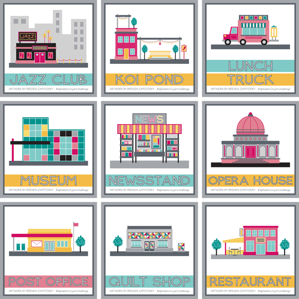
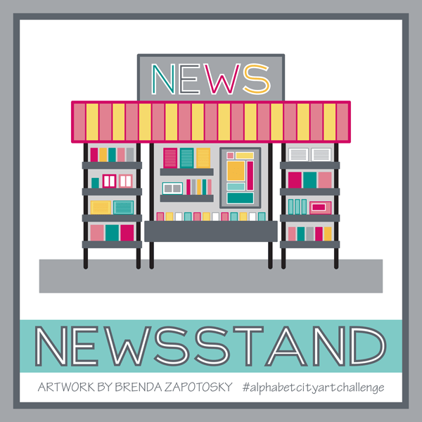
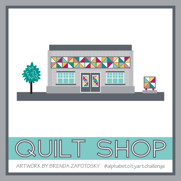
What a great mix!  I love the variety in the group as a whole.  It is a great collection overall!

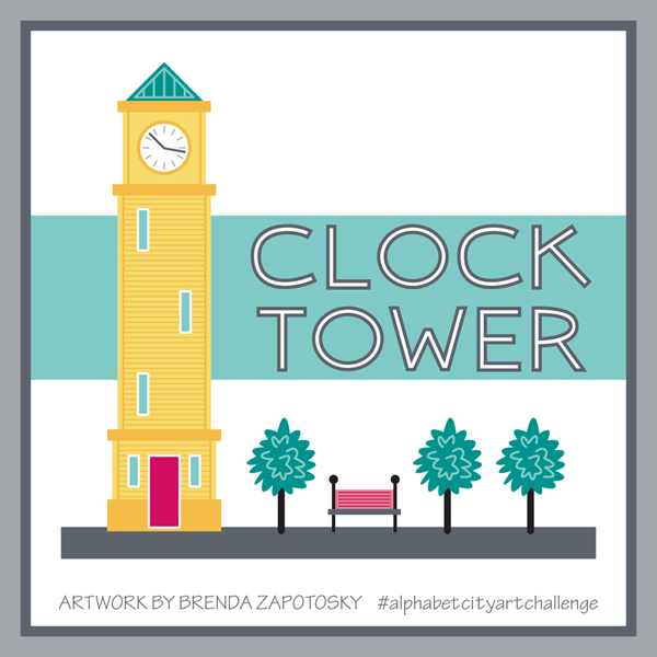
It is interesting seeing the variating and color distribution of the title stripes since I just sort of picked colors randomly as I went (Trying to use the three color options evening but not really paying attention to how the final mix would look).  When I created the Clock Tower I loved how title stripe was layered behind the clock tower (out of neccessity).  I hoped to have more boards like this but if never really worked out again.

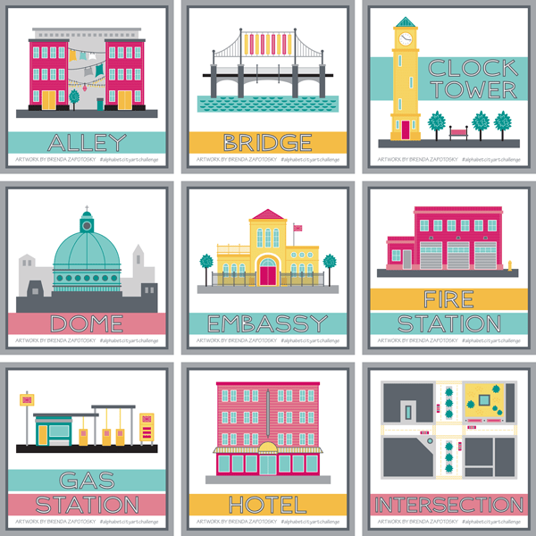
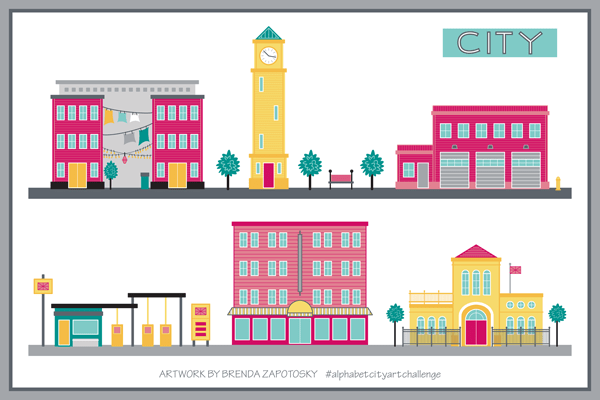
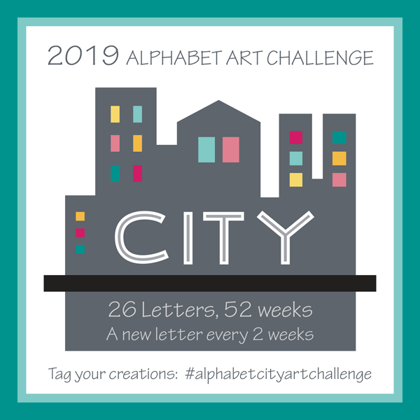
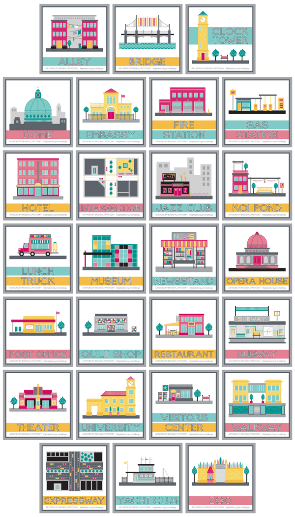
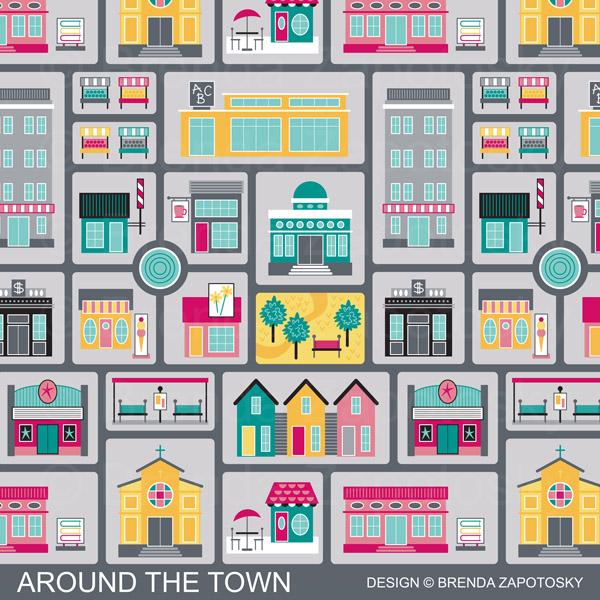
One thing I love about the this group that wasn’t true with the previous two challenges is the consistancy of color!  I began with a set color palette already in place from my CITY Collection.  It was this Collection that also inspired the overall look and scale of the illustrations and I love that I now have many more buildings to add to all the existing ones I originally created for my Around the Town design:

Around the Town Promo by Brenda Zapotosky

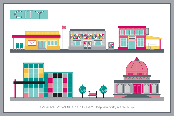
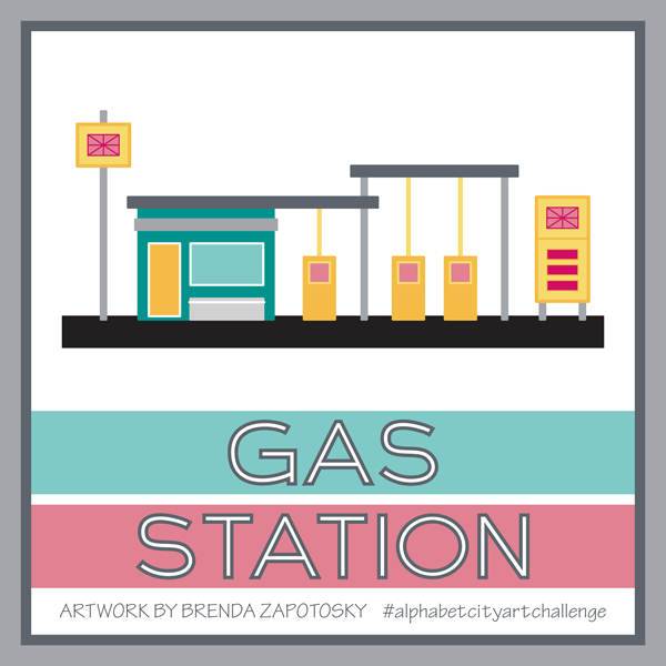
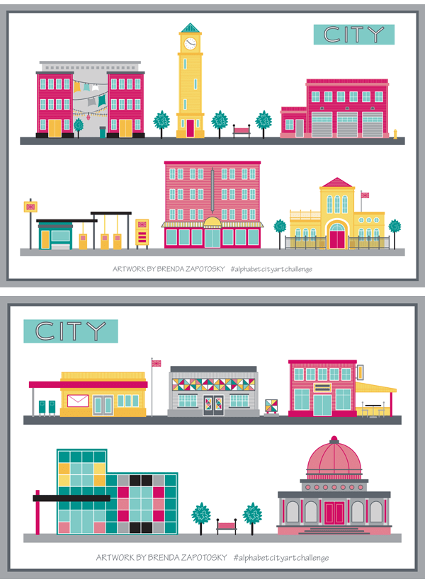
There a large number of illustrations that do not incorporate with these because of scale, or view, or “levels” (like the subway).  But there are many that do.  When it worked, I was consistant with door height etc so that all the “regular” scale ones CAN work together.  In the course of the Challenge I did create a few street view illustrations here is a reminder of what they look like:

2 CITY Street Views by Brenda Zapotosky

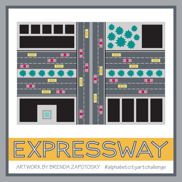
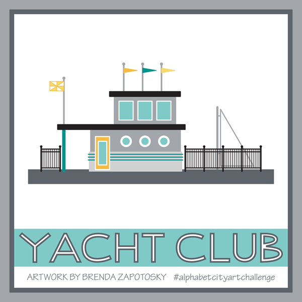
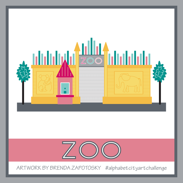
It is impossible for me to pick a favorite out of the group or even a top 3.  Instead you can read about more about my thoughts on the groupings of illustrations in the 3 previous Recaps (linked at the end of this post).

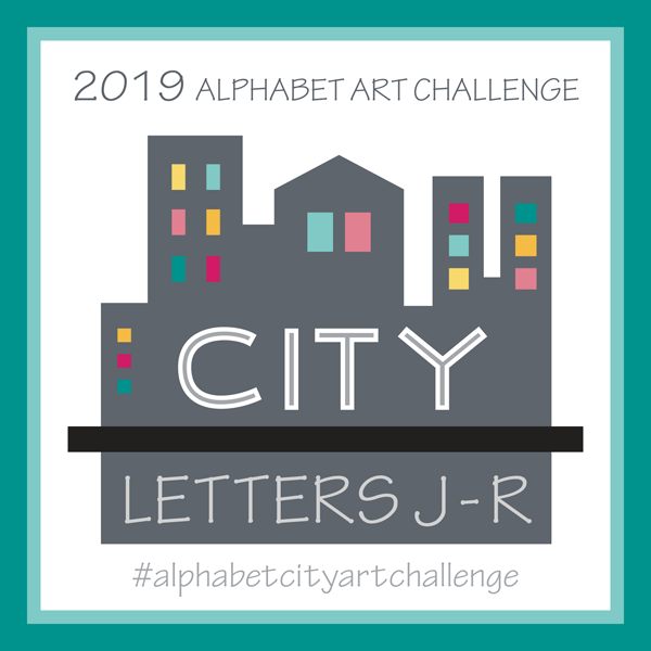
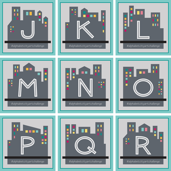
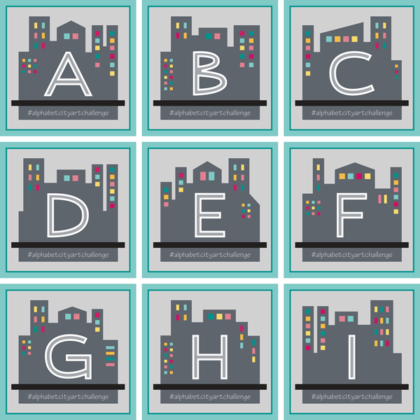
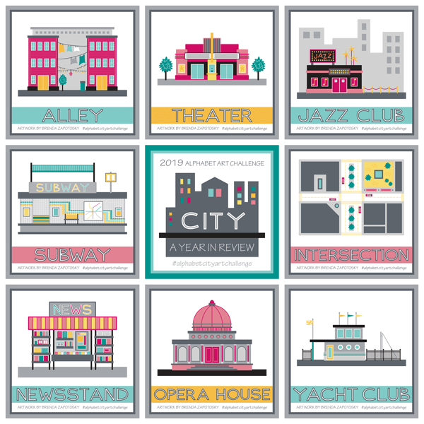
Also part of the Challenge were the CITY Blocks I created for each letter.  Here is a look at them all together:

26 CITY Letter Blocks by Brenda Zapotosky

The look of these were inspried by the original CITY Collection Logo.  All letters are my own original font:

CITY Original Lettering by Brenda Zapotosky Online

I love this font overall and definitely plan on using it in the future.  I will probably need to do a few tweaks.  I did not like the “B” when I created it… and I still don’t!  But I never got around to editing it.

Unlike the previous challenges I have not created any new patterns or cards featuring these illustrations.  I do have a project planned for them AND the font!  A very exciting one in fact.  But it is something I am keeping secret for the moment.

FINAL THOUGHTS:

Overall I think this challenge was easier to execute than the others since architecture is already a strength of mine.  And I really enjoy drawing buildings and built spaces so it was mostly fun.  But having to stick to the alphabet was not always enjoyable. And of course there is the deadline of the 2 week time frame…

So for 2020 I have decided that there will not be an alphabet challenge.  While it is a great way to motivate me to create new art pieces on a regular basis, the alphabet component is too constraining.  Also… this has been an Instagram centered challenge and with all the algorythym changes the posts just aren’t getting much engagement.  This wouldn’t be such an issue if these posts were spread across multiple platforms.  But if the main place I am sharing the art isn’t showing the art to many people, then I am mostly just creating for myself.  With that in mind… I think my design time will be better spent elsewhere.

To those have been following along and liking etc for the past year (or longer) BIG THANKS!  To those just reading about this challenge here are the previous posts so you can catch up!

And that’s a wrap!  After 3 straight years of Alphabet Challenges I look forward to a change!  I hope you will follow along with me on Instagram as I share more new work this year (including a NEW, non-alphabet challenge I will be doing monthly).

THANKS for Reading!  And feel free to comment below.  I love hearing your thoughts!

Brenda

Alphabet City Art Challenge: S-Z

Alphabet City Art Challenge Blog Post S thru Z_CITY S thru Z

It is time for the 3rd (but not final) recap of the Alphabet City Art Challenge!  I have decided to dedicate a post to the last group of letters and then do a full year recap.  If this is your first time hearing about this Challenge you can read the Introduction Post and the First Recap and Second Recap to catch up!

As usual I will start with a look at all 8 illustrations that make up this group:

City Illustration Boxes S thru Z by Brenda ZapotoskyI want to note that I did change one illustration since posting it on IG.  I revised the Visitors Center which used to have a “TI” on its sign.  I thought “TI” was a universal term for tourist information, but it turns out it is not… So I switched it to a generic star.  Ha ha!  If you want to see the original you can find it HERE.

I am really happy with this group of illustrations.  Some of the more difficult letters are part of this batch and not only did I find something to draw for each letter, they aren’t just filling a slot, they are nice choices!

I did have to be creative with the letter “X”.  For that one I decided just to go with something that had a “X” in it.  And expressway sounds like it starts with “X”!  Good enough!  Actually it is one of my favorites of the group!

X is for Expressway by Brenda Zapotosky

It was nice to create an illustration in plan view and I just love the energy and activity of the cars.  Plus I love how bold the colors look, especially since it fills up so much of the presentation square!

Another favorite of mine is the Yacht club:

Y is for Yacht Club by Brenda Zapotosky

As a person who loves to sail and has a partiality for the nautical it makes sense that I like this one.  But also the colors and unique building design are things I like too.  Interestingly, the idea I had in my head for this one was very different.  Originally I was going to pick WHARF for the letter W.  I actually picked it way before I even reached W.  But as I got near the end I realized there were more options for W than Y and that a Yacht Club could be very similar to a Wharf.  I envisioned LOTS of boats docked (which for wharf would have worked well) but when it actually came to draw this one I was more drawn to the idea of a nautical themed building.  I did slip in one boat!  And as a disclaimer:  I know that the sail most likely would NOT be up when docked… I did it for the visual effect.  We can pretend they got caught in the rain and wanted to dry out the sail!

The subway is another favorite.  Again, it was nice drawing a different view, this time a cross section… one of my favorite construction views from back in my architecture days.

S is for Subway by Brenda Zapotosky

A lot of time was invested for all that detail too!

Finally I want to give a mention to a special detail for the Zoo.  When thinking of how I could illustrate a sprawling place like a Zoo I decided to focus on just the front entry.  To give it a unique Zoo look I decide to add some animal silhouettes!  To create these I started with a few animals from a previous challenge:  The 2017 Alphabet Animal Art Challenge.   Unfortunately, while I love the idea of a simple monochrome outline, especially when envisioning a real wall, they do not stand out as much as I would like.

Z is for Zoo by Brenda Zapotosky

I also wish I could have come up with a better way to depict the “zoo in the background” that you glimpse through the gate.  But I do like the color embellishments along the top of the wall and the ticket booth.

Overall I think this group was a strong finish to the challenge!

Finally, as with the rest of the Challenge I also created a letter block for each of the 8 letters in this batch.  Here is a look at them all together:

City Letter Boxes S thru Z by Brenda Zapotosky

Stay tuned for final recap that will discuss the entire years worth of illustrations!  Coming Soon!

Thanks for reading!

Brenda

Alphabet City Art Challenge: J – R

Alphabet City Art Challenge Blog Post J thru R

It is time for the second recap for the Alphabet City Art Challenge.  This time I am sharing the illustrations I created for letters J thru R.  If you are new to learning about this art challenge you can read the original blog post HERE.  And you can find the first recap HERE.

Ok! Let’s start with a look at the 9 illustrations in this group:

City Illustration Boxes J thru R by Brenda Zapotosky


This is an interesting group.  There were some challenging letters in the mix, not only in terms of finding an appropriate city sight to illustrate (i.e. koi pond, quilt shop) but also in creating a building that could distinctly convey a certain sight without using specific branding (i.e. jazz club, post office, restaurant).  It would be an interesting to see if I had posted all of these illustrations without the titles if people would be able to name what they depicted.  Obviously the Jazz Club has the word JAZZ on it and the post office has an envelope so that would help. These features were added specifically to help convey their function.  I think the newsstand is probably the only one that is obviously apparent. (Even the lunch truck could be mistaken for an ice cream truck etc.)

N is for Newsstand by Brenda Zapotosky


The newsstand is one of my favorites of this batch too.  It was fun to create something other than a building and to create something at a scale big enough to show some detail.  I really enjoyed “filling the shelves” of this kiosk.

I also really like the Quilt Shop:

Q is for Quilt Shop by Brenda Zapotosky

I LOVE the quilted components I was able to incorporate and how their colors really pop in contrast to the gray building.

As I did with my first recap I put together a couple of “street views” so you could see the buildings interacting with one another.

CITY Street View 2 by Brenda Zapotosky

I really like seeing them in relationship to one another.  The modern Art Museum and classical Opera House don’t initially seem like an obvious pairing, but I think within the contest of an “Arts District” they could work!

I have also continued to post a letter block on the Monday of each new week period.  Here is the collection of letters J-R:

City Letter Boxes J thru R by Brenda Zapotosky

I really like seeing them all together in a grid like this.  Since it is difficult to continue to come up with new silhouettes, after the letter “M” I started over and reused the same blocks, but I mirrored them to give them a little variety and then made tweaks as needed to work well for the new letter.  So the letter “N” started with a mirrored version of the “A” block and so on.

And that wraps about another batch of alphabet city sights!  I anticipate a few challenges with the last batch of letters, but I already have at least one idea that I am super excited about!  Be sure to follow me on Instagram to see each illustration when they get posted.

And feel free to comment on this post!  I love hearing from my readers.

Thanks!

Brenda

Alphabet City Art Challenge: A-I

Alphabet City Art Challenge Blog Post A thru I

Time for the First Recap in the 2019 Alphabet City Art Challenge!  This year, I have decided to three recaps instead of four, so this first post will look at the illustrations I created for letters A thru I.  If you missed what the challenge is all about you can read the announcement blog post HERE.

Let’s start with a look at the 9 Illustrations I did for the first round, as they were presented as square, framed art.

City Illustration Boxes A thru I by Brenda Zapotosky

Overall I think this is a fun mix.  I have been intentionally switching up the colors so that there is a variety and looking at them all grouped together like this, I am very happy with the overall feel of the collection so far.  Whenever possible I have been keeping the scale of the buildings similar as well.  So, for example, for all the buildings with doors, all the doors are the same height. This was done so that I could easily combine them together in future compositions.  Just for fun, I arranged the buildings in two “street” views so you can see how they look.  (I had to change up the Gas Station colors a tad to make it work).

CITY Street View 1 by Brenda Zapotosky


As with past challenges, I did not “research” ahead of time if there would be a good pick for every letter.  I am mostly choosing each subject as I reach that letter (I did/do have some pre-picked ideas for a few of the letters).  Embassy was the biggest “surprise” so far, as it took me a while to come up with that idea (and I almost chose something else before it came to me).  It was one of the trickiest to create too, especially the curved entryway.

E is for Embassy by Brenda Zapotosky

My overall favorite is the Clock Tower.  It isn’t the most elaborate or even creative of the illustrations but I really love the overall feel of the composition.  The title for this one had to moved up to fit everything and I love how the building interacts with it.  Hopefully a few more illustrations down the line can also be arranged in a creative way.  Also… it makes me think of Italy.

C is for Clock Tower by Brenda Zapotosky

Somewhat surprisingly, the most “hearted” illustration so far has been the Gas Station.  Now I know that there are a lot of factors that can influence hearts, including when the artwork is posted and what hashtags it has…. So it could be that I just picked a “hot list” of hashtags.  Still, it is a pretty fun one.  Lots of little details.

G is for Gas Station by Brenda Zapotosky

So far I have not created any other art or patterns that incorporate any of these illustrations.  I already have the CITY COLLECTION in my Spoonflower Shop that features many city inspired designs, so I don’t have any specific plans to create more surface patterns.  As part of that collection, I have my Around the Town design that already includes many City buildings, which has added an extra challenge as I am trying to not repeat any of those and it includes many ubiquitous buildings.

That wraps it up for the illustrations, but I did want to talk about the letters/titles too.

I mixed things up this year and instead of using “A is for xxx” etc. to title my illustrations (like in past years) I chose to just put the word I was illustrating.  And the lettering for those words, is all original by me.  I like this clean look, but I do wonder if people who stumble upon the illustrations without knowing about the challenge miss out on the alphabet connection. Also new this year:  I have not been posting idea prompt lists.  Instead I have been simply posting the letter for the 2 weeks on their designated Mondays.  Here are the 9 posts so far:

City Letter Boxes A thru I by Brenda Zapotosky

I had already established the style of the letters with the CITY Collection title art, and I have been creating new letters as I have needed them (for either the letter prompts or in the illustration titles). The cityscape used also began with the CITY Collection title art, I have simply been mixing up the details for each letter.

Ok.  I think that covers everything. I hope you enjoyed this first recap.  If you aren’t already, be sure to Follow Me on Instagram to see each new Letter Prompt and Illustration as I post them.  And feel free to comment below!

Thanks for reading!

Brenda


Announcing the 2019 Alphabet Art Challenge!

It is that time of the year again friends.  Time to announce the theme for next year’s Alphabet Art Challenge.  I have to be honest… I seriously considered NOT doing a 2019 challenge.  They are a lot of work and sometimes the obligation to create something was more annoying than fun.  I am hoping with a little reworking of my task parameters it will be a bit easier this time around.  This will be the third year I am hosting this challenge.  You can read about the original 2017 Animal Challenge HERE and last year’s 2018 Fruit and Veggie Challenge HERE.

Ok.  Without further ado the 2019 theme is: CITY!!!

REVISED Alphabet City Art Challenge Title by Brenda Zapotosky

One of the reasons I decided to do a 2019 challenge is this theme.  I already have a CITY Collection in my Spoonflower Shop and I want to use this year of illustrations to grow that collection of patterns and expand into other coordinating works including greeting cards.  For those who may not know, my field of study was actually Architecture and I have found that designs of mine that incorporate buildings etc tend to do well.  I would like to play on this strength but also still challenge myself.  I think this challenge will do both.  For each letter of the alphabet I will create something CITY related.  This could be a building:  bank, library, skyscraper etc.  But I am not limiting it to only buildings.  ANYTHING that can be found in a city is fair game.  (And let’s face it, creativity will probably be required for some of the letters!).

One big change I will making for this year’s challenge is that I will NOT be posting a list of prompts for each letter.  My original reason for doing the lists was to give others ideas of what they could create for each letter.  And while these lists DO get a surprising amount of likes on Instagram, those likes do not translate into others actually participating in the challenge.  And since I don’t need the lists myself, eliminating them will take off one of the burdens from past challenges.  I do plan on posting a LETTER on each start day as a reminder of the start of the next 2-week period (more on that below).  For the 2018 challenge I decided to create a letter for each week.  I hope to do the same this year, although I haven’t decided exactly what I want the font collection to look like.

Stylistically I will be keeping with the already established look of the existing City Collection and only use the colors in its palette.  I actually enjoy working with a limited palette… I like having limitations!

This is my Around the Town design.  It is a good example of the style and colors you can expect to see from me this challenge!

Around the Town Promo by Brenda Zapotosky

HOW THE CHALLENGE WORKS:

Now for the official “rules” for this Challenge.  There are 52 weeks and 26 letters, so that means 1 letter for every 2 weeks.  Even though 2019 starts on a Tuesday, I have decided to keep Monday as the starting day for each new letter.  And in order to not delay a full week, Monday Dec 31 will actually kick off the letter “A”. On each Monday when a new letter begins I will post a reminder on Instagram with the letter for that 2-week period.

As it was for past years, this is JUST FOR FUN!  There are not any prizes for participating.  You can use any type of medium you like to create your art.  And if you are late to join in or miss a letter or 2, that is totally fine!  Depending on participation I will try to share other artist’s work who are regular contributors to the hashtag.  So if you want to be included don’t forget to use the official tag:  #alphabetcityartchallenge on all the pieces you create!

That’s it!  I have one more creation left to finish for the 2018 Fruit and Veggie Challenge and then there will be recaps for both the last quarter and the entire year coming to the blog in January.

In the meantime you can check out the hashtag:  #2018fruitandveggieartchallenge to see all the that has been posted this year by myself and others! (There have been 3 of us posting to it regularly). And (if you are not already) I recommend following me on Instagram so you are sure to see all the posts that are to come!

If you have any questions feel free to ask!

Happy Almost New Year!

Brenda