With the end of June it has officially been six months since the 2017 Art Challenge: Alphabet Animals has come to a close. I wanted to do an update since I have used those animals I created in quite a lot of new designs! One of the goals of the Challenge was to create a library of illustrations I could use in various ways and in that goal I have had much success! So today I want to share all the creations that I have made since the challenge ended. If you are hearing about this challenge for the first time you can read the final blog post recap and see ALL the animals. You can also see the other designs I created last year.
SURFACE PATTERNS
I’ll start with surface patterns. All these have been created this year, so after the close of the challenge. Since in many cases I ended up tweaking the animal illustrations I will share a look at the original animal and the pattern side by side!
All of the patterns I have created this year with animals so far have been created specifically for Spoonflower Design Challenges (although one did not end up being entered as you will soon learn).
Modern Farmhouse

As you can see for this pattern the quail is playing a supporting role. I removed its top plume and did some recoloring to make it more “generic bird” versus a quail specifically. I really love how it fits in so well with the other farmhouse images I created. Modern Farmhouse is available in my Spoonflower shop.
Elephants and Polka Dots
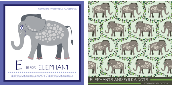
For the “Endangered Species” Design Challenge I chose to feature my elephant illustration. I didn’t make many changes to this character. I changed the toe nail color to white and made the line weights for the facial features a little thicker. (And overall color changes of course). Since my elephant already had a unique polka dot detail I decided to build upon that for the pattern. I actually created 4 different colorways of this design. The Taupe colorway one you see here is the version that was entered in the contest. You can find it and the 3 other colorways in my Animal Fun Collection. This was actually the second time this elephant was selected from the library. Last year I created a greeting card featuring the elephant!
Hedges and Hedgehogs
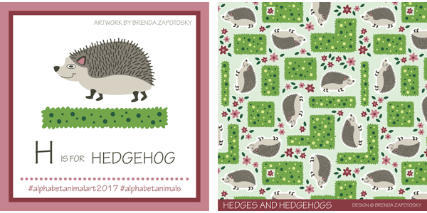
The idea for this pattern was in my head almost immediately after creating the original hedgehog so I was very excited when the “Animals by Land” Design Challenge was posted giving me the perfect excuse to create it! I kept the hedgehog mostly the same but tweaked the facial features again on this one, the most noticeable being that I gave it a round eye. I think it is cuter that way! The hedges got a bit more colorful too! Find Hedges and Hedgehogs in my Spoonflower shop!
Mostly Happy X-Ray Tetras
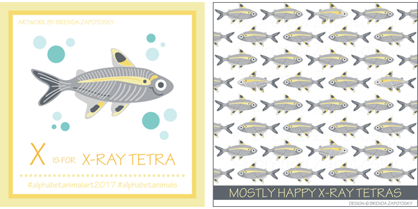
Last but not least is my X-Ray Tetra. For this one, I kept the pattern simple since there is already a lot of detail in the fish itself. I did play with adding some polka dots, but I didn’t like them. I did, however, do a fun little switch-up! As the title suggests, not ALL these tetras are smiling… I added some frowny ones to the mix and reversed their coloring in places to make them just a bit more distinctive. This design was created with a contest in mind but was never entered because I got the THEME wrong!!! I thought it was Animals by/in/of WATER since the previous two contests were Land and Air… but for this one Spoonflower mixed it up and themed it “Animals of the OCEAN”. Technically tetras are not ocean fish (which I learned through research, I am not a fish expert!) and I did not feel right entering this design. Oh well… at least it gave me the motivation to create it since this was also a pattern idea I had in my head for a while! Mostly Happy X-Ray Tetras is also available in my Spoonflower shop.
GREETING CARD
I have created one new card since the close of the challenge. I have a niece and nephew who both turned 3 in June (cousins, not twins) and I thought the koala was a good pick since it was already holding onto to something making it easy to swap in the number 3. I also changed the hat to a party hat. I left the koala itself the same (even the position of the arms worked as is for the number 3!)

I was there when my niece opened her card and upon seeing it she recognized it as a koala! Granted she had recently seen a show that had koalas, but still, it made me really happy to know that my characterization was accurate enough for her to name the animal specifically! I call that success. The koala cards joins several other animal cards I created last year which you can find on my Cards and Gift Wrap page.
ARTWORK
The biggest thing (literally) that I created with the animal illustrations is a poster that incorporates ALL of them! As I mentioned above my niece and nephew turned 3 and I decided that for their gifts I would create this poster. It was actually quite a bit of work to pull it all together and fit them in a logical way and adding in all the text circles, title, etc.

In addition to removing all the “props” that were originally paired with I also did some minor re-scaling, both enlarging and reducing scales of some of the animals to get them to work better as an ensemble. Other than that all the animals except one stayed the same as the original in look and color (all the tweaks I made for the patterns came later). The one animal that DID get changed was the armadillo since that was my very first illustration and it did not have the same “cute” look that I started with letter B. Here is the “Before” and “After”.
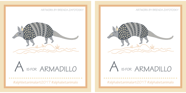
It was actually my husband who suggested I make them “cuter” after seeing the first animal, armadillo. I am so happy he did, because it definitely enhances my already slightly cartoon-ish interpretations. And I am glad I changed up the armadillo for the poster!
It is definitely a bit of a gamble to give the gift of art. Especially BIG ART that is intended to be hung in someone’s house. I took that chance because I thought my niece and nephew as well as their parents would like the gift. And because I expected these to be hung in the kids’ rooms and not the main house. I am so happy to report that gifts were well received AND have both already been hung! Here is a look at the posters “in the wild”.

I printed these posters at a standard 20″ x 30″ but sized the poster border proportions to work with a favorite IKEA frame line that I love (Its similar sized frame is 19.75″ x 27.5″). (Seriously, almost every wall frame in my house is from this line). For the smaller frame on the left (which I framed) I trimmed it to fit the slightly smaller proportioned frame. My sister opted for the same IKEA frame but with bigger dimensions so it has a mat (on the right). It is fun to see the two looks side by side.
My husband’s reaction to seeing the poster for the first time was that I should sell them! After selling greeting cards for a number of years I decided that being a producer really wasn’t for me. I have been focused for the last several years solely on designing and selling my work where someone else does all the work. However, these posters, which I am extremely pleased with, have me actually considering maybe selling (on a VERY limited basis) again. It is just an idea at this point. I would probably sell them both wholesale and retail if I did. If you are a retailer or an individual and would be interested please let me know! If there seems to be enough interest I would start investigating larger quantity printing!
And that about wraps it up! I anticipate using more of these animals in future design projects. Do you have a favorite you’d like to see used in something? I’d love to know!
Thanks for reading!
Brenda