Fruit and Veggie Art Challenge: A-F

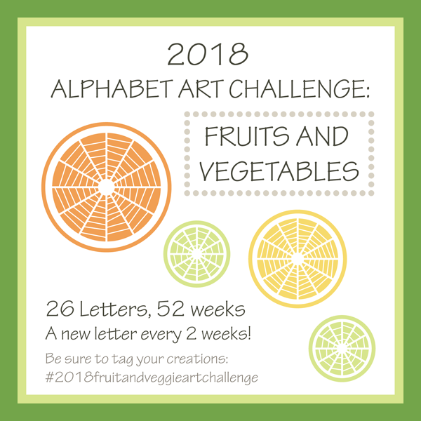
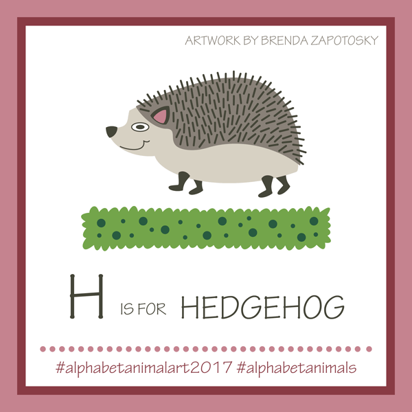
It is here!  The first blog recap of the 2018 Fruit and Veggie Art Challenge!  6 letters and 12 weeks completed!  Wow.  This new theme has been quite fun and overall, for me at least, easier than the Alphabet Animal Art Challenge from last year. If this is the first time you are learning about the 2018 Alphabet Art Challenge I recommend reading this blog post first.

Also, a side note:  I have been struggling with what simple word to use when writing about my illustrations.  I have settled on the generic combo fruit/veg to try to make things as simple as possible 🙂

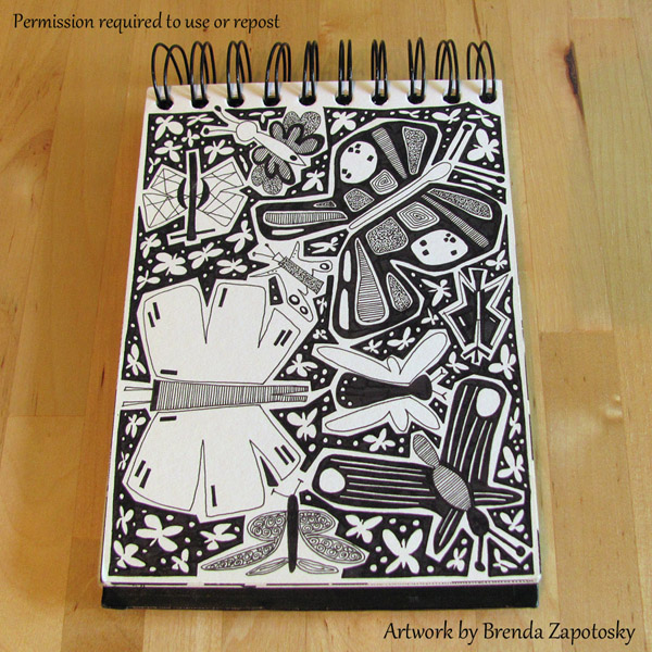
Let’s start with a look at the first 6 illustrations I created:

A thru F Fruit and Veggies by Brenda Zapotosky

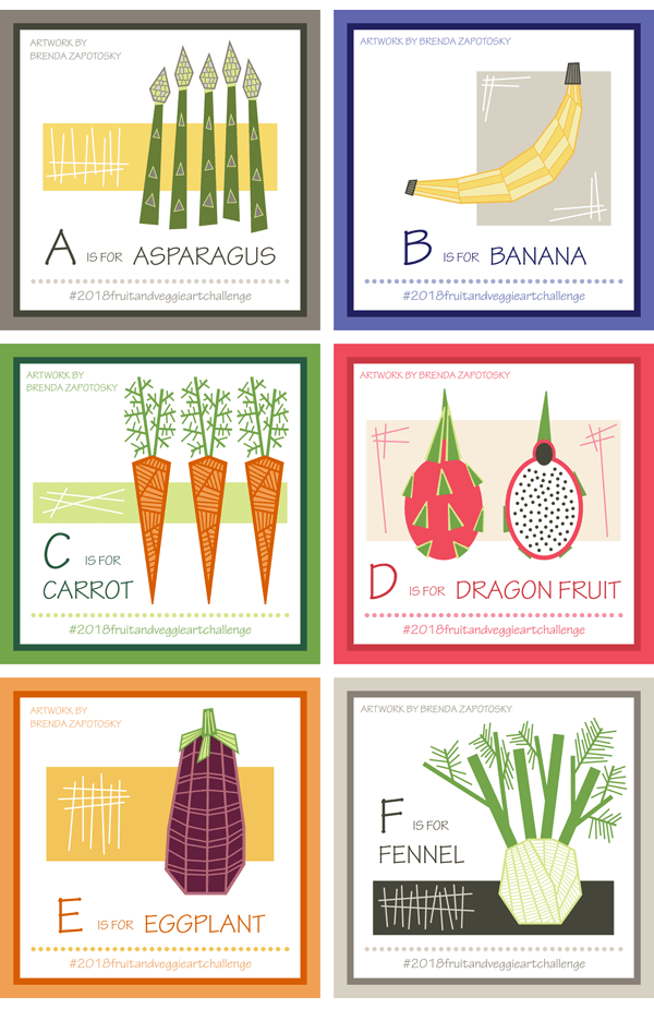
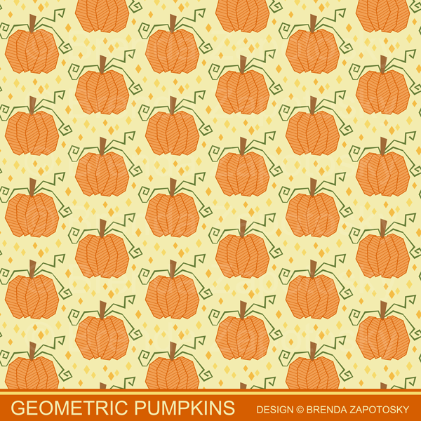
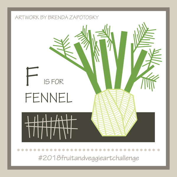
4 Veggies and 2 Fruits so far.  As I shared in the original blog post for this year’s theme, in addition to the Alphabet Fruits and Veggies I am also giving them all a “geometric” flare.  I am absolutely loving this twist on the theme as it frees me from trying to exactly recreate the fruit/veg I have chosen and gives me a bit of creative flexibility.  It is quite fun to choose my fruit/veg then think through the best way to geometrically create it.  In addition to the fruit/veg itself each illustration has a rectangle and hatching as part of the composition.  I added this for the first item, asparagus, to fill in the blank space and liked it so much I decided to make it a standard element for all the illustrations.  I think my favorite illustration this round is the Fennel, it was such a perfect fit for my geometric style.  Here is a closer look:

F is for Fennel by Brenda Zapotosky

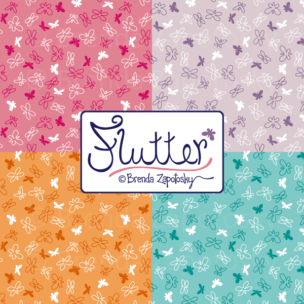
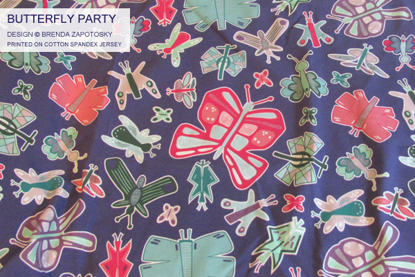
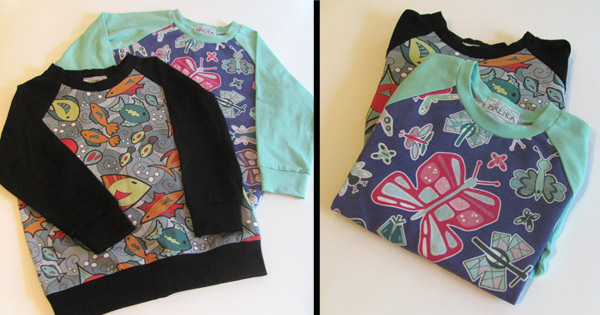
I also really like the carrot.  In fact, I have already made it into a repeating pattern and added it to my Spoonflower Shop!  I think this Geometric Carrots print would be especially fun for the kitchen!

Geometric Carrots Pattern by Brenda Zapotosky Outlined


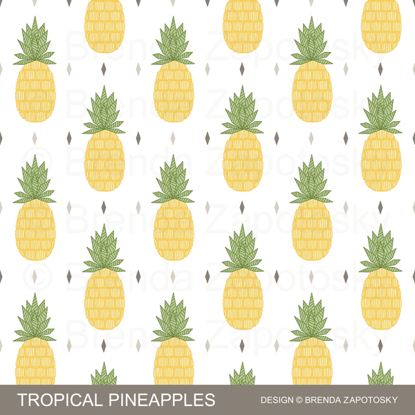
I anticipate more patterns in the future and probably a few that incorporate more than one fruit/veg. Those will probably come closer to the end or after the challenge once I have an entire collection.

Probably the biggest challenge I have encountered so far is fitting the fruit/veg well on my template.  I really liked the framed square I used for the Alphabet Animal Art Challenge and definitely wanted to keep the square format for this year too, however, so far the fruit/vegs have been much more vertical than the animals. Had I thought of this before starting I might have tweaked the format of the squares.  This is another good reason to incorporate the background rectangles and sticks as they help to fill the space.

Like last year, I extended an invitation for other artists to join me in the challenge. Not sure if fruit/veg are less appealing than animals, or that others found it too difficulat to stick to a year long challenge, but participation is down from last year.  (Actually last year started strong and then eventually everyone except myself dropped out).  3 other artists started the year with me.  I wanted to give them a shout out because I loved that they joined in.  And since there are less options with fruit/veg there were often repeat picks which I think is quite fun.  You can see all our creations on Instagram via the hashtag for the challenge:  #2018fruitandveggieartchallenge.  You can also check out all of the artist’s individual feeds:  onecreativechameleon, deevlasak, and jillbyersdesign

Jill from jillbyersdesign is the only artist that has also completed every letter and I wanted to give her a special mention!  She is also using a consistent design style and I absolutely LOVE how her collection is coming together!!!  Her style is so different from mine which is super fun.  Painting is NOT my strength, but I have done it enough to really appreciate the gift in others.  Jill definitely has the gift.  Here are her first 6 fruit/veg paintings!

Jill Byers A-F

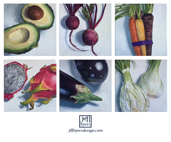
So gorgeous, right?  I highly recommend giving her a follow on Instagram.  You can also find more of her work on her website and in her own Spoonflower shop (which is how we “met” in the first place!)

Speaking of other participants… you could still join in if you wanted!  I think that the fruit/veg are so much faster to create you could easily catch up at this point.  Or simply start at the latest letter:  G!  I even create a prompt list for each letter to give you ideas.  Find the latest one here.

I think that about covers it all.  I would love to hear which fruit/veg is your favorite!  Or any other comments you may have 🙂

Thanks for reading!

Brenda

Sewing and Design Meet: Transit Lines

Sewing and Design Meet Logo

It is time for another edition of Sewing and Design Meet!  This time I am sharing about my Transit Lines design and the tote bag I made with it. This design is part of the City Collection which can be found in my Spoonflower shop.

DESIGN:

Transit Lines by Brenda Zapotosky

When putting together a new collection I don’t often sit down and sketch out ideas for coordinates but for CITY I actually did.  My original idea for the Transit Lines design was to have criss-crossing lines going in many directions, similar to a subway map.  However, as I started drawing it in Illustrator I really loved the look of just the horizontal lines with the thickened bars and decided to take it in that direction instead.  I love how the pattern is a versatile stripe and yet, when paired with its title, can easily (I think) invoke images of the city site that inspired it.  Whether you interpret the thick bars as trains or stations is up to you!  I also really love the color palette I decided on for this print: mostly neutral but with pops of color.

FABRIC: 

Transit Lines on Eco Canvas by Brenda Zapotosky BLOG

A few years ago Spoonflower had an awesome and rare 50% off sale on Eco Canvas and I ordered a couple of yards.  One yard I divided into (2) 1/2 yard pieces with the intention to make a tote bag with each of them, although at the time I did not have a specific pattern picked out.  I ended up choosing free tote patterns from Purl Soho for both of the totes.  I have a previous blog post about the first one I made, the Railroad Tote, and some zipper pouches I made with the extras.  I chose the Everyday Tote for the Transit lines design as I thought the more horizontal shape would suit it well.

The Eco Canvas has pluses and minuses for me personally.  On the plus side: It washes and sews well and colors are bright and vibran.  On the minus side: It is  much softer and drapier than other canvases which is something I do not like.  But I think this is really just a personal preference. I gave the Railroad Tote to my mom and she loves that soft quality.  When making the zipper pouches I decided to interface the Eco Canvas portions and I was much happier with the structure.  So for the Everyday Tote I knew I wanted to interface those pieces.  I needed to do some construction changes to accommodate this (Along with a bunch of other construction changes) which I detail below.

SEWING:

There were a lot of steps to making this bag, including some extra ones that came along with my changes, but otherwise it was straight forward and easy to sew.  I didn’t take a lot of in-progress photos (my sewing space is not photo friendly) and it was difficult to get a good overall look of the bag.  Here is the best one:

Transit Lines Tote by Brenda Zapotosky 3

As mentioned above, I made several construction changes when sewing up this bag.  I knew I wanted to interface the Eco Canvas pieces and since the bag isn’t lined, I needed to underline at least those portions so that the interfacing was not exposed.  After contemplating solutions for this, I decided to also change how the bag panels were sewn.  Per the instructions, you cut two full side pieces from what eventually becomes the “upper” fabric, and then cut bottom panels of the “lower” fabric which go over top the first fabric on just the bottom portion.  There are some good reasons to sew the bag this way.  It ensures you aren’t relying on a horizontal seam to hold the top and bottom half of the bag together and it creates a nice double layer for the bag base.  But, it meant that 1/2 of my good patterned fabric was going to be covered which I wasn’t crazy about.  So, I decided to instead cut both pieces at half height and let the seam where the bias “piping” detail is connect them together.  Since the bag side pieces were already cut, I chose to cut one in half height wise and that determined the height of my bag (and preserved a nice FQ sized piece of the Transit Lines for a future project!).  I sewed the top and bottom halves together with the accent bias “piping” in between.  I then UNDERLINED the entire height of the bag sides with a coordinating quilting cotton that I had leftover from the previous Eco Canvas projects.  I quilted this to the bag panels which helped provide the extra stability I lost when I changed the construction.  The quilting, despite using a walking foot AND having design lines to follow, is kind of wonky… Quilting is not my forte!  Despite the lackluster quilting, I absolutely love the end result inside the bag.  I think the quilted underlining really gives the bag a high quality look!

Transit Lines Tote by Brenda Zapotosky 1

Other changes I made:

  • I flip flopped from the directions which fabric I used for the front and back of the pocket so that I could enjoy more of the print.  I also made the pocket wider since there was plenty of room to do so.
  • I changed the order of sewing so that the folded over top hem of the bag was sewn last.  I did this on my Railroad Tote too.  By saving it until last the tops of the side seams are concealed instead of exposed.
  • Longer straps.  I like to wear my bag over my shoulder and longer straps make it more comfortable when I do.

I chose to use 2 different colors of bias tape instead of one and I am very happy with the results.  On areas where I wanted the trim and finishing to stand out (like on the exterior seam or around the top of the tote fold over hem) I used black.  To finish all the interior seams I used white.

Transit Lines Tote by Brenda Zapotosky 5

Transit Lines Tote by Brenda Zapotosky 4

Transit Lines Tote by Brenda Zapotosky 6
DETAILS! Pretty details are one of the “perks” of sewing your own!  Like rotating the print to be vertical on the pocket.

The webbing I used for the straps (linked at the end) is a bit industrial.  It works ok… especially since the Eco Canvas is also a synthetic, but I wouldn’t get it again.  I purchased a large roll of it and have a lot leftover, so it will probably pop up in another project at some point. It was a really good deal though, and should be pretty durable (I hope).

I was hoping that this bag would work as my music bag and I am happy to report that it works perfectly!  My previous bag was a freebie tote that I got when I worked in Architecture.  It was rather ugly and advertised a window company that I am not even a big fan of (otherwise I might have posted a “before” photo).  I love having my new “chic” bag that is me-made and features one of my own designs!  It holds all my music, books, and misc. with room to spare! (And even packed can sling over my shoulder!)

Transit Lines Tote by Brenda Zapotosky 2

DETAILS SUMMARY:

(I have seen others do a summary like this and think it is a fun way to provide quick access info all in one place. I will probably make it a regular feature of my sewing posts.)  

Pattern:  Free Everyday Tote from Purl Soho

Fabrics:

Notions:

  • Pellon Interfacing, Lightweight, Fusible (I can’t remember the exact #)
  • 1 package each white and black bias tape
  • HipGirl 1 1/4″ Black Polypro Webbing
  • Sewing label designed by me and printed by Spoonflower

That about wraps it up!  If I missed a detail that you would like to know about feel free to ask in the comments!

Thanks for Reading!

Brenda


Sewing and Design Meet: Floral Bliss

Sewing and Design Meet Logo

It is time for another installment of Sewing and Design Meet.  Actually it is time for the second installment… I started this series last year and then never did a second one!  Oops!  Hopefully this year, there will be more regular posts for this series.

Today I am sharing about my Floral Bliss design and several projects I sewed with it. I currently have 4 different colorways of the design plus coordinates all available in the Floral Bliss Collection in my Spoonflower Shop.

DESIGN:

This design has a really fun story, since it began as a doodle in a doodle book I kept a long, long time ago.  Here is a look at the original, non-repeating doodle:

Floral Bliss Doodle by Brenda Zapotosky

As you can see, this doodle was not created with a repeating pattern in mind, and thus, there was a lot of work involved in turning it into one.  It was a multi-step process, where I would split the design apart in photoshop, print it out and add more elements by hand, re-scan it, erase elements, digitally tweak etc. Here is just one in-progress look.

Floral Bliss In Progress Pattern Creation by Brenda Zapotosky

At this point you can see the original page outline was still present.  Once I went through all those steps mentioned above (some more than once) and had a repeating tile with all my hand drawn elements, I next started the long process of recreating it as a vector tile in Illustrator.  I did auto-trace it as a first step, but there was a lot of time spent editing and tweaking, etc again in Illustrator.  This is not a fast process!

The original use of this pattern was for a Spoonflower limited palette contest. There was no theme other than the colors: Coral, Mint, Black and White, so it was a perfect opportunity to use an abstract pattern. Here is the look at that colorway of the pattern for the contest:

Floral Bliss Coral and Mint by Brenda Zapotosky
Floral Bliss (Coral and Mint) Design by Brenda Zapotosky

This is one of the most “hearted” designs in my shop.  Because of its popularity and the amount of time invested in the pattern, it made sense to offer it in other color versions as well.  I also added a second, smaller scale version.  I currently offer it in 4 different colorways and 2 different scales!  I have sewn with 3 of those colorways.  Here is a look at the other 3 versions:

Floral Bliss 3 Color Versions by Brenda Zapotosky
Colorways Left to Right:  Pink and Gray, Tropical, Winter Blues


SEWING:

The first project I made from one 8 x 8 swatch:  A Travel Eye Mask.

Floral Bliss Eye Mask by Brenda Zapotosky

This was made with the Floral Bliss Pink and Gray (Small Scale) version of the design.  I am not 100% sure which fabric type this is… one of the woven cottons.  I created my own sewing pattern by tracing a freebie eye mask that I had (modifying the shape and size a little bit and adding seam allowances). It is backed in raspberry pink flannel with a layer of batting in between and I kept the piece of 1/4″ elastic I used “raw” (which I rather like).  Bonus:  All the extra materials were already in my stash!

The second project I made used the original colorway of the design in the Small Scale again combined with a coordinating Polka Dot:  A Travel Jewelry Pouch.

Floral Bliss Travel Jewelry Pouch 4 views by Brenda Zapotosky

This was a gift for my sister and Floral Bliss was one of the patterns I knew she liked. (She also loves polka dots).  It was quite an ambitious project for me at the time I made it.  It was my first time working with vinyl, had multiple zippers, and a LOT of bias binding.  I actually wrote an entire blog post about this one where you can read all about it in great detail.

The third, and final project so far is an Infinity Scarf.

Floral Bliss Winter Blues Infinity Scarf by Brenda Zapotosky

This scarf features the newest color of the Floral Bliss design, Winter Blues, in the larger scale.  (The small scale version has not been added to my shop yet.)  It is printed on 1/2 yard of Cotton Spandex Jersey.  I don’t like my infinity scarfs to be too voluminous so 1/2 yard is the perfect size for me.  I used Spoonflower’s Fill-A-Yard function to get 1/2 yard of this print and a different print for the other half which I also plan to make a scarf with.

I created this colorway specifically for this project.  I wear a lot of scarves in the wintertime and keep them on even inside, so I like a lot of variety.  This print, at this scale, in these colors will work well with a lot of what is already in my wardrobe and is quite different than my other scarves.  Here it is styled with another recent make of mine, a Lane Raglan by Hey June Handmade sewn up in RK Laguna Knit in Navy.  I think this is the 7th Lane Raglan I have sewn.  It is definitely a TNT (Tried and True) pattern for me!

Floral Bliss Scarf with Lane Raglan Brenda Zapotosky

FINAL THOUGHTS:

I think it is apparent from the above projects that Floral Bliss is a very versatile design!  I sewed these 3 very different projects quite far apart.  It is fun to see that it is a design that I continue to return to and use in different ways.  I have not sewn anything up in the Tropical colorway yet, but there is the chance that I will in the future should the right project come along!  A skirt or dress for summertime would be lovely in that version of the print.

How about you?  Which version is your favorite?

Thanks for reading!

Brenda


Alphabet Animal Art Challenge: The final recap!

Alphabet Art Challenge 2017 Final Review by Brenda Zapotosky

Finished!!!!!!!!!!!

That was the elation I felt when I completed the final animal in the Alphabet Animal Art Challenge!  52 weeks, 26 letters, and I created both a prompt list and an animal for ALL of them!  It is quite an accomplishment if I do say so myself, and NOT easy.

I had several reasons/goals/ideas when I first dreamed up this challenge and I am happy to say that I met them (and perhaps even surpassed them!) There is so much to share, in fact, that I hardly know where to begin… (And, if you are just hearing about this challenge for the first time you can read the original post here).

First, the animals!  All 26 of them.  One for every letter of the Alphabet and almost all of them posted within their allotted 2 week time frame!

26 Animal Illustrations by Brenda Zapotosky

It is rather amazing seeing them all together.  Such a wide variety!  The first animal, armadillo, is a bit out of place.  After that first letter, and motivated by a comment from my husband, I decided to go “cuter” with the look of my animals.  I am really glad I did!  I think that I was able to achieve a pretty good consistency of style throughout the year and, scale aside, these animals could work well in combination in addition to solo.  (In fact I plan on tweaking the armadillo to use in a project I have planned). I chose a handful of favorites to create the title art for this post, but honestly, while I definitely have ones I don’t like as much, there is future “potential” for most of these.  One of the great “side effects” of this challenge is that I now have a large library of animal characters ready to use in patterns, greeting cards, and any other sort of art.  In fact, many of them have already been used in these ways, which you will see below.

Next, I wanted to share all the “prompt” posts I did for Instagram.

26 Animal Prompts by Brenda Zapotosky

These were posted every Sunday (except for 1, which got delayed due to some major computer issues I had) to kick off the new letter and give some ideas to get participants started on their next letter. (Of course, after the first quarter most other participants dropped out, but I persevered in sharing the prompts anyways, always in hope of new people joining in!) Each prompt had 7 animals listed. I researched animals and created these letter by letter as the year went along.  You might be surprised to learn that I did NOT check prior to starting the challenge if there even was an animal for every letter of the alphabet.  Honestly, that didn’t matter to me.  I figured there would be an animal for MOST of them and I could always use adjective descriptors for a letter that did not have an animal.  It turned out, however, that every letter DID have an animal!!!  And in fact, I was able to fill all 7 “slots” on my prompt list for every letter (although for Y some of them are “adjective Y” animals)!  It was a bit of work putting together the lists but it was also fun.  I liked looking up the letter and discovering new and interesting animals.

As I mentioned above, I have built up an impressive library of illustrations that I can now use for other design projects.

Surface Pattern Design: I have ideas for patterns for many of the animals I have created, but so far I have only created one seamless pattern.  It features the flamingo and is titled:  Flamingos and Flowers. This design is now available as part of the Floridian Collection in my Spoonflower Shop.

Flamingos and Flowers Pattern Promo by Brenda Zapotosky

Greeting Cards:  I also created several greeting cards, basically on an “as needed” basis as occasions popped up throughout the year.  So far I have created 5 different greeting card designs, 2 of which, the elephant and owl, have 2 different color variations (I chose to only include 1 color version of each card below but you can see the other elephant here and the other owl here).
Animal Greeting Cards by Brenda Zapotosky

I think it would be fun to do some coordinating patterns for these as well.  I am particularly found of the Birthday Owl!

Onto my final thoughts:

  • One of my goals was to force myself to be creative on a regular basis.  This challenge definitely achieved that goal!  There were definitely times when I really did not want to create an animal for a particular letter, but since I committed to the challenge I did.  I am very happy for that.
  • Another goal was to improve my animal drawing skills.  Character design does not come easy to me, so this was a great way for me to grow that skill set.  I think some animals were more successful than others, but even my least favorites gave me good practice.
  • If I am disappointed with any part of the challenge, it was the dropping out of most of the participants after the first quarter.  I totally get it… it was hard for ME to keep up sometimes and I created the challenge!  But I did miss that social aspect of it.

I think that’s it!  It is a little weird to be done with this challenge.  But I am excited to move on to a new subject matter!  I announced the 2018 Alphabet Art Challenge theme a few weeks ago:  Fruits and Vegetables!  It will be a nice change of pace.  I would love for you to join me!

Thanks for reading!  I would love to hear which animal is YOUR favorite!  You can comment below.

Brenda

Announcing the 2018 Alphabet Art Challenge!!!

I super excited about this post and to share the theme for the 2018 Alphabet Art Challenge!  If you are new to this Challenge you can read all about the first one, The Alphabet ANIMAL Art Challenge, here. You can also read each of the quarterly updates here, here and here.

And so without further ado, and perhaps a little drumroll…. The 2018 theme is:

FRUITS AND VEGETABLES

Yay!!!!!!!!!!!!  (At least, I am hoping that is what you are thinking.)  I am very excited about this theme.  While the Animal theme was a great challenge to me personally, and I will be sharing a lot of thoughts about it all when I do the final recap of the year, I am looking forward to having a little bit simpler subject matter this time around.

The OFFICIAL name for this challenge will be the Fruit and Veggie Challenge, because that is more fun in my opinion, and makes for a shorter hashtag:  #2018fruitandveggieartchallenge

2018 Alphabet Art Challenge Announcement by Brenda Zapotosky

For this theme I have a very distinct vision for the style of the art I will be creating.  Since my days of doodle books, starting way back in college, I have LOVED hatching.  And one of the style methods I employ a lot in my artwork is creating “geometric” versions of common objects.  So for my fruits and vegetables this year, they will be geometric in style and employ hatching as part of the rendering.  I already created some patterns that use geometric fruits and vegetables, so I will be building upon that small library.  Here are a few examples (Which are available as fabric, wallpaper and gift wrap in my Spoonflower shop) :

Geometric Pumpkins by Brenda Zapotosky

Tropical Pineapples Pattern by Brenda Zapotosky

As an added “bonus” this year, I have also decided to create a new geometric font to go with my fruit and veggie illustrations, which will add an element of Art to the “Prompt” posts that I do at the beginning of each letter. (You can see examples of the prompts on my Instagram feed.)

Ok, so onto the official “rules” for this Challenge.  There are 52 weeks and 26 letters, so that means 1 letter for every 2 weeks.  Since 2018 starts on a Monday, that will be our starting day for each new letter.  So Monday, Jan. 1 will kick off the letter “A”.  On each Monday where a new letter begins I will post a reminder on Instagram with the letter for that 2-week period and some ideas of fruits and veggies to get you started.

Like last year, this is JUST FOR FUN!  There are not any prizes for participating.  Use any type of medium you like to create your art.  And if you are late to join in or miss a letter or 2, that is totally fine!  I would like to do an artist round up like I did for the first quarterly recap of 2017.  Sadly participation last year drastically tapered off after that first quarter, so the other recaps did not include other artist’s work.  I hoping that there will be more participation this year and I will able to share a bit more of other’s work.

So get your artistic thinking caps on and start mentally prepping for a year of Alphabet Art Fun!  I really hope you will consider joining me!

Brenda

ps.  If you are not already following me on Instagram, I highly recommend it.  It is where I will be posting all the prompts and fruit and veggie creations.

Alphabet Animal Art Challenge: G-M

Well folks, we have officially reached the halfway point of the Alphabet Animal Art Challenge and it is time for the second recap for the year!  As time has progressed, I have found that participation from other artists is dwindling.  Bummer? Yes.  But… this began first and foremost as a personal challenge to myself and alone or with a crowd, I will continue until the end!  I certainly miss seeing other’s people work inspired by the letter prompts, but I totally get the difficulty of sticking with any challenge for a full year!  Honestly, it has been hard for me for a few of these letters to want to spend the time creating anything, especially when I was uninspired by the choices.  If not for my determination to stick to my goal I might have stopped too!  (Or at least skipped some letters).  But I persevered and am happy I did. Today I am sharing a look at the second batch of animals, G-M, and sharing some designs I created that incorporate animals from both the first and second round of creations.

Letters G-M  There was definitely a lag in excitement when I hit the middle of this batch. Letters I and J were not very inspiring to me.  I came up with the idea to do multiple insects for I, which ended up kind of fun.  But J… the jellyfish you see here was actually just a re-working of an old illustration (and then scaled twice to create 3  different sized ones).  Thankfully the Koala helped me get some of my enthusiasm back!

Alphabet Animals Letters G to M by Brenda Zapotosky

I think my favorite of this batch is the Hedgehog.  I would definitely like to create a pattern for him using a maze of green hedges!

H is for Hedgehog by Brenda Zapotosky

Pattern and Cards:  So far I have incorporated 4 different animals from the challenge into either cards or a pattern.  These include my giraffe from this batch of illustrations and 3 other animals from my first round  (Letters A-F) of illustrations.  I absolutely love that I am building a library of animal illustrations, in my style, that are all ready to be used in other ways.

I created a seamless pattern with my flamingo for the Birds and Blooms Design Challenge on Spoonflower.  I absolutely love the bright, happy palette and am in the process of creating an entire collection around the signature print:  Flamingos and Flowers.

Flamingos and Flowers Pattern Promo by Brenda Zapotosky

The collection is not finished yet, but you can find the first two coordinates of Floridian, as well as the flamingo print available now in my Spoonflower shop.

I also created some greeting cards using my animal art designs too!

Animal Art Greeting Cards by Brenda Zapotosky

The cat card was a birthday card for my husband.  The giraffe card was actually a MOTHER’S day card (my mom loves giraffes) but I kept the greeting on the front generic to give it better flexibility for future use.  I had both a niece and nephew turn 2 in June, so I actually did 2 different colorways of the elephant card.  In my “girl” version (below) the elephant has pink toenails like in the original illustration, although in a brighter shade of pink!

Birthday Elephant Greeting Card Pink by Brenda Zapotosky

These cards were a lot of fun to put together.  I could see an entire line of animal cards along with maybe some matching gift wrap being developed at some point.  For now, I am enjoying creating them as the need arises.

Overall, I will call round 2 a success!  It is quite incredible how many different animals there really are!  I have discovered many “new to me” animals along the way.  Next up is the letter N, which marks the beginning of the second half of the alphabet.  So if you wanted to join me, or jump back in if you started and fell behind, this is a great time to start!!!

And be sure to follow me on Instagram, to see each animal as I finish them and see the reminder posts and animal idea prompts each fortnight!

Thanks for reading!

Brenda

A Fabric Design Tale

This post is a tale of sorts, of two whimsical designs that began as hand drawings and were transformed into fabric.  An appropriate title could have been: From Pen and Ink Hand Drawings to Seamless Patterns to Printed Fabric to Sewing Creations. But that is a lot of words. Hence:  A Fabric Design Tale 🙂

If you read my previous post then you already know that for Christmas 2016 I made my youngest niece and nephew each a raglan tee using my fabric designs.  Both began as hand drawings and so I thought it would be fun to share the process (since it was different for both) in how I transformed those into the fabric and ultimately a finished sewing project.

Fantasy Fish

fantasy-fish-promo-pattern-by-brenda-zapotosky

For my nephew I chose my Fantasy Fish pattern.  I originally created this design for the Great Barrier Reef themed contest on Spoonflower.  This was still in the beginning stages of my learning Adobe Illustrator and creating patterns. For this pattern I wanted to have all the elements inter-connected and I wasn’t yet sure how to do that in AI, so I stuck with Photoshop to create the entire pattern.  To do this I began by drawing a base design by hand, scanned it into Photoshop, cleaned it up, and then using the offset function split the design apart.  I then printed the split apart design and drew in more elements to start to fill the space.  I had to do this several times before I had the entire piece filled in and the full pattern tile created.  Below you can see some of the stages of the pattern.

fantasy-fish-pattern-progression-by-brenda-zapotosky-with-words

I chose to have the design printed on Spoonflower’s Cotton Spandex Jersey since I would be pairing it with Cotton Spandex Solids purchased elsewhere and I wanted the fabric types to be as close as possible.

fantasy-fish-by-brenda-zapotosky-fabric-photo

I love how it looks printed out!

Butterfly Party (Midnight)

butterfly-party-midnight-by-brenda-zapotosky-promo

For my niece, I chose the Butterfly Party design, Midnight color version from my Flutter Collection.  I created this design from a doodle I drew in one of my doodle sketchbooks long before I ever started created surface patterns.

butterfly-doodle-by-brenda-zapotosky

Since I never intended this drawing to be a seamless pattern when I created it, I decided to use the elements as components in a new design instead of converting the original composition to be seamless.  For this design, I used the auto-trace function in Adobe Illustrator to render the elements as vector.  From there I did A LOT of clean-up, modifications and redrawing.  In fact sometimes I do so much editing of a traced design that I wonder if it wouldn’t be faster to just redraw all the elements manually.  I do like, however, how auto trace gives a bit more of the hand-drawn feeling and for this print I think it really works.  While I love the black infill with the butterfly silhouettes and polka-dots on the original doodle, I thought it was too busy for the pattern version so I decided to eliminate it.  Instead I used some of the little butterflies to create a coordinating pattern.

delicate-delights-four-colors-small-by-brenda-zapotosky
Delicate Delights design in 4 different colorways.

You can find these little butterflies and many other coordinating prints in the Flutter Collection on Spoonflower.  And here is a look of the fabric (also printed on Cotton Spandex Jersey):


butterfly-party-by-brenda-zapotosky-fabric-photo


Raglan Tees

kiddo-raglans-by-brenda-zapotosky-2

I used the same pattern for both tees, the Raglan Sweatshirt 015 from Brindle and Twig. Since the kids are so close in age, I was able to use the same size for both of them!  For each shirt I was able to fit the body pieces on one fat quarter of the Spoonflower fabric and used solid fabric leftover from other projects for all the rest of the pieces.  (Huge perk of sewing for littles!!!)  I chose black for the fishes since there is already black in the design and I love how it makes the colors really pop.  For the butterflies I used this aqua I had in my stash that I was happy to see matched so well!  I was a bit concerned about the arms being lighter than the body (I guess when I think of raglans I usually think the darker color as the arms and bands) but I think it adds a lovely brightness!

butterfly-party-raglan-tee-by-brenda-zapotosky-with-words

fantasy-fish-raglan-tee-by-brenda-zapotosky-with-words

For the most part I thought this was a good pattern.  I was surprised at the size of all the bands, which seemed a little small in diameter to me.  I change almost all of them to be a little bit bigger after I sewed the first one (I THINK the neckband on the butterfly shirt is the only place where the band is cut to the pattern size).  I would definitely keep this change in the future.  It made it easier to sew and was still not too big. I made the butterfly raglan first so the tweaks on the fish one reflect what I learned from the first.  My only other complaint is with the pdf assembly.  I found that the aligning box on the pdfs to be a bit confusing.  Perhaps it would not be to someone else, but I thought I would mention it.  I will say that Melissa from Brindle and Twig was very kind and receptive to my feedback when I emailed her, which is huge bonus points in her favor!!!  Customer service and communication goes a long way in my book. I also like the very large size range that comes with the pattern.  I could make these for several more years before the kids will be too big for the pattern.

So there you have it!  A look at the progression of a design from the very beginings to a final finished project!  I’ll end with a couple of detail close-ups.

kiddo-raglans-by-brenda-zapotosky-details

And as always,

Thanks for Reading!

Brenda