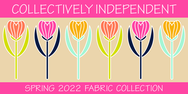
Happy February! Spring is around the corner and spring is in the air with a new collection that I am excited to share with you today that is actually a collection WITHIN a collection! Intrigued? Read on to learn all about this new collaboration!
Many months ago a group of us Spoonflower designers joined together to create a color cohesive collection for a Spring release. This is not the first time this group of designers has a created a group collection in this way but it IS my first time joining in the fun! We began by choosing a colorway. Designers were allowed to submit color palettes that we as a group then voted on. The winning colorway is very bright and bold (and a little out of my usual comfort zone to be honest). I do think it is quite lovely for spring!
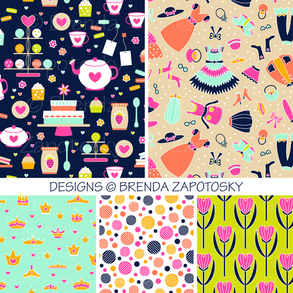
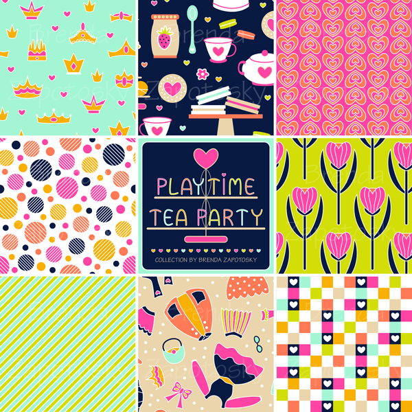
Once we finalized the colors we moved on to the design phase! While technically this is our Spring Release Collection we did not have to create solely spring themed designs. Since these colors were so bold and playful (and slightly girly) I drew inspiration from my 6 year old niece and designs I thought she would love.. Some brand new and some a new color version of older designs (from several different collections). My collection is called PLAYTIME TEA PARTY!
Playtime Tea Party features whimsical prints inspired by imaginary tea parties and dress up fun! All my designs can be found together in one COLLECTIONin my shop. I already have a second colorway in the works and an additional design which will be added to it over time. The designs can also be found in various collections elsewhere on Spoonflower where they are grouped with all the other designer’s patterns.
To keep the group collection to a manageable size and aide shoppers in finding great prints and coordinates there are actually 6 separate collections featuring our spring colors. The main collection features a wide range of design styles, basically we could submit up to 5 designs of anything we liked as long as they met the color guidelines. Here are the 5 designs of mine that you can find it the MAIN COLLECTION:
In addition to the main collection there are 5 sub-collections featuring popular coordinate categories: Basics, Blenders, Florals, Plaid, Checks
I have 3 designs in two of those categories. Two in BASICS
While not all styles will compliment each other, by designing in a color cohesive collection like this the number of options buyers have to mix and match greatly increases! I did not add any designs to the other collections (some of my designs could fit but I chose to put them in the main collection) but they are definitely worth checking out as they are filled with lovely designs! Here are the links:
I am very excited to be a part of these collections! There are a lot of really great designs. One thing I find very interesting, similar to when I have participated in a Spoonflower limited palette challenge, is how very different the colors can look when applied in different combos and ratios from different designers. For a collection that was limited in color… the spectrum of design differences is big! And really quite fun! Between the 6 sub-collections there are more than 1000 designs from 59 different designers… there should be a little something for everyone!
We are using the hashtag: #designerspr22 on all our social posts and designerspr22 as a search tag on Spoonflower in case you would like to follow along with everyone’s posts or see all the designs not divided by collection.
I will end this post with one final look at all of my designs in a collage together.
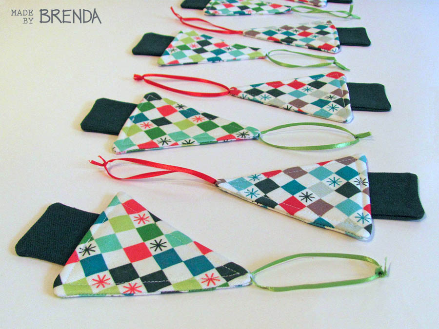
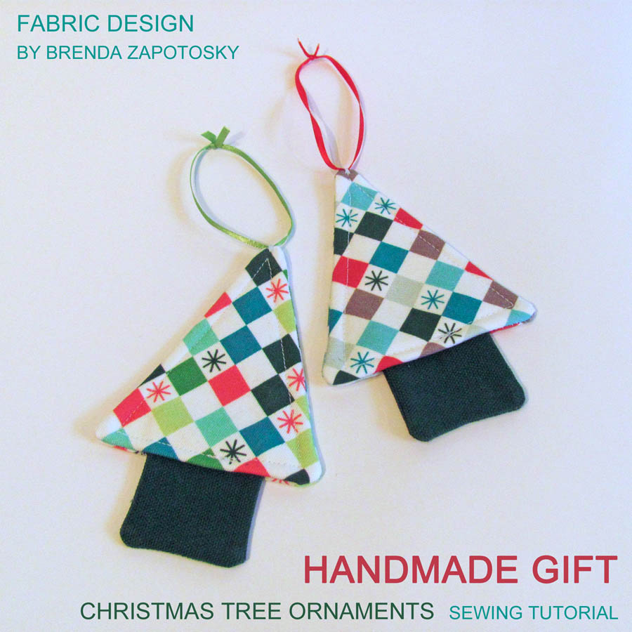
Today I am sharing with you an easy handmade Christmas gift idea that you can make with SCRAPS! Yay! Scrap busting ideas are always welcome to me! Hopefully they are for you too! And since you can use scraps, you could sew up a few of these in time for Christmas. (You could change up the batting if you don’t have it on hand).
This is sort of a simplified tutorial (my first ever!) I’ll describe how I made these in a few short steps but no photos of the process.
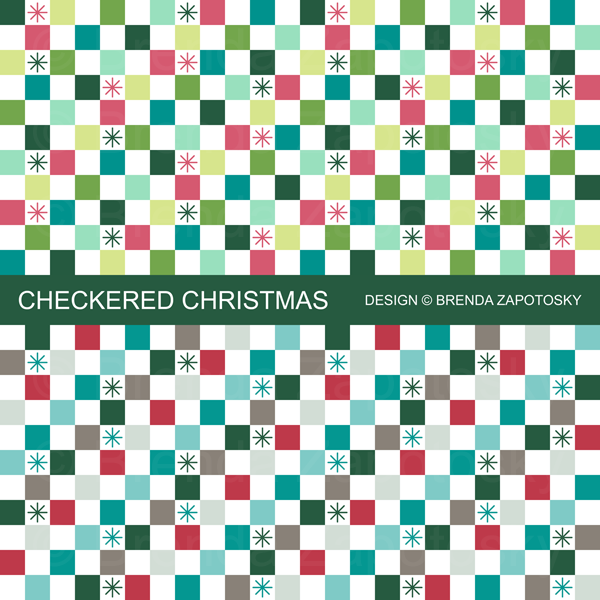
But first: The fabric! The main fabric I used for these ornaments was one of my own designs: Checkered Christmas, in both the Merry (top) and Festive (bottom) colorways.
I originally purchased this fabric for another Christmas gift project which you can read about in this POST. The fabric type was Spoonflower’s Lightweight Cotton Twill (but you could used any woven type of fabric you’d like). I paired it with some Forest Green Canvas in my stash. I cut the main fabric at an angle to add a little visual interest and fused it with a layer of batting to give it some extra thickness. The ribbon for the loops was also in my stash. You could also use embroidery thread, yarn, or even a tiny loop of thread for an ornament hook to attach.
HOW TO:
Before diving in I want to say that these instructions are for a medium weight fabric like the Canvas Twill. If you choose something lighter, like quilting cotton, you may want to interface pieces, add fusible batting to the trunk, or even have the batting on both pieces of the triangle. You want to make sure there is a enough stability that they can hang nicely.
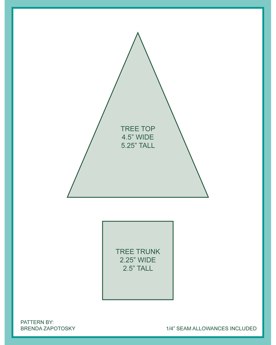
Step 1: For each ornament CUT: (2) Tree Top Triangles, (2) Tree Trunk Rectangles, and (1) Fusible batting triangle approx 3/8″ smaller all around than the tree triangle. (See Diagram at the end of post for dimensions).
Step 2: Fuse 1 side only of the tree top triangle with the batting. (You could skip this step or interface with non-batting instead.)
Step 3: Sew tree trunk rectangles right sides together on 3 sides with a 1/4″ SA, leaving the top unsewn. Clip corners, turn right side out and press well.
Step 4: Sew tree top triangles right sides together with a 1/4″ SA, leaving an opening in the bottom center slightly wider than the finished outside dimensions of the tree trunk rectangle. Clip corners, turn right side out and press well.
Step 5: Insert the trunk into the bottom of the tree, unsewn side up approx. 1/4″ Secure with a pin, washable tape etc.
Step 6: Add top attachment piece of your choosing. For my trees I secured the ribbon loops to the top of the trees with a few hand sewn loops of thread. I THINK I did this before sewing the tree opening closed so I could hide the knotted ends INSIDE the tree.
Step 7: Top-stitch around entire tree outline with a 1/8″ SA (which will attach the trunk to the tree top).
And Voila! Your simple ornament is finished! Repeat steps 1-7 for as many as you’d like. As you can see below I made A LOT of these!
I hope this tutorial was helpful. If a step is unclear please let me know so I can clarify!
CUTTING DIAGRAM:
These are the approximate dimensions for my trees. I made these for Christmas 2018 and the trunk might have been sized slightly differently. I had hoped to have a pdf download of the “pattern” as part of this post. (and may add it in the future). For now, if you would like a printable copy of the pieces let me know and I can send them too you.
Thanks for much for reading! If you make this and share online please be sure to tag me so I can see your creation! On Instagram: @brendazapotosky
Today I am bringing you the Year End Recap for the Fruit and Veggie Art Challenge and I am very excited to be wrapping things up! Actually… this is sort of a Part 1 as I have a follow up post planned… but more on that at the end. And if this the first time you are hearing about this challenge, you may want to read the orginal challenge announcement HERE.
Let’s begin with a look at all the fruit and veggies I illustrated this past year:
I think it is such a fun and colorful collection! I love seeing them all together like this. My design parameters for this challenge were to do a geometric interpretation of the fruit/veg which included simplifying shape lines, segmentation, and using hatch, dots etc. to create texture. You may notice that all the boards also include a background rectangle(s). This was not originally planned, but I added it for the asparagus to fill in the white space and liked it so much I decided to make it a standard feature for all the boards! Overall, I am extremely happy with this collection as a whole. I already shared favorites and other thoughts in my quarterly recaps so I won’t do that again. If you missed any of those, they are all linked at the end of this post.
As with last year, one of the goals of this challenge, besides committing myself to creating new art on a regular basis, was to create a library of illustrations that could be used in other ways. I would definitely consider this aspect a success. I created three new patterns which incorporated one of more of the fruit/veg and have ideas for a few more in the future. I have also had a request for a poster version that would include most of the illustrations. This will be similar to the animal art poster I did last year but smaller and probably without the words. You can see that poster in THIS post.
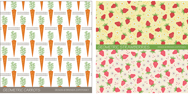
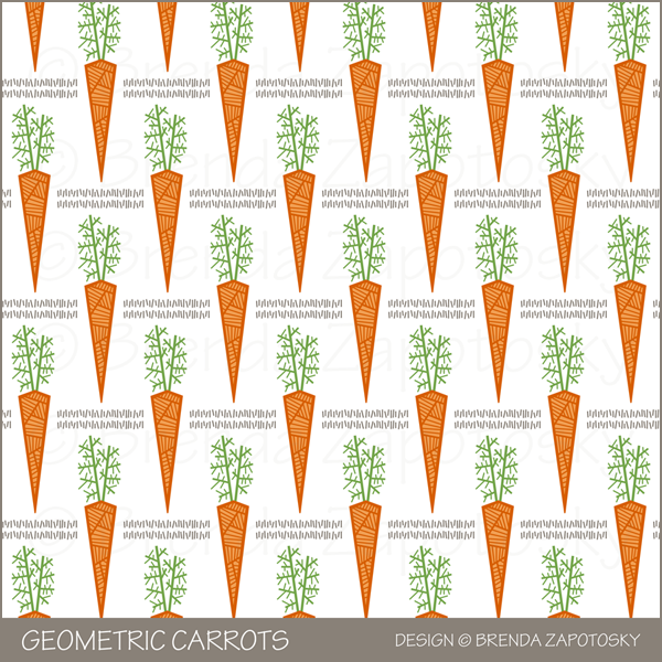
Two patterns I created featured just one illustration: Geometric Carrots and Geometric Strawberries (which has two different colorways).
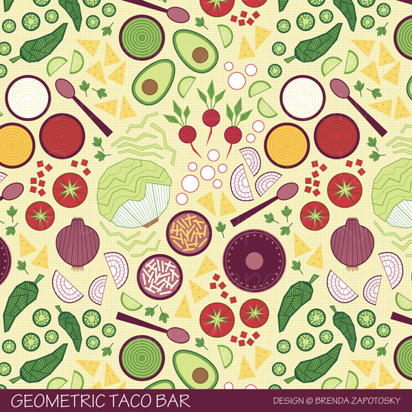
I also created a pattern that uses many of the above fruit/veg along with some other ones not part of the alphabet collection. Geometric Taco Bar was created for a Spoonflower contest.
All of these designs can be found as fabric, wallpaper and gift wrap for sale in my Spoonflower shop. Along with several other geometric food designs from the past. Here is a link to the entire Geometric Food Collection.
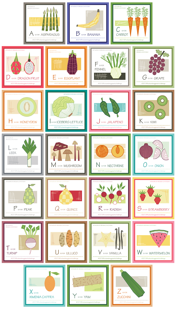
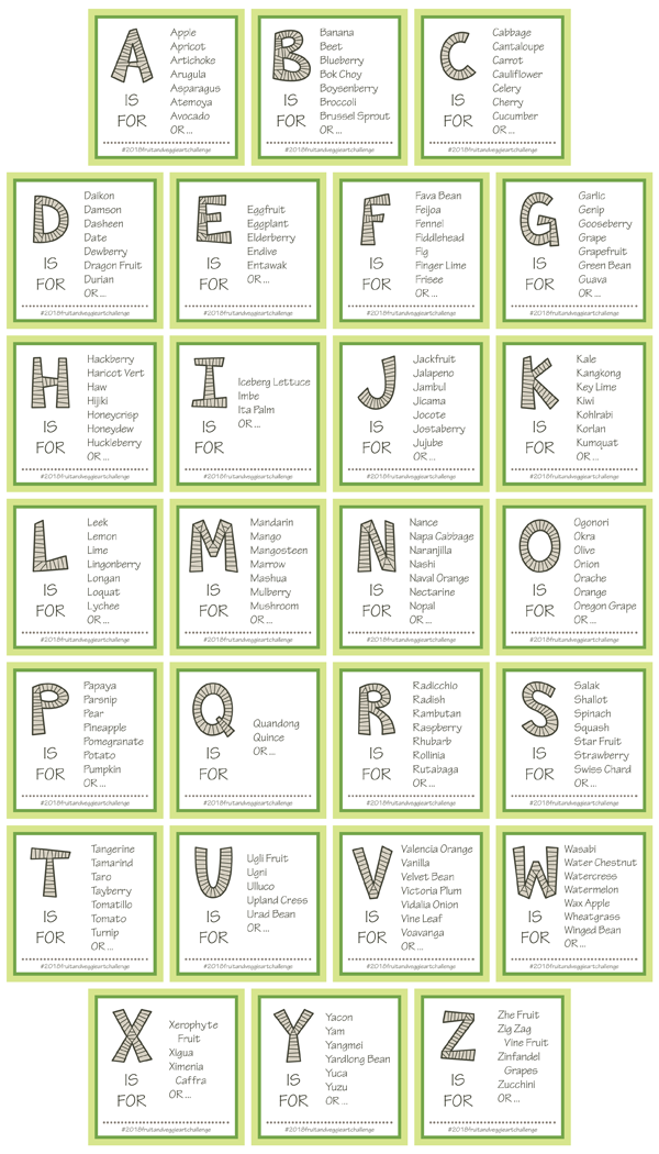
The other major component of this year long challenge was the Letter Prompt lists that I posted at the beginning of each fortnight. These prompts included an original block letter and a list of fruit/veggie ideas that began with that letter. Here are all 26 together:
I tried to include 7 options for each letter but as you can see that wasn’t always possible. I enjoyed learning about different fruit/veg I had not heard of before. The font is an expansion of a slightly more simplified block font I had started a few years ago. (You can see an example of the letters on my Colorful Merry Christmas Text pattern.) I had been adding to it as needed so not all the letters were there. AND I modified the look of most of them and added all the hatching. It was nice to create a font in increments like this. It made it much less tedious. I am super happy with the alphabet as a whole:
I definitely plan on making a repeating pattern with these letters. And I am excited to play with lots of color variations! Plus, now I have it to use for future projects! WIN!
Overall I think I can call this year long challenge a success! Admittedly, I wasn’t always enthusiastic to work on some of them. And I was definitely happy to reach the end. But looking back on the library of illustrations and letters I now have I am happy I did it!
And… so did two others! Yup! Two fellow artists followed along and completed *most* of the challenge! Since their work is so different from my own and I knew this blog post would be long to begin with I have decided to give them their own Featured Artist Post. COMING SOON! (I will link it once it is live). You are definitely going to want to come back and see their beautiful creations!
And as mentioned above, in case you missed any of the previous posts about this challenge here are all the links:
Finally there IS a new challenge for this year! We are still in the middle of letter A so if you feel inspired to join in you still can from the very beginning! The theme is CITY and you can read all about it HERE. Or you just follow along with me!
Do you have a favorite? Any fruit or veggie you would like to see as a pattern? I would LOVE to hear from you in the comments!
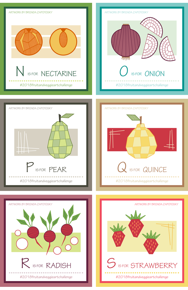
It is time for the 3rd “Quarter” Recap for the 2018 Fruit and Veggie Art Challenge! Letters N thru S were an interesting group and I am beginning to see some of the limitations of my “geometric” design criteria. Before I jump into my thoughts on this group let me share my 6 fruit and veggie creations for this portion of the challenge:
Overall I really like this group.
You may notice that the pear and quince are quite similar. This was completely intentional. I thought since their shapes are so similar AND they are in season around the same time that it would be nice to have them “go” together. While I already have a Geometric Apple pattern in my shop, I think I would like to do a new apple that matches the style of the pear and quince and create a pattern using all of them.
Also, I had an interesting creative process with a few of these. I recently created a new pattern, Geometric Taco Bar, that includes a variety of fruit/veg, including both the onion and the radish. The letter “O” fell during the time that I was making the pattern so it was created for both at the same time. As for the radish, that was created for the pattern first, but I did not feel compelled to do another “R” fruit/veg when it arrived, so I simply composed a board featuring the Radish.
Geometric Taco Bar was created for a Spoonflower Design Challenge and is available in my shop!
I also included both the Jalapeno and Iceberg Lettuce which were created earlier in the Challenge (adding in slices of each). I love this pattern.
It is hard to pick a favorite in this group. I am actually more prone to pick a least favorite: The nectarine! It is difficult to differentiate between the specific varieties of round fruits especially in the geometric style I have chosen. I like the cut view of the nectarine better and do think it captures the essence pretty well. This difficulty is one of the limitations I was referring to at the start of this post. I am also finding that even in the “non-circle” fruit/veg that there are a lot of similar looking shapes. For example, radishes, beets and turnips, when drawn in the geometric style are also hard to differentiate. The same would hold true with leafy greens. Hopefully enough unique shapes will present themselves as I complete the challenge.
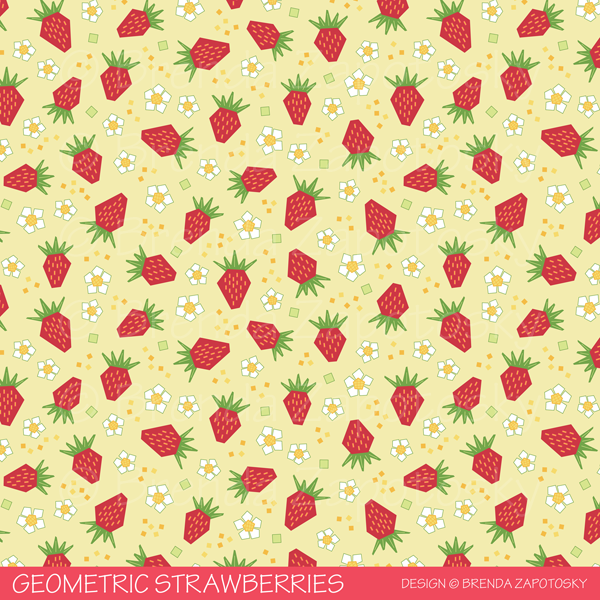
One fun aspect of this group is that half of them have been included in surface patterns! The onion and radish are both part of the Geometric Taco bar design. Additionally, I love the strawberry so much I already created a pattern for it! This pattern will be added to my shop very soon. So that is 3/6. And, as I have already mentioned, I hope to create a pattern using both the pear and quince together. One of my favorite aspect of this challenge is a library of illustrations to use in other applications.
Speaking of the strawberries, I wanted to share a look at the pattern! I have ordered the swatches, so it will be in my shop soon. But I do want to say it COULD CHANGE. I often tweak designs after seeing them printed, so this is how it will tentatively look.
This is the Classic colorway. I also created a Pinky colorway too! I’ll update this post when they are available in my shop.
And that’s a wrap! Looking forward, I expect this final batch of letters to be challenging. For the most part I do not look at the options for a letter until I make the prompt list, so there is a chance that I will be surprised, but I think the options for everything but “T” to be very limited. Follow me on Instagram if you want to see each letter (and the prompts as I create them).
With the end of June it has officially been six months since the 2017 Art Challenge: Alphabet Animals has come to a close. I wanted to do an update since I have used those animals I created in quite a lot of new designs! One of the goals of the Challenge was to create a library of illustrations I could use in various ways and in that goal I have had much success! So today I want to share all the creations that I have made since the challenge ended. If you are hearing about this challenge for the first time you can read the final blog post recap and see ALL the animals. You can also see the other designs I created last year.
SURFACE PATTERNS
I’ll start with surface patterns. All these have been created this year, so after the close of the challenge. Since in many cases I ended up tweaking the animal illustrations I will share a look at the original animal and the pattern side by side!
All of the patterns I have created this year with animals so far have been created specifically for Spoonflower Design Challenges (although one did not end up being entered as you will soon learn).
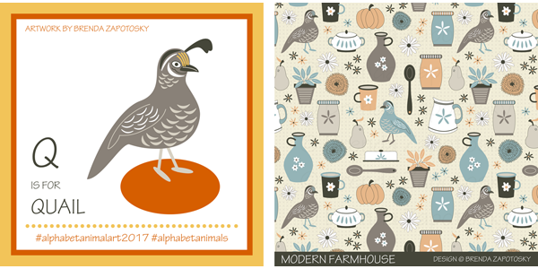
Modern Farmhouse
As you can see for this pattern the quail is playing a supporting role. I removed its top plume and did some recoloring to make it more “generic bird” versus a quail specifically. I really love how it fits in so well with the other farmhouse images I created. Modern Farmhouse is available in my Spoonflower shop.
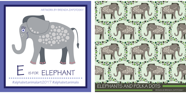
Elephants and Polka Dots
For the “Endangered Species” Design Challenge I chose to feature my elephant illustration. I didn’t make many changes to this character. I changed the toe nail color to white and made the line weights for the facial features a little thicker. (And overall color changes of course). Since my elephant already had a unique polka dot detail I decided to build upon that for the pattern. I actually created 4 different colorways of this design. The Taupe colorway one you see here is the version that was entered in the contest. You can find it and the 3 other colorways in my Animal Fun Collection. This was actually the second time this elephant was selected from the library. Last year I created a greeting card featuring the elephant!
Hedges and Hedgehogs
The idea for this pattern was in my head almost immediately after creating the original hedgehog so I was very excited when the “Animals by Land” Design Challenge was posted giving me the perfect excuse to create it! I kept the hedgehog mostly the same but tweaked the facial features again on this one, the most noticeable being that I gave it a round eye. I think it is cuter that way! The hedges got a bit more colorful too! Find Hedges and Hedgehogs in my Spoonflower shop!
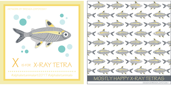
Mostly Happy X-Ray Tetras
Last but not least is my X-Ray Tetra. For this one, I kept the pattern simple since there is already a lot of detail in the fish itself. I did play with adding some polka dots, but I didn’t like them. I did, however, do a fun little switch-up! As the title suggests, not ALL these tetras are smiling… I added some frowny ones to the mix and reversed their coloring in places to make them just a bit more distinctive. This design was created with a contest in mind but was never entered because I got the THEME wrong!!! I thought it was Animals by/in/of WATER since the previous two contests were Land and Air… but for this one Spoonflower mixed it up and themed it “Animals of the OCEAN”. Technically tetras are not ocean fish (which I learned through research, I am not a fish expert!) and I did not feel right entering this design. Oh well… at least it gave me the motivation to create it since this was also a pattern idea I had in my head for a while! Mostly Happy X-Ray Tetras is also available in my Spoonflower shop.
GREETING CARD
I have created one new card since the close of the challenge. I have a niece and nephew who both turned 3 in June (cousins, not twins) and I thought the koala was a good pick since it was already holding onto to something making it easy to swap in the number 3. I also changed the hat to a party hat. I left the koala itself the same (even the position of the arms worked as is for the number 3!)
I was there when my niece opened her card and upon seeing it she recognized it as a koala! Granted she had recently seen a show that had koalas, but still, it made me really happy to know that my characterization was accurate enough for her to name the animal specifically! I call that success. The koala cards joins several other animal cards I created last year which you can find on my Cards and Gift Wrap page.
ARTWORK
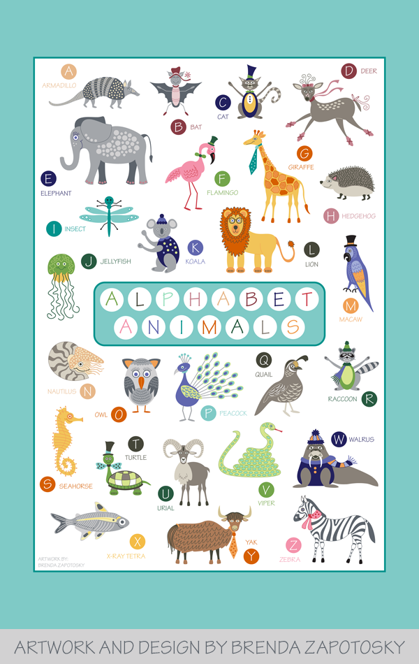
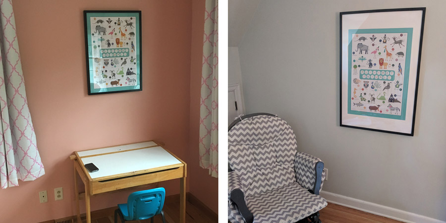
The biggest thing (literally) that I created with the animal illustrations is a poster that incorporates ALL of them! As I mentioned above my niece and nephew turned 3 and I decided that for their gifts I would create this poster. It was actually quite a bit of work to pull it all together and fit them in a logical way and adding in all the text circles, title, etc.
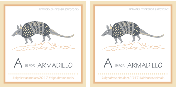
In addition to removing all the “props” that were originally paired with I also did some minor re-scaling, both enlarging and reducing scales of some of the animals to get them to work better as an ensemble. Other than that all the animals except one stayed the same as the original in look and color (all the tweaks I made for the patterns came later). The one animal that DID get changed was the armadillo since that was my very first illustration and it did not have the same “cute” look that I started with letter B. Here is the “Before” and “After”.
It was actually my husband who suggested I make them “cuter” after seeing the first animal, armadillo. I am so happy he did, because it definitely enhances my already slightly cartoon-ish interpretations. And I am glad I changed up the armadillo for the poster!
It is definitely a bit of a gamble to give the gift of art. Especially BIG ART that is intended to be hung in someone’s house. I took that chance because I thought my niece and nephew as well as their parents would like the gift. And because I expected these to be hung in the kids’ rooms and not the main house. I am so happy to report that gifts were well received AND have both already been hung! Here is a look at the posters “in the wild”.
I printed these posters at a standard 20″ x 30″ but sized the poster border proportions to work with a favorite IKEA frame line that I love (Its similar sized frame is 19.75″ x 27.5″). (Seriously, almost every wall frame in my house is from this line). For the smaller frame on the left (which I framed) I trimmed it to fit the slightly smaller proportioned frame. My sister opted for the same IKEA frame but with bigger dimensions so it has a mat (on the right). It is fun to see the two looks side by side.
My husband’s reaction to seeing the poster for the first time was that I should sell them! After selling greeting cards for a number of years I decided that being a producer really wasn’t for me. I have been focused for the last several years solely on designing and selling my work where someone else does all the work. However, these posters, which I am extremely pleased with, have me actually considering maybe selling (on a VERY limited basis) again. It is just an idea at this point. I would probably sell them both wholesale and retail if I did. If you are a retailer or an individual and would be interested please let me know! If there seems to be enough interest I would start investigating larger quantity printing!
And that about wraps it up! I anticipate using more of these animals in future design projects. Do you have a favorite you’d like to see used in something? I’d love to know!
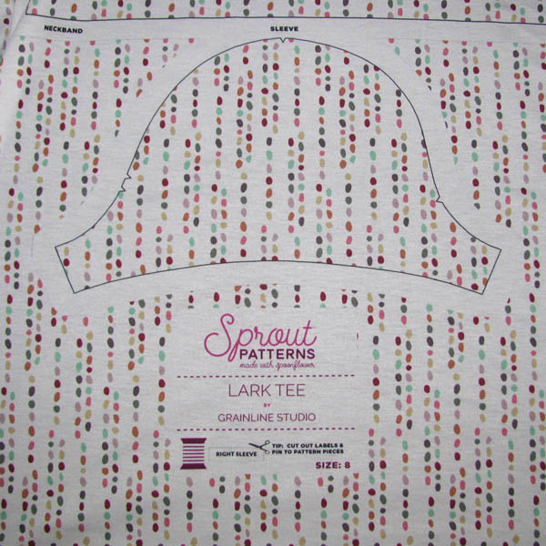
SPECIAL NOTE: Sprout Patterns which is discused in detail in this post is no longer open. I have decided to keep all the Sprout content as part of this post. Unfortunately you will not be able to purchase the product I used. You CAN still get the Lark Tee Pattern from Grainline Studio.
It is time for another installment of “Sewing and Design Meet”. This time I am sharing all about my Pebbles design and what I have made with it. The majority of this post will be focused on the Lark Tee I sewed via a cut-and-sew project I ordered through Spoonflower’s sister site, Sprout Patterns, and I will be speaking a bit about that experience too. At the end I’ll share a quick look at a simple winter accessories set I also made. This post is LONG. If you don’t care about sewing details you can read about the design and then just scroll and look at all the photos 🙂
DESIGN:
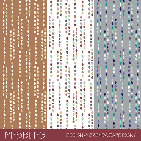
Pebbles is a coordinate I created to go with my Sandcastles design as part of my Beach Bliss Collection. I originally offered this print in 2 different colorways and then added a third one which does not actually color coordinate with the collection because I specifically created it for the winter accessories project.
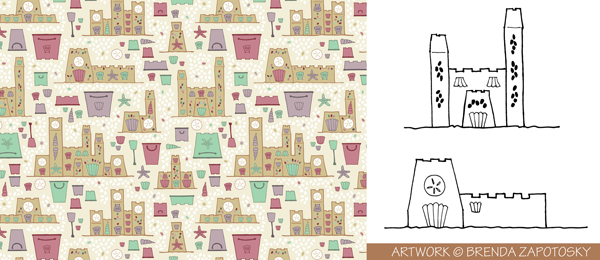
The Sandcastles design was created from hand drawings that I vectorized and turned into a pattern in Illustrator. I included pebble details on the sandcastles and as background infill. To create the Pebbles print I pulled out pebbles from the pattern and arranged them into vertical lines. Below is a look at Sandcastles and some of the original hand drawings. Most often, even if I do a hand drawing first, I completely redraw them in Illustrator, but this time I used auto trace since I wanted to maintain the feel of the hand drawing which I think matches the beach theme well.
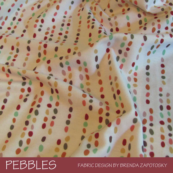
Instead of purchasing “raw” fabric for this project I ordered my fabric AND pattern through Sprout Patterns. If you are not familiar with Sprout they are one of Spoonflower’s sister companies. With Sprout, you can order sewing patterns from a wide range of companies and designers printed directly on the fabric! It is the ultimate, cut-and-sew: all you need to do is cut around the outlines of the pieces and start sewing! With your Sprout purchase you also get a pdf copy of the pattern so you can sew it again in the future and also use the pieces for adjustments, etc. (Which I definitely did). I chose the Multicolored version of my Pebbles design printed on Modern Jersey. Here is a look at a portion of the printed fabric where you can see a pattern piece and how the design continues on the unused fabric:
There are some pro’s and con’s to using Sprout and I think ultimately it will vary person to person on whether this sort of sewing experience is right for you.
PROS:
This is definitely a time saver. Not only does it save you the time of printing and assembling a pdf or cutting out a paper pattern, but it saves on the time it takes to cut fabric too since all the arranging of the pieces on the fabric and lining up the grainlines etc. is already done for you.
You can order exactly the amount of fabric you need! Instead of having to over buy on yardage numbers, the cut of fabric you get from Sprout will give you the fractional yards without having to buy a full 2 yards for example for a 1.5 yard project. You can also mix and match fabric designs within a project… so if you want all your trim pieces to be a different fabric, you can select a different fabric design or even a solid color for those pieces.
Even though the fabric is sized to fit the pattern, for many projects there will still be some unused spaces leftover. Sprout prints the fabric design on these areas too (as you can see in the photo) so you might end up with some bonus fabric pieces you can use for something else. (I did end up NEEDING some of my extra, which you will read about below).
CON:
You can only choose to have one size printed… they do not grade between sizes. If you are a “straight out of the package” size this is probably not even a con. I am most definitely NOT a single size gal and this is a big issue for me. I found a way to work around this and grade a bit between sizes which I will discuss in the sewing section of this post.
One last detail that is VERY important to note is that you MUST follow washing instructions. I learned this the hard way as I shrunk my fabric, which changed the size and proportion of the pattern pieces! I am so used to pre-washing my fabric in a blast of hot water and hot dryer to get the fabric to shrink as much as possible before I sew with it, I was basically on auto-pilot and did the same with this project. BAD IDEA. I was able to make it work, thankfully, but my shirt is a bit shorter as a result. AND I had to cut new sleeves. Thankfully they were the cap style and needed very little fabric and were able to fit on unused portions of the fabric but it is a bummer that I had to do that instead of saving those sections for a future project.
SEWING:
The Lark Tee is a basic tee shirt with a ton of options. For my Sprout project I chose the scoop neck with cap sleeves (but as I mentioned above you get the pdf so you get ALL the views and variations with it and can print it and use it like a regular pattern. I have already made several other versions). I chose Modern Jersey as the fabric option. The sewing is very straightforward so I won’t really go into that, but I do want to talk a little bit about grading the pattern.
I am pear shaped and in this pattern (and pretty much all Grainline top patterns per the SIZE CHART) I am a size 4 bust and my hips sort of hover between size 8 and 10. But with Sprout you can only pick 1 size, so I had to do some creative thinking. I have square shoulders and a wide upper back so I usually like to go up a size (to a 6) for my bust. And since this was a stretchy tee, I figured I would be safe going with the size 8 for my hips. So I ordered a size 8 with plans of using the pdf pattern pieces to grade the top smaller. Of course needing to print and assemble ALL the tee pieces pretty much negated the fast and quick factor of Sprout, but I really wanted to try the whole process once to see how it worked, AND it was still faster having the pieces already outlined on the fabric since it saved me from laying them all out and finding the grain, etc.
As I mentioned above, I unknowingly shrunk my pieces, so when I laid the pattern pieces on the printed fabric things did NOT line up like I expected. The fabric shrunk WAY MORE vertically then it did horizontally… so they weren’t smaller everywhere, more like squashed. In the end it was almost good that I was grading it smaller, because I was able to fix this with my adjustments. It did mean however, that the top got shorter. AND, the size 6 sleeve piece did not fit within the outline. Thankfully, there was enough extra fabric elsewhere to trace the sleeves. After that was all worked out the sewing was easy! Especially since I sewed it twice with other fabrics prior to cutting into the good stuff.
Overall I am very happy with the fit of this tee. I LOVE the size of the scoop neck! It is basically my “dream scoop”. The sleeves are maybe a tad snug for cap sleeves and I would like the tee to be an inch longer (but that was the fault of the shrinkage). I absolutely LOVE the Pebbles design as a tee, but the white background version might not have been the wisest choice. (Thankfully I ALWAYS wear a tank top under everything). I also do not love it in Modern Jersey and wish I would have chosen the Cotton Spandex instead. I have sewn a TON of things with Modern Jersey, I love the fabric, but for a tee shirt… it is just not breathable enough for my tastes. But this is totally personal preference. I am a natural fibers gal.
*** You might have noticed a pants change in these photos… I actually took photos on multiple occassions (months apart!) and locations. I actually finished this top last year! The blog post was so delayed I had a chance to take another round!
As stated at the start of this blog post, Sprout Patterns is no longer open. You can still make your own! You can buy the Lark Tee Pattern from Grainline Studio directly. It is also available as a paper pattern. And the Pebbles design on Spoonflower seperately.
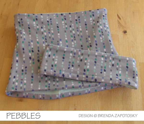
PROJECT #2: Neck and Ear Warmer Matching Set
Technically this Project #1 since I made this well before the tee shirt but the blog post flows better to have it at the end. Using the Drizzle colorway of the Pebbles design, printed again on Modern Jersey, I made a matching fleece-backed ear and neck warm set. Both of these are self-drafted. I love the fit of the ear warmer but I think I would tweak the neck warmer proportions should I make it again. And I would not use the Modern Jersey again. While I do love it for infinity scarfs, in this application where I backed it with fleece, a fabric with more structure like cotton spandex works better. I have made several ear warmers and the ones that used cotton spandex are much smoother against the fleece.
That’s it! You made it to the end! Woop! I actually have made one other item with some of Sprout leftovers, a headband, but I don’t have a good photo to share. (And still have pieces left I could use as accents on a future project too!) I think I covered everything, but feel free to ask any questions or just say hello in the comments.
It is here! The first blog recap of the 2018 Fruit and Veggie Art Challenge! 6 letters and 12 weeks completed! Wow. This new theme has been quite fun and overall, for me at least, easier than the Alphabet Animal Art Challenge from last year. If this is the first time you are learning about the 2018 Alphabet Art Challenge I recommend reading this blog post first.
Also, a side note: I have been struggling with what simple word to use when writing about my illustrations. I have settled on the generic combo fruit/veg to try to make things as simple as possible 🙂
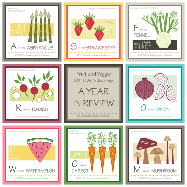
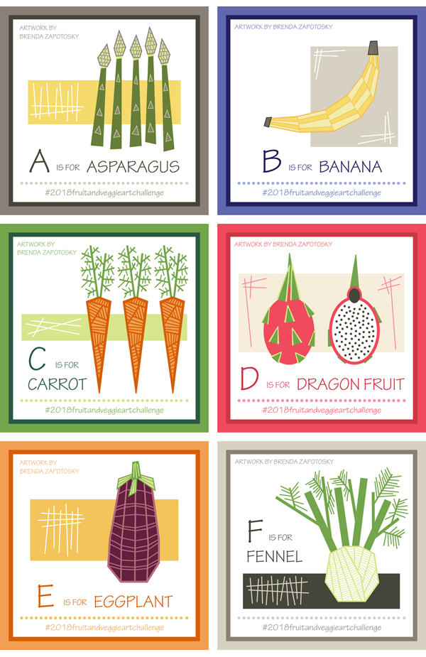
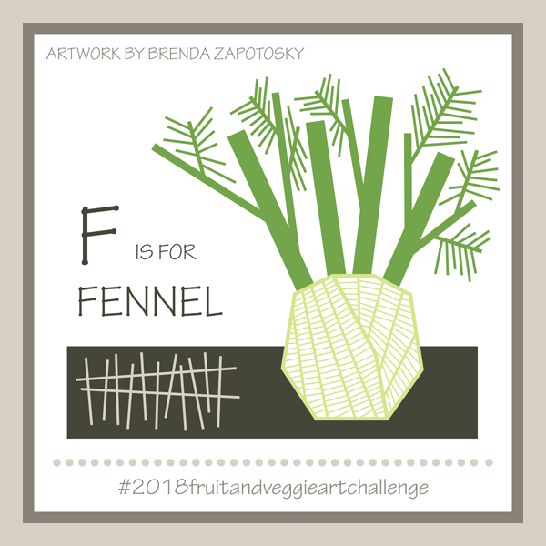
Let’s start with a look at the first 6 illustrations I created:
4 Veggies and 2 Fruits so far. As I shared in the original blog post for this year’s theme, in addition to the Alphabet Fruits and Veggies I am also giving them all a “geometric” flare. I am absolutely loving this twist on the theme as it frees me from trying to exactly recreate the fruit/veg I have chosen and gives me a bit of creative flexibility. It is quite fun to choose my fruit/veg then think through the best way to geometrically create it. In addition to the fruit/veg itself each illustration has a rectangle and hatching as part of the composition. I added this for the first item, asparagus, to fill in the blank space and liked it so much I decided to make it a standard element for all the illustrations. I think my favorite illustration this round is the Fennel, it was such a perfect fit for my geometric style. Here is a closer look:
I also really like the carrot. In fact, I have already made it into a repeating pattern and added it to my Spoonflower Shop! I think this Geometric Carrots print would be especially fun for the kitchen!
I anticipate more patterns in the future and probably a few that incorporate more than one fruit/veg. Those will probably come closer to the end or after the challenge once I have an entire collection.
Probably the biggest challenge I have encountered so far is fitting the fruit/veg well on my template. I really liked the framed square I used for the Alphabet Animal Art Challenge and definitely wanted to keep the square format for this year too, however, so far the fruit/vegs have been much more vertical than the animals. Had I thought of this before starting I might have tweaked the format of the squares. This is another good reason to incorporate the background rectangles and sticks as they help to fill the space.
Like last year, I extended an invitation for other artists to join me in the challenge. Not sure if fruit/veg are less appealing than animals, or that others found it too difficulat to stick to a year long challenge, but participation is down from last year. (Actually last year started strong and then eventually everyone except myself dropped out). 3 other artists started the year with me. I wanted to give them a shout out because I loved that they joined in. And since there are less options with fruit/veg there were often repeat picks which I think is quite fun. You can see all our creations on Instagram via the hashtag for the challenge: #2018fruitandveggieartchallenge. You can also check out all of the artist’s individual feeds: onecreativechameleon, deevlasak, and jillbyersdesign
Jill from jillbyersdesign is the only artist that has also completed every letter and I wanted to give her a special mention! She is also using a consistent design style and I absolutely LOVE how her collection is coming together!!! Her style is so different from mine which is super fun. Painting is NOT my strength, but I have done it enough to really appreciate the gift in others. Jill definitely has the gift. Here are her first 6 fruit/veg paintings!
So gorgeous, right? I highly recommend giving her a follow on Instagram. You can also find more of her work on her website and in her own Spoonflower shop (which is how we “met” in the first place!)
Speaking of other participants… you could still join in if you wanted! I think that the fruit/veg are so much faster to create you could easily catch up at this point. Or simply start at the latest letter: G! I even create a prompt list for each letter to give you ideas. Find the latest one here.
I think that about covers it all. I would love to hear which fruit/veg is your favorite! Or any other comments you may have 🙂
Today I am excited to finally start sharing with you all the gifts I made for this past Christmas. I think it is fun to do a post like this, not only to share sewing details, but also to perhaps inspire ideas for handmade gifts. If you want even more inspiration you can read my Handmade Christmas Gifts 2016 post! I am finding there are A LOT of details to share, so I have decided to break it up into a PART 1 and PART 2 so that the posts are not overwhelmingly long. Today I will focus of the gifts I made using my own fabric designs, since that always adds an extra layer of information.
It is a tough business sewing for Christmas: deadline looming, personal projects get delayed or on hold, and you have to keep a lot of secrets! (really tough for me when I am excited about a make). Learning a lesson from past years, I started REALLY EARLY this year and yet, somehow STILL found myself down to the wire. In my defense, I added a few gifts not originally planned AND lost some sewing time I expected to have. So I was still sewing on Dec. 23!!! But I got it all done and everything was well received!
NAPKINS AND TRIVETS
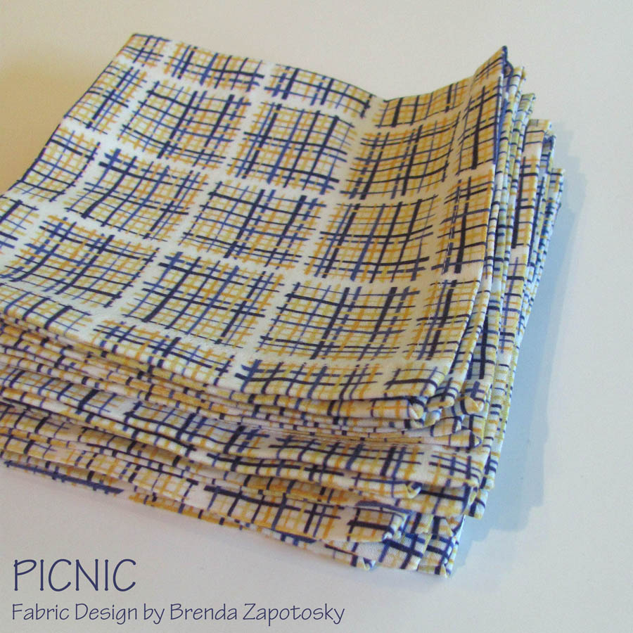
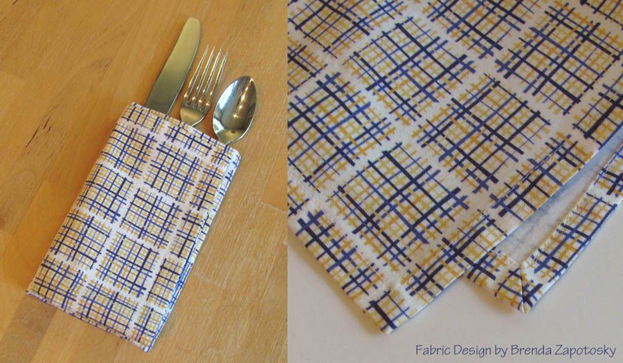
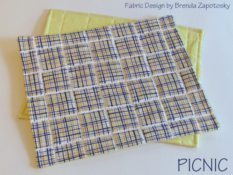
First up is a set of cloth napkins and matching trivets I made with one of my own fabric designs: Picnic (Sunny). This is actually the newest colorway for this design and I created it specifically with this project in mind. I chose this print because I think it is a modern take on both plaid and check and perfect for a kitchen. The colors were picked to match the recipients’ dinnerware. I really love how this palette turned out and might need to look into offering all the designs in the Flutter Collection in this new colorway. I ordered 1 yard printed on Spoonflower’s organic cotton sateen.
Since this print has a natural cutting point built in, I let the white space breaks in the pattern squares determine my size options for the napkins. Ultimately I decided to make 8 out of the yard I had. They turned out a little small… but not unusable, just smaller than you would expect. (Perhaps I could have made a smaller hem). This was my first time sewing mitered corners. 32 mitered corners! Yeah. That got old pretty quick. I found this tutorial from Colette very helpful. I did the sewn and topstitched version. Below is a zoomed in look at the corners as well as a “styled” photo with silverware.
Design: Picnic (Sunny), printed on Organic Cotton Sateen by Spoonflower
I had a good sized strip of fabric leftover so I decided to make a few trivets to go along with the set. I went with a slight rectangle instead of square for two reasons: 1. I thought they would be a bit more practical for oblong and rectangle serving dishes and 2. The fabric shrunk more in one direction than the other, so even if I cut it an equal number of design pattern squares wide and long they would not be square. (In fact the napkins are not exact squares for this very reason.) I backed the trivets in a light yellow quilting cotton.
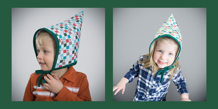
KIDDO HATS
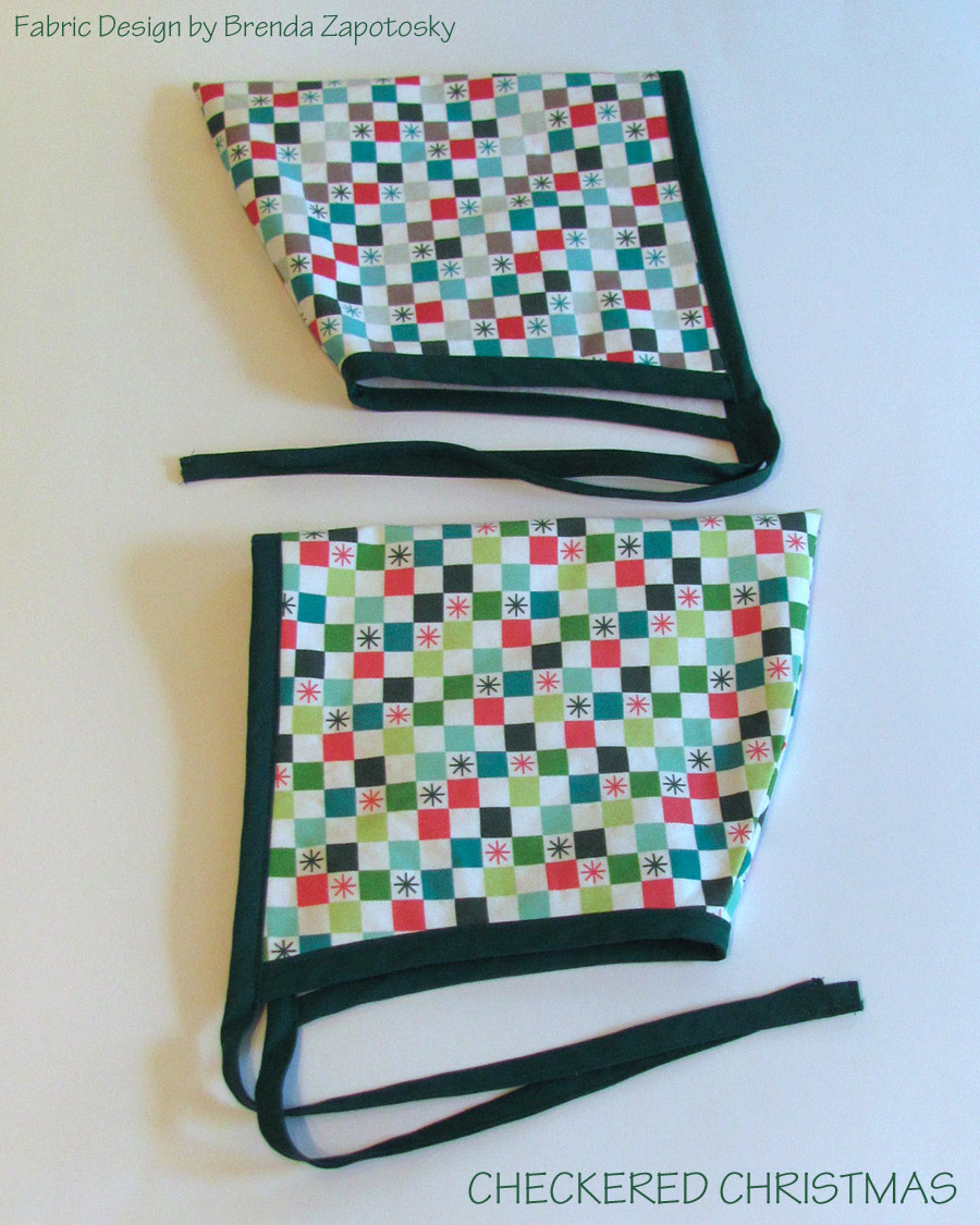
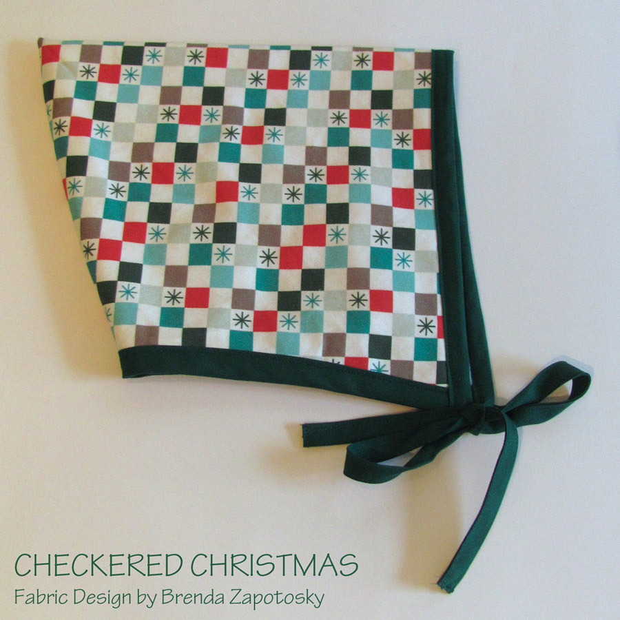
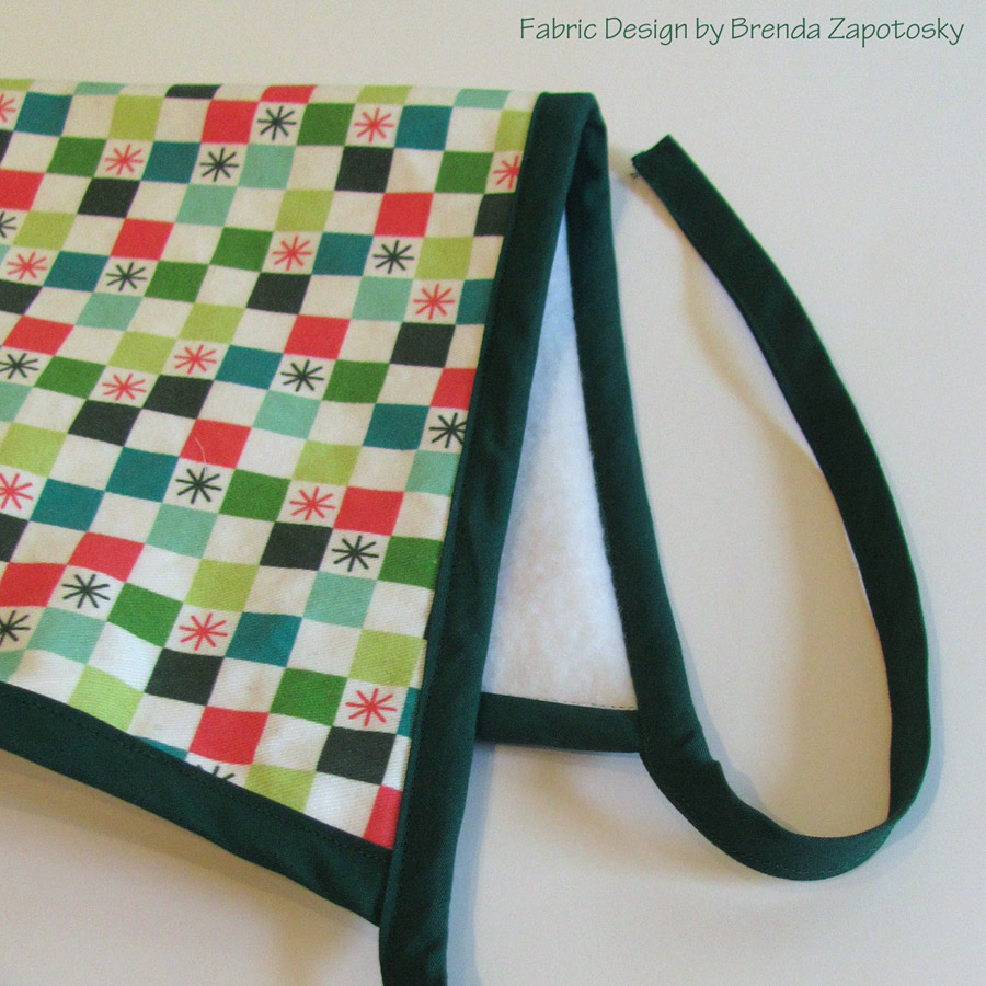
These are created from the FREE pattern for the Blizzard Bonnet by sweetkm. It didn’t take long after seeing this project to know that I wanted to make them for my niece and nephew. They are both 2 1/2 yrs old, born just 3 weeks apart. It is hard to resist making them something matching and I thought this little hat was so adorable! Like a little Gnome hat. In hindsight, maybe I should not have gotten caught up in the cuteness so much, as I am not sure how much they will actually wear these. (Although my niece did request to wear it at a birthday celebration! Ha Ha Ha! It is a party hat!)
They were surprisingly fun to sew up. Even the bias binding, which I usually loathe, sewed up so well! I think because it is sewn twice, instead of just sandwiching over it the edge, which made it “ok” to miss the back side edge in places as it was already sewn down. I actually changed the sewing of the bias tape from the directions. I first sewed it to the INSIDE of the hat and then flipped it to the outside. And I edge stitched on the front instead of stitching in the ditch. Aside from that, the only other change I made was to lengthen the ties. I do want to note that SIZING was a conundrum for me. The toddler size, which is what I consider a 2 1/2 year old to be, look super small to me. (I sewed up a quick tester with a scrap of fleece.) I ended up making the small child size and it is perfect. (My mom did do a stealth head measure of my niece for me.)
I used my own fabric design for this project as well. I actually created a brand new design: Checkered Christmas, to coordinate with my Classic Christmas Collection. I ordered 1 fat quarter of both the Festive and Merry colorways on the Lightweight Cotton Twill. After getting my fat quarters I decided to tweak design a little, so the designs as listed are slightly different than what can be seen on the hats (Same overall look and colors, just in different places). I used white fleece to line them and Jungle Green bias tape (by Wrights) for all the finishing (That color is a very good match to this print). Even in the second largest size, thanks to wider width of the fabric, I have a lot of this twill leftover for a future project.
I am ending with two ADORABLE photos of my nephew and niece “modelling” their hats! Shout out to my brother-in-law Jacob (of The Traveling Photo Booth) for taking these great photos and to my sister Deanna (of DLynn Design) for using her AMAZING Photoshop skills to crop out all the Christmas chaos in these photos!
If I left out a detail you would like to know about please ask in the comments! And stay tuned for PART 2!!!
It is time for another installment of Sewing and Design Meet. Actually it is time for the second installment… I started this series last year and then never did a second one! Oops! Hopefully this year, there will be more regular posts for this series.
Today I am sharing about my Floral Bliss design and several projects I sewed with it. I currently have 4 different colorways of the design plus coordinates all available in the Floral Bliss Collection in my Spoonflower Shop.
DESIGN:
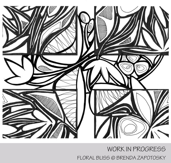
This design has a really fun story, since it began as a doodle in a doodle book I kept a long, long time ago. Here is a look at the original, non-repeating doodle:
As you can see, this doodle was not created with a repeating pattern in mind, and thus, there was a lot of work involved in turning it into one. It was a multi-step process, where I would split the design apart in photoshop, print it out and add more elements by hand, re-scan it, erase elements, digitally tweak etc. Here is just one in-progress look.
At this point you can see the original page outline was still present. Once I went through all those steps mentioned above (some more than once) and had a repeating tile with all my hand drawn elements, I next started the long process of recreating it as a vector tile in Illustrator. I did auto-trace it as a first step, but there was a lot of time spent editing and tweaking, etc again in Illustrator. This is not a fast process!
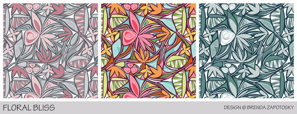
The original use of this pattern was for a Spoonflower limited palette contest. There was no theme other than the colors: Coral, Mint, Black and White, so it was a perfect opportunity to use an abstract pattern. Here is the look at that colorway of the pattern for the contest:
Floral Bliss (Coral and Mint) Design by Brenda Zapotosky
This is one of the most “hearted” designs in my shop. Because of its popularity and the amount of time invested in the pattern, it made sense to offer it in other color versions as well. I also added a second, smaller scale version. I currently offer it in 4 different colorways and 2 different scales! I have sewn with 3 of those colorways. Here is a look at the other 3 versions:
Colorways Left to Right: Pink and Gray, Tropical, Winter Blues
SEWING:
The first project I made from one 8 x 8 swatch: A Travel Eye Mask.
This was made with the Floral Bliss Pink and Gray (Small Scale) version of the design. I am not 100% sure which fabric type this is… one of the woven cottons. I created my own sewing pattern by tracing a freebie eye mask that I had (modifying the shape and size a little bit and adding seam allowances). It is backed in raspberry pink flannel with a layer of batting in between and I kept the piece of 1/4″ elastic I used “raw” (which I rather like). Bonus: All the extra materials were already in my stash!
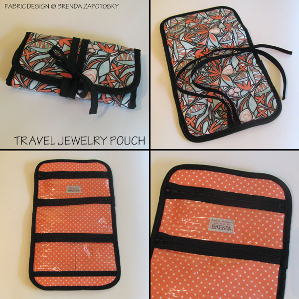
The second project I made used the original colorway of the design in the Small Scale again combined with a coordinating Polka Dot: A Travel Jewelry Pouch.
This was a gift for my sister and Floral Bliss was one of the patterns I knew she liked. (She also loves polka dots). It was quite an ambitious project for me at the time I made it. It was my first time working with vinyl, had multiple zippers, and a LOT of bias binding. I actually wrote an entire blog post about this one where you can read all about it in great detail.
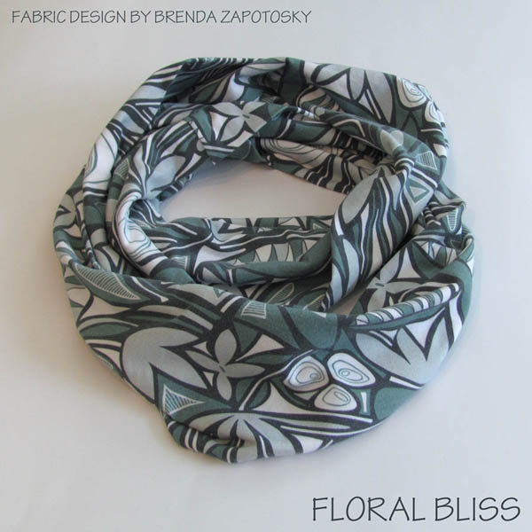
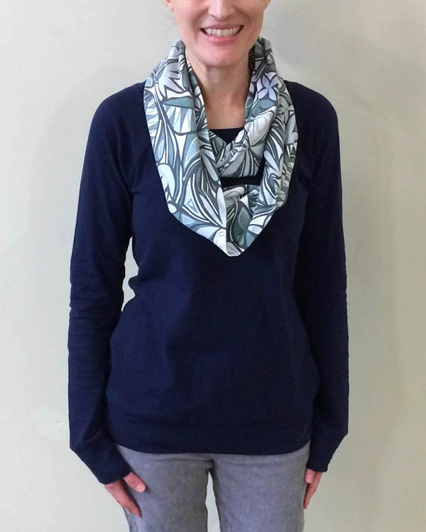
The third, and final project so far is an Infinity Scarf.
This scarf features the newest color of the Floral Bliss design, Winter Blues, in the larger scale. (The small scale version has not been added to my shop yet.) It is printed on 1/2 yard of Cotton Spandex Jersey. I don’t like my infinity scarfs to be too voluminous so 1/2 yard is the perfect size for me. I used Spoonflower’s Fill-A-Yard function to get 1/2 yard of this print and a different print for the other half which I also plan to make a scarf with.
I created this colorway specifically for this project. I wear a lot of scarves in the wintertime and keep them on even inside, so I like a lot of variety. This print, at this scale, in these colors will work well with a lot of what is already in my wardrobe and is quite different than my other scarves. Here it is styled with another recent make of mine, a Lane Raglan by Hey June Handmade sewn up in RK Laguna Knit in Navy. I think this is the 7th Lane Raglan I have sewn. It is definitely a TNT (Tried and True) pattern for me!
FINAL THOUGHTS:
I think it is apparent from the above projects that Floral Bliss is a very versatile design! I sewed these 3 very different projects quite far apart. It is fun to see that it is a design that I continue to return to and use in different ways. I have not sewn anything up in the Tropical colorway yet, but there is the chance that I will in the future should the right project come along! A skirt or dress for summertime would be lovely in that version of the print.